Looking for call-to-action examples that actually drive clicks and conversions? The difference between a bounce and a conversion often comes down to a single element: your CTA.
In this guide, you’ll find 19 call-to-action examples that work, plus the strategy behind why they convert. From copy and placement to design and UX, these examples will help you create CTAs that move users to take action as part of a broader how to design a website process.
Key takeaways
- Match CTAs to user intent and make the next step clear
- Reduce friction by addressing objections and simplifying the action
- Test and refine your CTAs based on your product and audience
- Small changes in wording, placement or design can significantly impact conversions
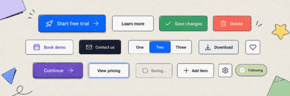
The anatomy of a great call to action
A call to action is a prompt that encourages visitors to take a specific desired action. It’s the bridge between engagement and conversion; the moment where interest becomes commitment.
From a UX perspective, CTAs are both decision points and navigational anchors that guide users through your website architecture . The placement of CTAs can increase conversion rates and even small changes like button color can boost clicks, so even small changes should be tested and refined over time.
Effective CTAs reduce cognitive load by clearly signaling the next step in the user journey, answering the question every visitor subconsciously asks: “What do I do now?”
Here’s how high-performing CTAs differ from weak ones:
| Element | Weak CTA | Strong CTA |
|---|---|---|
| Language | Passive (“Submit”) | Action-oriented (“Get Started Free”) |
| Value | Vague benefit | Clear value proposition |
| Friction | Hidden costs or steps | Transparent expectations |
| Design | Blends into the page | Visual prominence with contrast |
| Placement | Random or hidden | Strategic placement at decision points |
CTAs aren’t just buttons; they’re a key part of website planning, diagramming user flows, wireframing and content strategy—creating a logical path that moves users from awareness to action.
🎬 Learn what Slickplan can do!
We filmed a short video to show you exactly how to use Slickplan
19 examples of calls to action that get clicks
Not every call to action drives results. Below are 19 real-world CTA examples that stand out for their clarity, UX and conversion-focused design. Each one highlights a different approach you can apply to your own site.
Low-friction CTAs for reducing commitment barriers
These CTAs work by minimizing perceived risk and making it easy for users to take the first step. Free trials, simple signup flows and low-pressure language help move users forward without hesitation.
1. Intercom — “Start free trial” “View demo”
Intercom uses a classic SaaS double-CTA above the fold, offering both a free trial and a demo. The primary CTA emphasizes zero-risk access, while the secondary option supports users who aren’t ready to commit.
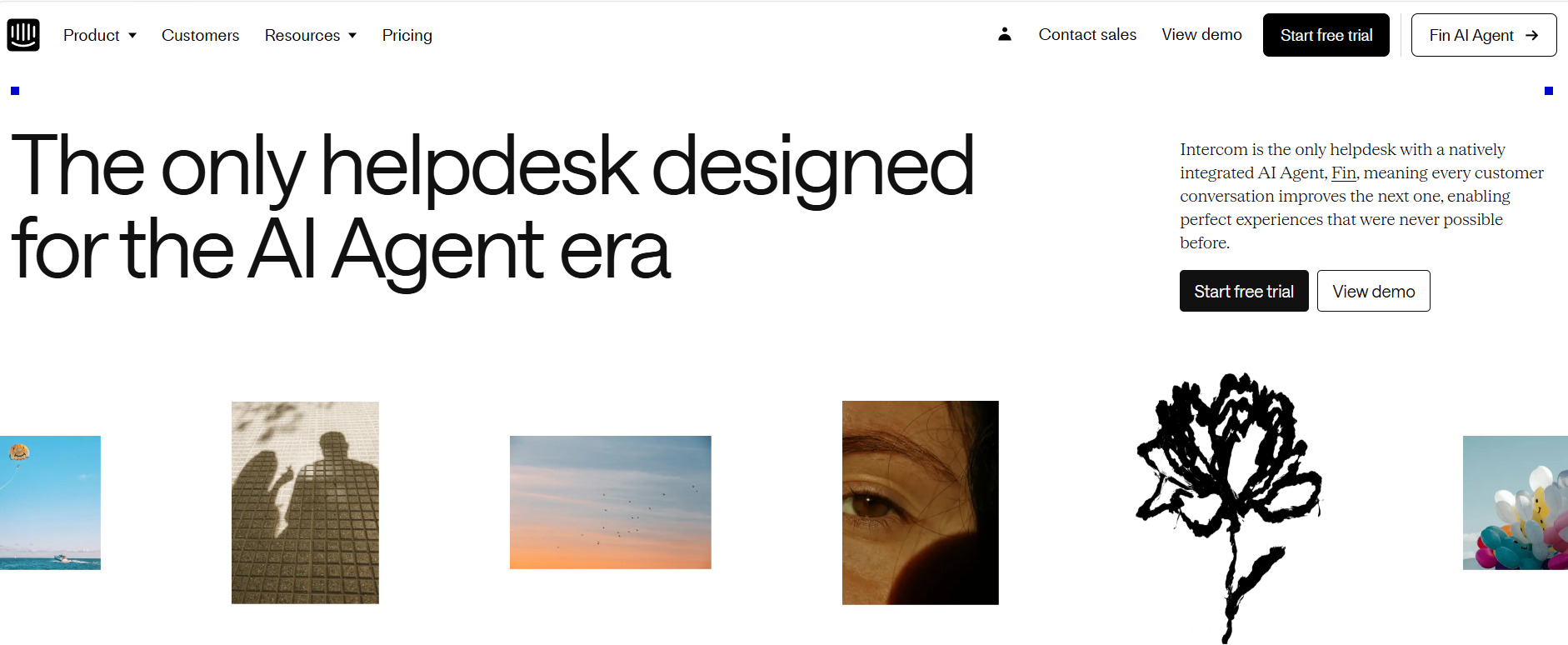
CTA type: Low-friction/dual-path
Why it works: Removes friction with a clear, low-commitment entry point while offering an alternative path for more cautious users.
Best for: SaaS companies where users need hands-on experience to understand value.
Watch out for: Free trials can attract low-intent users if not supported by strong onboarding.
2. Netflix — “Get Started”
Netflix relies on a simple, direct CTA backed by strong brand recognition and immediate value. Paired with a straightforward registration form design, the landing page experience quickly moves users from interest to action in a single step without adding friction or extra decisions.
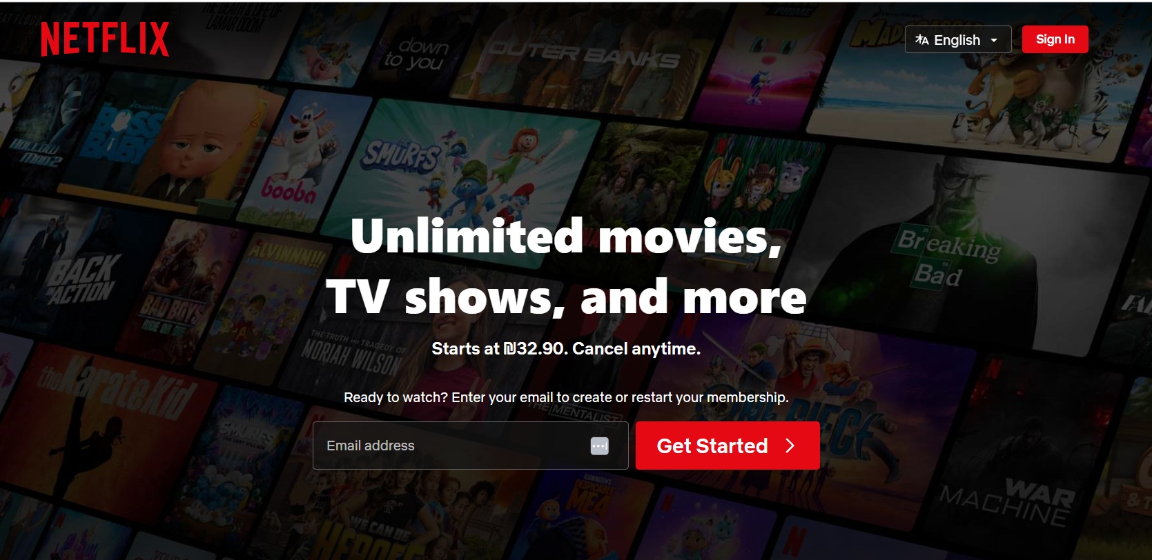
CTA type: Low-friction
Why it works: Combines minimal input with immediate access, reducing effort and decision-making. Additionally, the sticky top-bar CTA appears consistently regardless of scroll position, capturing interest at any point in the browsing session.
Best for: Subscription-based services with clear, immediate value and strong brand awareness, as well as no-brainer offers.
Watch out for: Generic language relies heavily on brand strength and surrounding messaging.
3. Descript — “Get started for free”
Descript uses a bold, high-contrast CTA that stands out on the page. The simple language is supported by strong visual design, making the button hard to miss.
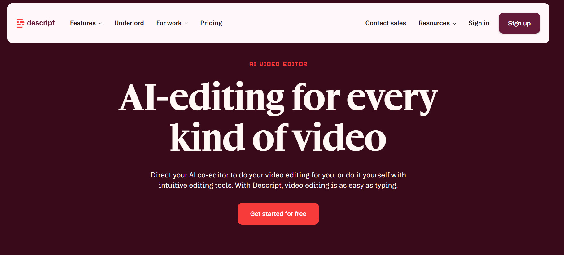
CTA type: Low-friction
Why it works: Strong visual hierarchy combined with low-risk language makes the action obvious and appealing.
Best for: Creative tools where visual design plays a key role in engagement.
Watch out for: Plain phrasing relies on visual execution to differentiate.
4. Dropbox — “Try Dropbox free”
Dropbox reinforces both the action and the product in a single CTA, combining brand recognition with a low-risk entry point. The messaging is simple and focused on immediate access.
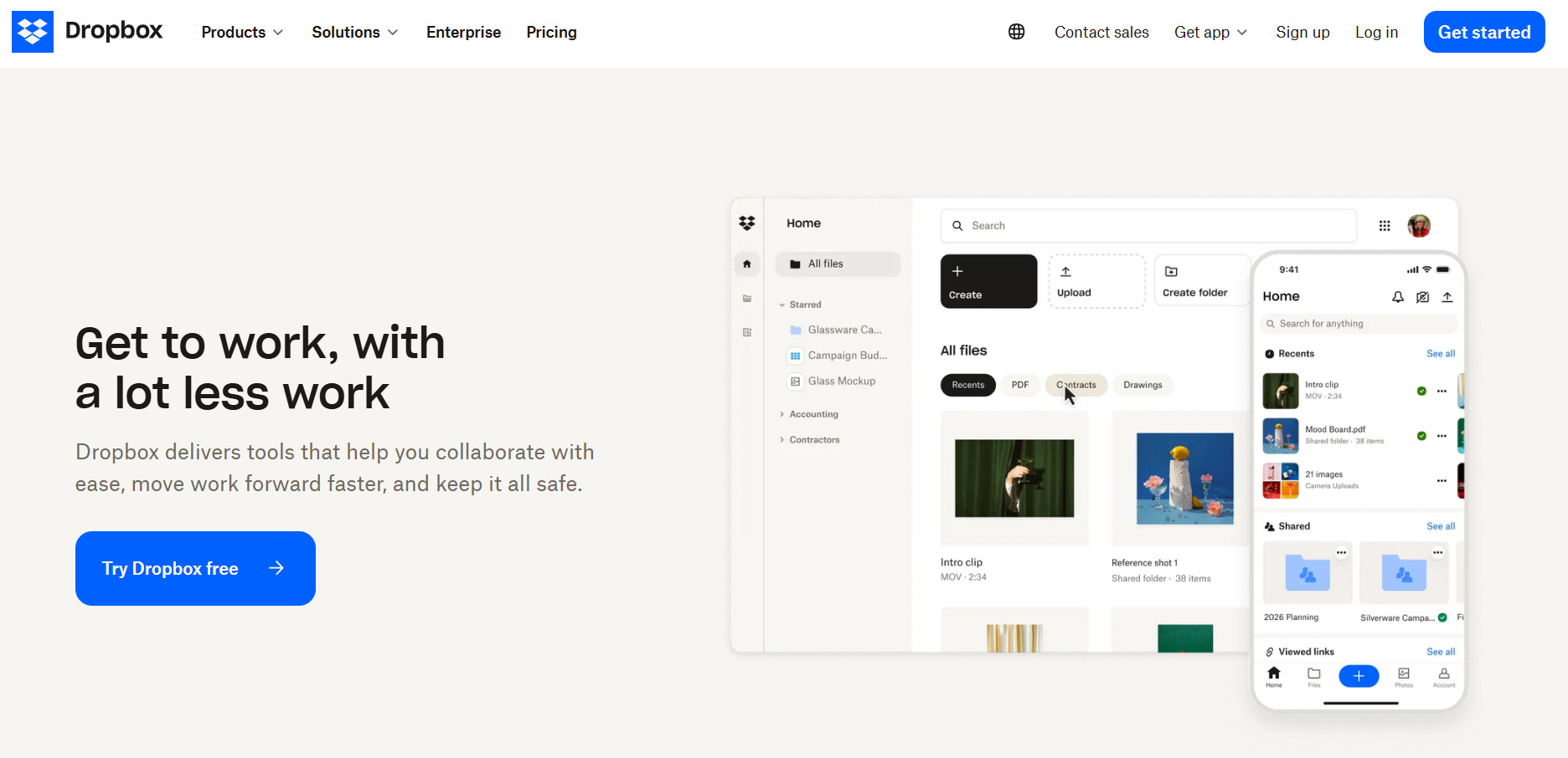
CTA type: Low-friction
Why it works: Integrates the brand directly into the CTA, strengthening recall while keeping the value proposition simple.
Best For: Established products with strong awareness and broad, utility-driven appeal.
Watch out for: Less distinctive than more creative CTAs and depends on brand familiarity as well as surrounding messaging to stand out.
5. Headspace — “Try for $0” & “Check your coverage”
Headspace uses a multi-CTA approach that aligns with different user needs, pairing a low-risk trial with a more considered therapy option. “Try for $0” emphasizes immediate, no-cost access to meditation content, while “Check your coverage” targets users exploring insurance-backed therapy services.
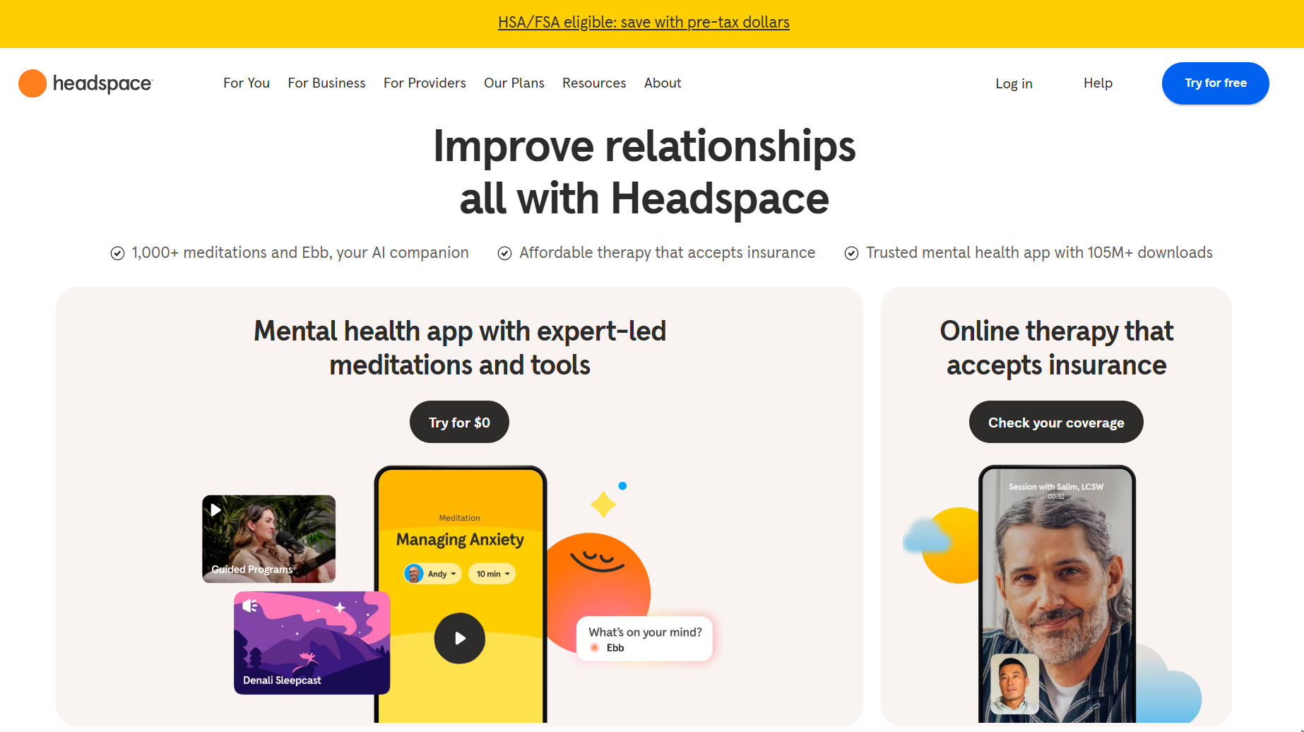
CTA type: Low-friction (with segmented offerings)
Why it works: Emphasizes zero-risk entry while accommodating different user needs within the same experience. Framing as “Try for“$0” is a nice change from the classic “free trial”.
Best for: Subscription-based apps and services with multiple entry points or service tiers.
Watch out for: Multiple CTAs tied to different products can split attention or dilute the primary conversion goal.
6. Jira — “Get it free” & “Sign up”
Jira combines a strong free-entry CTA with a structured signup flow designed for team onboarding. A sticky CTA keeps the primary action visible as users explore the page.
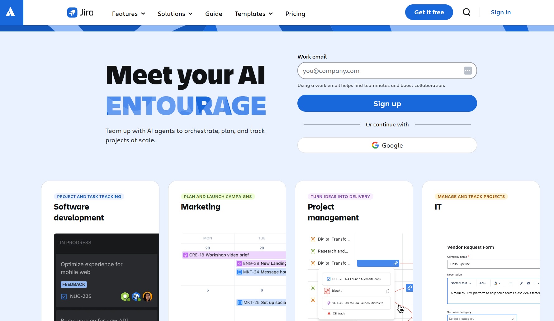
CTA type: Low-friction
Why it works: Reinforces a strong free value proposition with immediate signup functionality, aligning the CTA with team-based adoption by qualifying users at the point of signup.
Best for: B2B and technical tools with high-intent users ready to try immediately and team onboarding drives value.
Watch out for: Simple “Sign up” language relies on the surrounding context to communicate value.
Product-led CTAs to highlight value upfront
Instead of asking users to commit, these CTAs let them experience the product first. By turning the CTA into an interaction, they reduce friction and build trust immediately.
7. Slickplan — “Generate now — It’s free”
Slickplan turns its CTA into an interactive experience by letting users generate a sitemap directly from the page. Instead of sending users into a signup flow first, users can describe their site and immediately see real output from the AI sitemap generator.
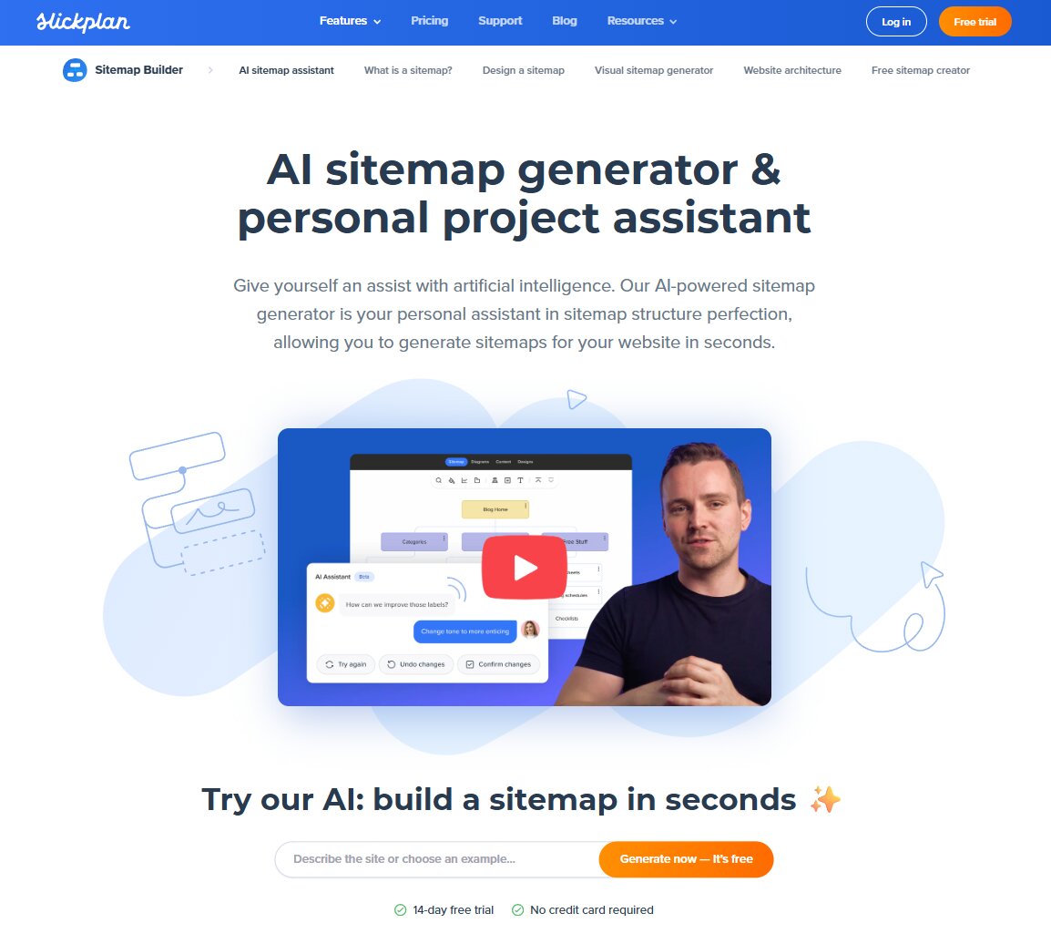
CTA type: Product-led
Why it works: Delivers immediate value before requiring commitment, reducing friction and building trust through real product interaction.
Best for: Tools where users benefit from seeing instant output before committing.
Watch out for: Users may still need to create an account to save or continue their work, adding a step after initial engagement.
8. Instantly — Product-led CTAs like “Create Sales Agent” & “See Demo”
Instantly replaces traditional CTAs with interactive product actions, inviting users to engage with the platform right away.
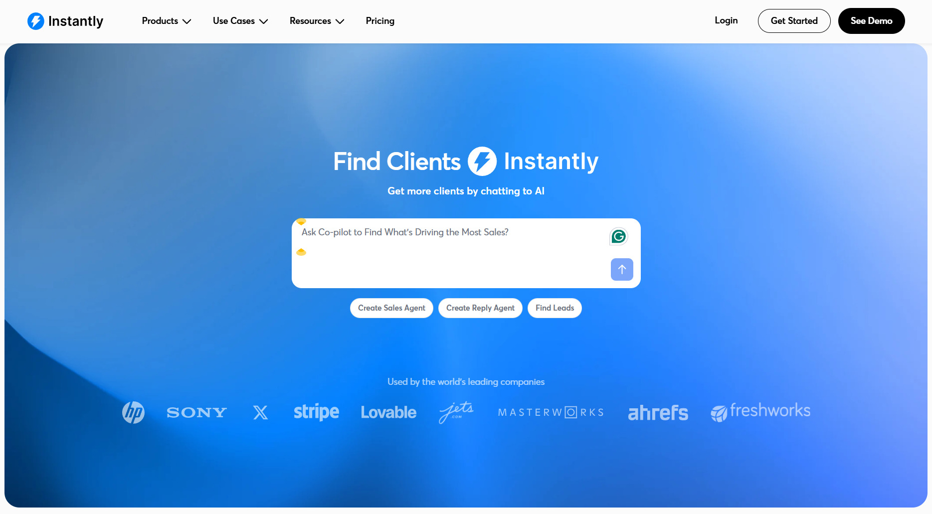
CTA type: Product-led
Why it works: Blurs the line between landing page and product experience.
Best for: Tools with fast, intuitive onboarding and immediate value.
Key strengths: Zero friction, highly engaging and product-first design.
Watch out for: If the product experience isn’t intuitive, users may drop off quickly. In the case of Instantly, all actions route users into a signup flow, which can create a disconnect between expectation and outcome, ultimately creating potential distrust.
Dual-path CTAs to support different user intents
These CTAs give users multiple ways to engage based on their readiness. Whether it’s trying the product or learning more, they reduce friction by offering flexible entry points.
9. Slack — “Get Started” & “Find Your Plan”
Slack goes with the double-CTA along with a persistent sticky CTA that follows users as they scroll, so it’s permanently visible at whatever moment the user wants to take action.
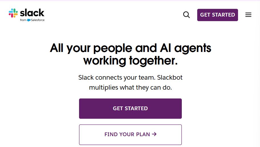
CTA type: Dual-path
Why it works: Supports different user intents by offering both immediate action with the primary call and deeper evaluation paths with the secondary path.
Best for: SaaS companies offering freemium products and varied user readiness.
Watch out for: The secondary CTA (“Find your plan”) introduces a pricing decision early, which can slow down users who just want to try the product first.
10. Perspective — “Create free funnel in 30 min” & “Watch demo”
Perspective uses highly specific CTA copy to set expectations before users click, using a sort of urgency tactic. Instead of the more generic “get started”, it tells users exactly what they’ll achieve and how long it will take, supported by a demo option for validation.
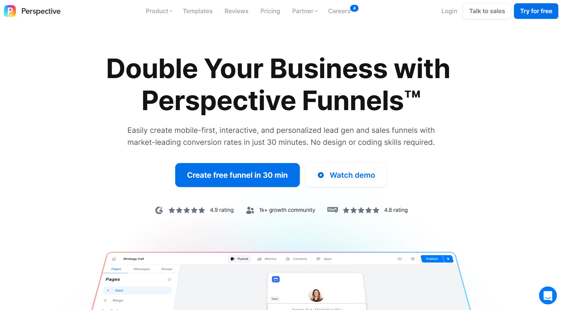
CTA type: Dual-path
Why it stands out: Combines clear action, a specific outcome and time commitment in one line, reducing uncertainty.
Best for: Tools with clear, measurable outputs that benefit from upfront explanation.
Watch out for: Time-based promises can create pressure if the experience doesn’t match expectations.
11. Asana — “Get started” & “View demo”
Asana pairs a high contrast “Get started” button with a softer “View demo” option for users who want to validate the project management offering before moving forward. The same primary CTA is reinforced in a sticky header, keeping it visible as users scroll through product details.
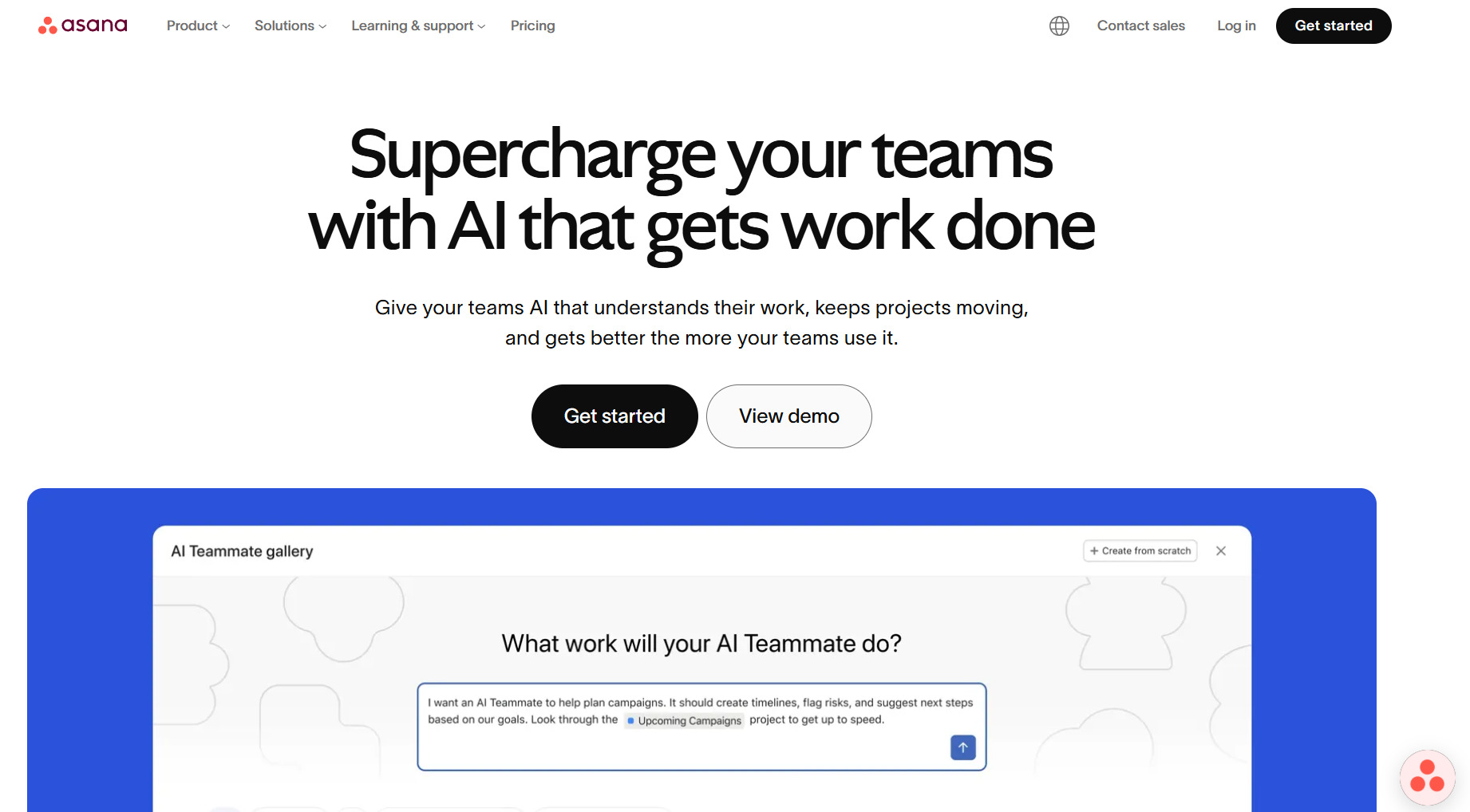
CTA type: Dual-path
Why it works: Balances self-serve onboarding with a guided exploration path, reducing hesitation.
Best For: Tools where users may need validation before trying the product.
Possible Limitations: Competing CTAs can split attention if the hierarchy isn’t immediately clear.
12. Loom — “Get Loom free” & “Install Chrome Extension”
Loom centers its call to action around free access, reinforcing it across both the hero section and sticky navigation with a high-contrast button design. Secondary options like the Chrome extension provide another easy action to take, while the contact sales CTA button supports different user needs without distracting from the main action.
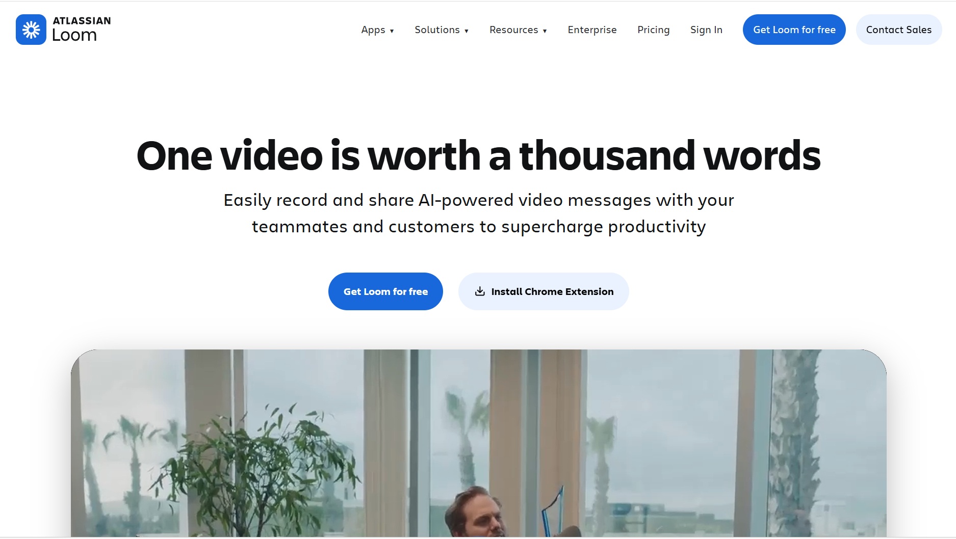
CTA type: Dual-path
Why it works: Provides flexible ways to engage while reinforcing a simple, value-driven primary action.
Best for: Tools with a clear, single use case that users can understand instantly.
Possible limitations: Too many different calls to action create choice overload if not clearly prioritized
Outcome-driven CTAs that focus on results
These CTAs emphasize what users will achieve rather than what they need to do. By highlighting outcomes, they create stronger motivation and clearer expectations.
13. Canva — “Start designing for free”
Canva uses an action-driven CTA that focuses on what users actually want to do—design. Instead of emphasizing signup, the language encourages customers to jump straight into the creative process.
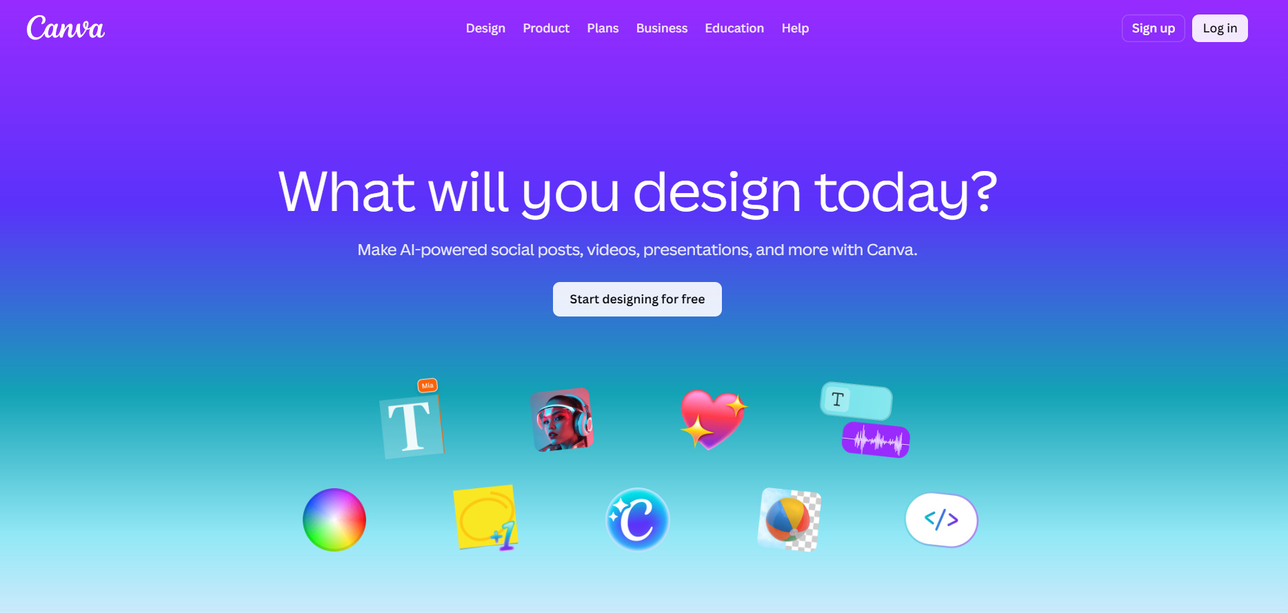
CTA type: Outcome-driven
Why it works : Shifts the focus from account creation to immediate user goals, making the action feel more meaningful and motivating.
Best for: Creative tools and design platforms where the activity itself is the appeal.
Watch out for: The broad “design anything” positioning can feel vague, especially for first-time users who aren’t sure where to start.
14. Charles Schwab — “Start investing”
Charles Schwab uses a direct, outcome-focused CTA that reflects the seriousness of the action. Instead of softening the language with “learn more” or “get started,” the CTA clearly states what the user is about to do—begin investing—supported by messaging that emphasizes control and flexibility.
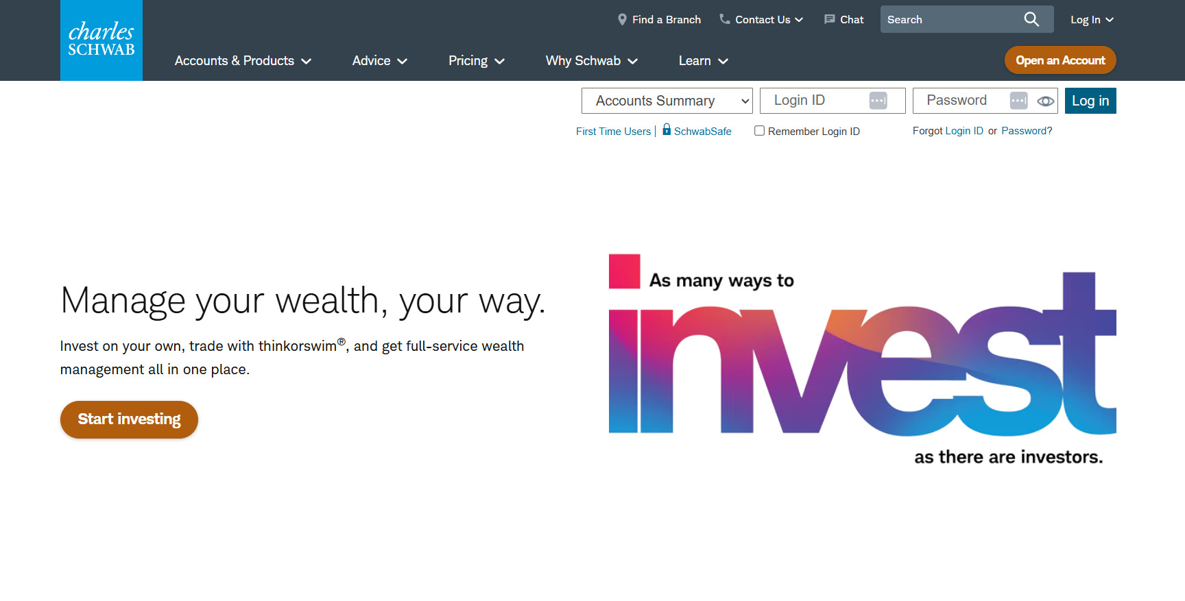
CTA type: Outcome-driven
Why it works: Sets clear expectations and aligns the action with a meaningful result.
Best for: Financial services, fintech and platforms where user decisions carry real-world consequences.
Possible limitations: Higher perceived commitment compared to softer CTAs, which may deter users still in the research phase.
15. Unbounce — “Start building for free”
Unbounce combines an action-driven CTA with strong outcome-focused messaging, encouraging users to start building landing pages while reinforcing the end goal of faster launches and higher conversions. Supporting elements like “no credit card required” reduce friction and reinforce low-risk entry.
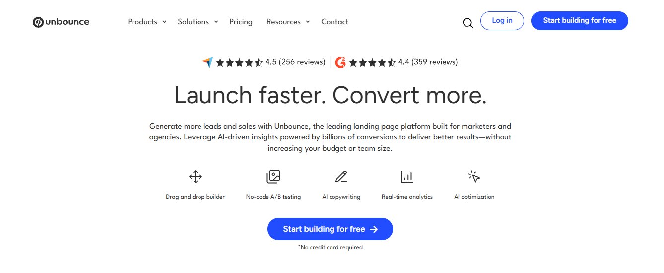
CTA type: Outcome-driven
Why it works: Connects immediate action with clear business outcomes, increasing motivation.
Best for: Marketing tools and platforms where performance and results are the core value.
Possible limitations: Relies on surrounding messaging to communicate full product depth beyond landing page creation.
16. WooCommerce — “Start here”
WooCommerce uses a simple, open-ended CTA that aligns with its positioning as a flexible, customizable ecommerce platform. Rather than pushing urgency, “Start here” acts as a guided entry point into the setup process, reinforcing the idea that users are building something tailored to their needs.
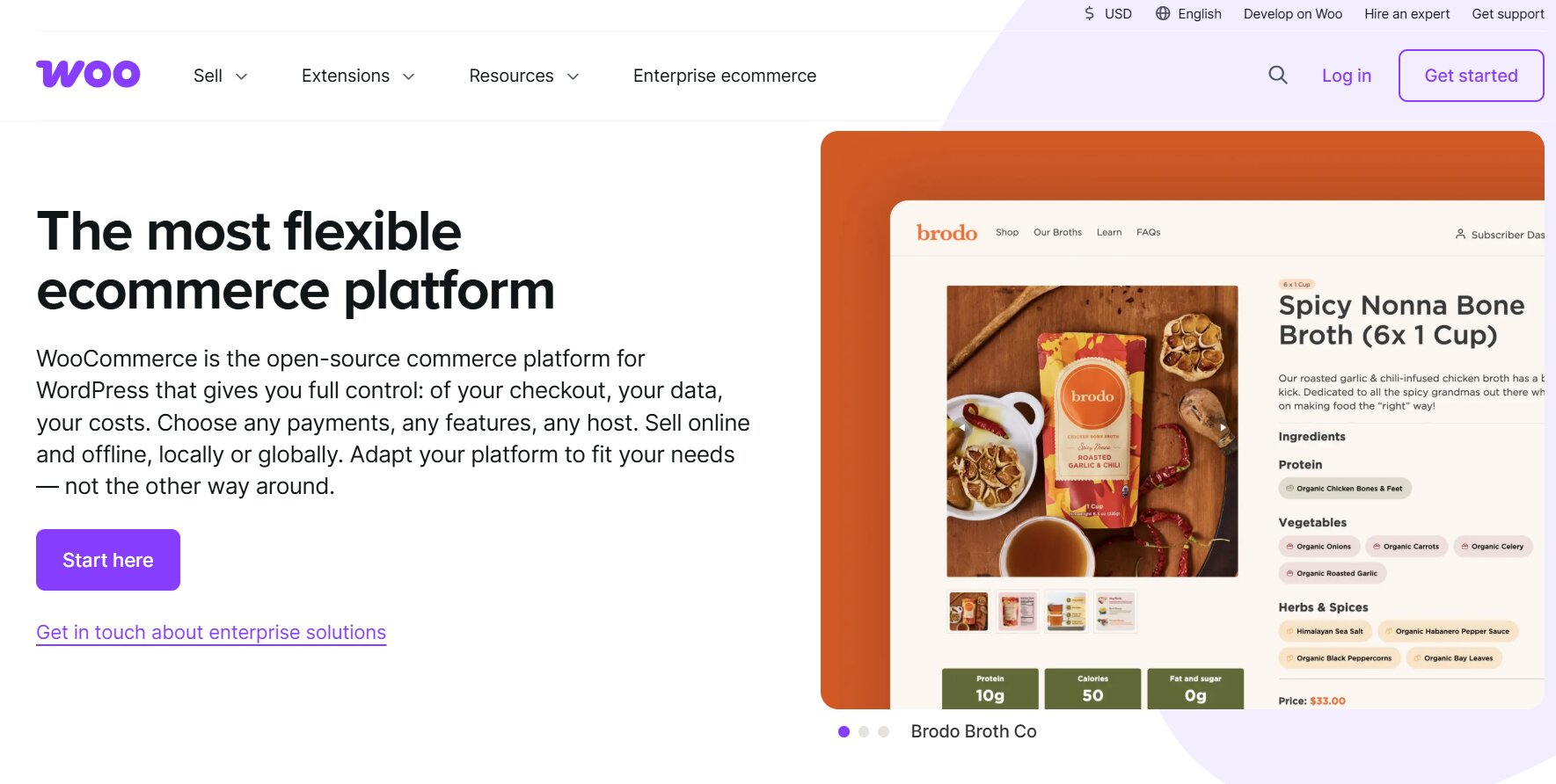
CTA type: Outcome-driven
Why it works: Feels approachable and provides a clear starting point for users looking to create a website to sell products.
Best for: Ecommerce platforms and tools where users need flexibility and control over setup.
Possible limitations: Lacks specificity, which may reduce urgency or clarity for users looking for a more immediate outcome.
Brand-driven & ecosystem CTAs that leverage trust and familiarity
These CTAs rely on brand strength, personalization or existing ecosystems to drive action. They reduce friction by building on trust and familiarity users already have.
17. WordPress.com — “Start my site”
WordPress shifts from generic phrasing to a more personal CTA with “Start my site”, reinforcing ownership and intent. It also layers in multiple contextual CTAs across the page for different user goals as you scroll, from hosting to themes to enterprise demos.
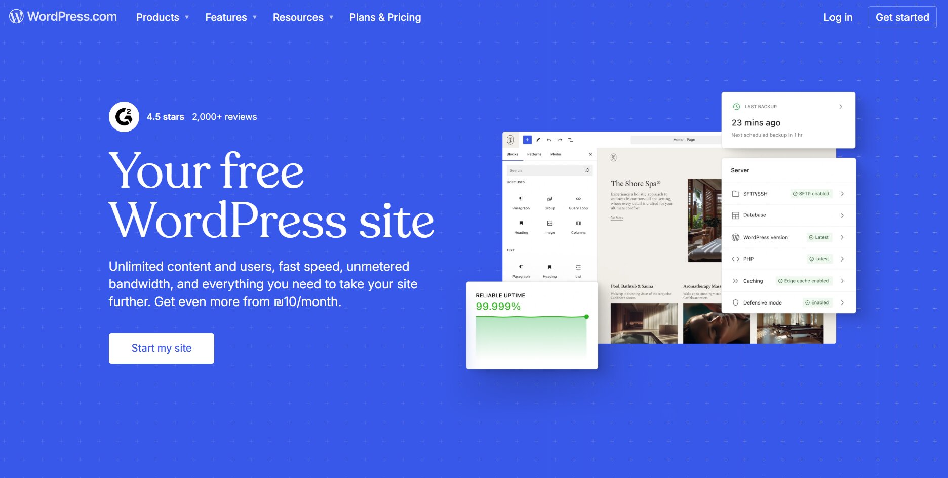
CTA type: Brand-driven/personalized
Why it works: Personal language increases emotional connection and makes the action feel more tangible. “Start my site” creates more of a connection than “Start a site”.
Best for: Platforms where customization and ownership are key selling points.
Watch out for: Too many secondary CTAs can fragment user attention, especially without a sticky call to action that follows a site visitor.
18. Authority Hacker — “Learn Claude Code”
Authority Hacker takes an education-first approach, using a call to action that draws users into a free lesson page instead of pushing for an immediate signup or purchase. The CTA focuses on delivering value upfront to build trust before asking for commitment.
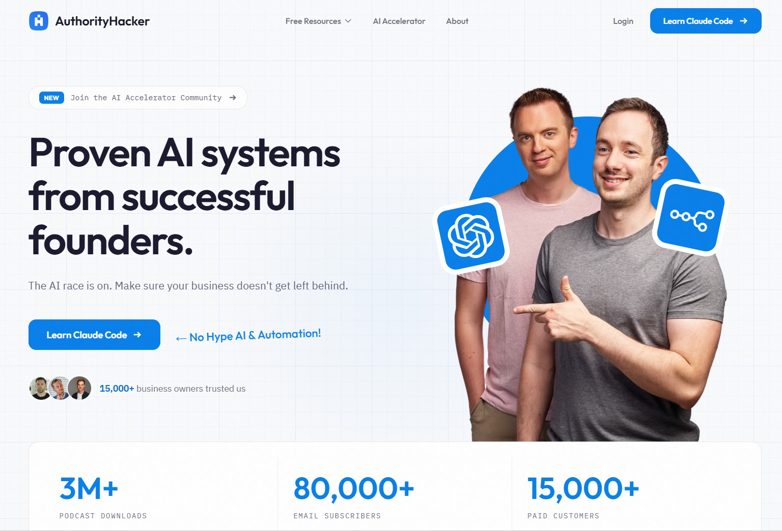
CTA type: Brand-driven/value-first
Why it works: Focuses on curiosity and learning instead of commitment with immediate social proof underneath (“15,000+ business owners trusted us”) for click validation.
Best for: Courses, content platforms and top-of-funnel strategies.
Watch out for: Longer path to conversion compared to direct-response CTAs
19. Calendly — “Sign up with Google”/“Sign up with Microsoft”
Calendly goes beyond a standard signup CTA by offering direct authentication through Google and Microsoft accounts. Users connect the calendar systems they already rely on, allowing Calendly to instantly access availability, sync events and start working without additional setup.
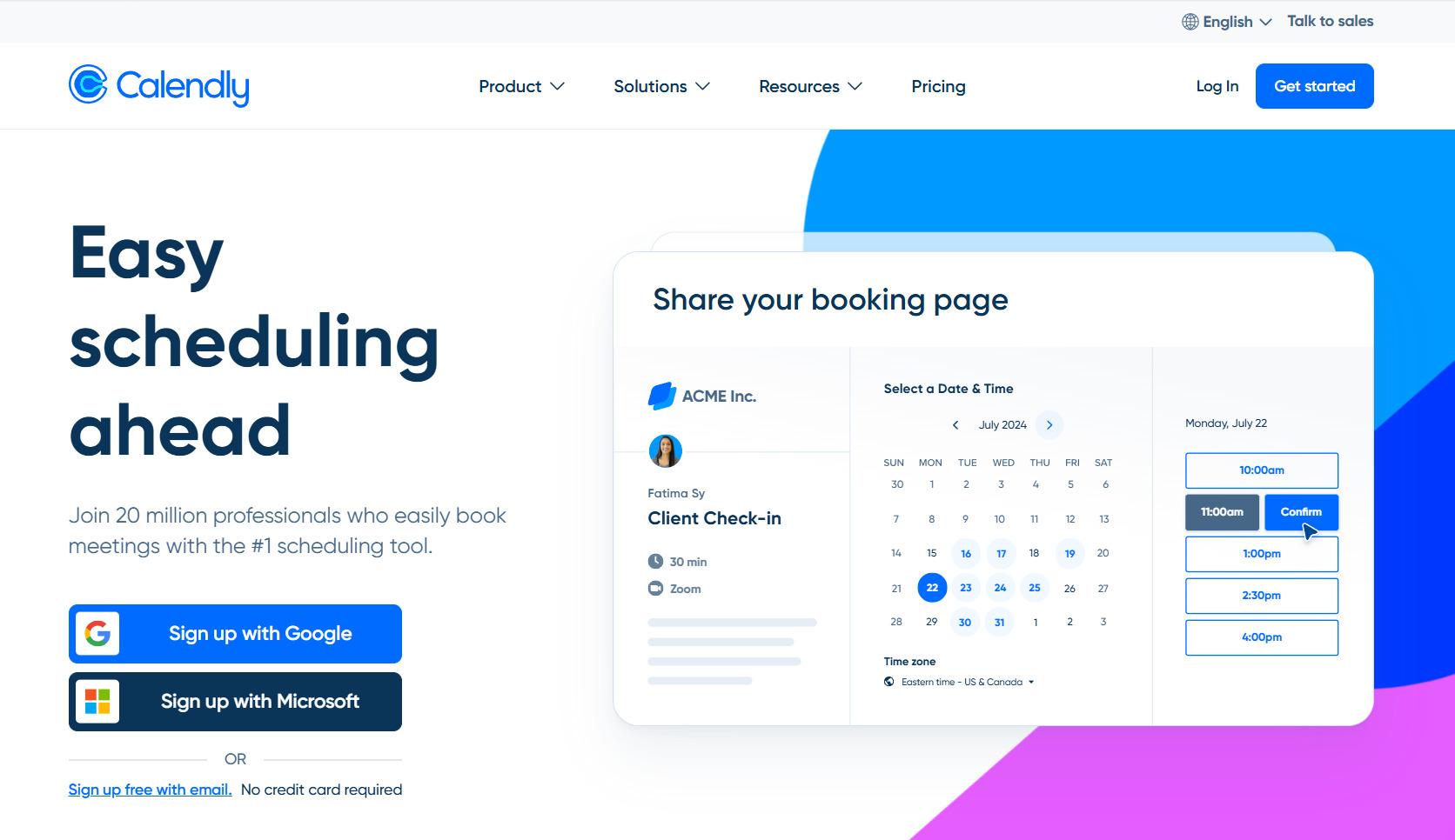
CTA type: Ecosystem-driven
Why it works: Leverages existing platforms to reduce setup friction and accelerate time-to-value.
Best for: Productivity tools and SaaS platforms that depend on integrations to deliver value.
Watch out for: Generic phrasing doesn’t highlight the specific scheduling benefits.
Comparison of effective calls to action in marketing
Different CTA styles work for different situations. Choosing the right approach depends on your product, user intent and where visitors are in their journey.
| CTA type | Call-to-action examples | Best for |
|---|---|---|
| Low-friction CTAs | Intercom, Netflix, Dropbox | Products that benefit from quick, low-risk entry (free trials, simple signup) |
| Product-led CTAs | Slickplan, Instantly | Tools where users can experience value before committing |
| Dual-path CTAs | Slack, Asana, Loom | Products with users at different stages of readiness |
| Outcome-driven CTAs | Canva, Unbounce, Charles Schwab | Tools where the end result motivates action |
| Brand/ecosystem CTAs | WordPress, Calendly | Established brands or tools that rely on integrations and trust |
Your main CTA isn’t the only thing that determines whether visitors convert or bounce, but choosing the right type can nudge them in your direction.
How to choose the right call to action for your website
Choosing the right call to action depends on user intent, product complexity and audience expectations. The best CTAs align with how ready someone is to take action, not just what you want them to do.
To choose the right CTA, evaluate three key factors:
- Where the user is in their journey
- How complex your product is
- Who your audience is
Each one shapes what type of CTA will perform best.
CTAs based on user journey stages
Where someone is in the customer journey should shape your CTA strategy:
- Top of funnel: Use softer, low-commitment CTAs focused on learning and exploration to encourage reader engagement. “Learn more” or “Read the guide” work well here to reduce pressure and build interest.
- Middle of funnel: Use evaluation-focused CTAs like “Start free trial”, “Get a demo”, or “Try for $0” to help users compare options and experience the product without committing fully.
- Bottom of funnel: Use clear, high-intent CTAs like “Buy now,” “Start your plan”, or “Start investing.” At this stage, clarity and confidence matter more than creativity.
Common mistake to avoid: using one CTA across all pages regardless of where users enter the customer journey.
CTA based on product complexity
The more complex your product, the more your CTA needs to support exploration.
- Simple products: Use direct action CTAs when the value is immediately clear; Canva’s “Start designing for free” works perfectly here.
- Complex products: Use trial or demo-focused CTAs. Tools like Slickplan or Jira rely on user experience, trials and guided onboarding to help users see and understand the full value.
The goal isn’t just clicks, it’s helping users get to value without feeling overwhelmed.
CTAs based on target audience
Your audience influences how your CTA should sound and behave:
- B2B audiences: Prefer professional, straightforward CTA language like “Book a call”, “Request demo” or structured signup workflows that align with how teams evaluate tools.
- Consumer audiences: Respond to more creative, emotional CTAs because they tap into motivation and curiosity, not just utility.
The right call to action matches not just your product but your audience’s expectations and decision-making style.
Which call to action style is ideal for you?
Use this quick guide to match the right CTA approach to your product and audience:
- Use low-friction CTAs if users need a low-risk way to get started (e.g., free trials, simple signup flows)
- Use product-led CTAs if your product delivers immediate value and users can experience it right away
- Use dual-path CTAs if your audience includes users at different stages of readiness
- Use outcome-driven CTAs if the result or benefit is the main motivator for action
- Use brand or ecosystem CTAs if trust, familiarity or integrations play a key role in adoption
There’s no perfect CTA, only the one that fits your product, your users and their level of intent.
How to write a call to action that converts
Writing a high-converting call to action comes down to clarity, intent and reducing friction. The best CTAs use simple, purposeful microcopy to guide users toward the next step.
It’s less about clever wording and more about being clear.
Use strong action verbs
Start with verbs like “get”, “start”, “generate” or “try”. Action-oriented language creates momentum and makes the next step obvious.
Create urgency without manipulation
Time-based framing like “in 30 minutes”, “14-day trial”, “limited spots”, etc., works because it sets expectations. Avoid fake urgency or dishonest scarcity—once trust is lost, it’s difficult to rebuild.
Address objections directly
Strong CTAs remove hesitation by handling concerns upfront. “Free” addresses price, “no credit card required” reduces commitment and phrases like “trusted by 15,000 users” build credibility. The best CTAs don’t just prompt action; they answer the question users haven’t asked yet.
Keep it short and scannable
Users don’t read buttons, they scan them, so every extra word adds a tiny bit of friction. Your call to action must be short.
Match the experience behind the click
Your CTA sets an expectation. If you promise immediate value, the next step should deliver it. Misalignment breaks trust and increases drop-off.
Test and refine systematically
Small changes in wording, placement or design can make a meaningful difference. Keep tabs on your UX analytics and adjust your approach. Your first version isn’t necessarily the most powerful CTA.
All of this applies beyond call to action buttons, too; well-designed chatbots and conversational flows can include subtle calls to action that guide users toward conversion without interrupting the experience.
Common CTA mistakes to avoid
- Hiding CTAs below the fold
- Using vague labels like “Submit”
- Multiple CTA buttons competing for attention and action
- Generic and vague “Click here” language that provides no context
- Mismatched expectations between CTA and the web page experience
Best call-to-action phrases by industry
Different industries tend to follow patterns that users already expect. Matching those expectations makes your CTA feel natural instead of forced.
SaaS and software call-to-action examples
SaaS CTAs focus on reducing risk and encouraging product exploration through free access.
- “Start free trial”
- “Get started for free”
- “Try [Product] free”
- “Start your 14-day free trial”
Ecommerce call-to-action examples
Ecommerce CTAs prioritize speed and clarity to drive immediate purchase decisions.
- “Shop now”
- “Add to cart”
- “Buy today”
- “Get yours”
Content and media call-to-action examples
Content-focused CTAs emphasize low commitment and curiosity to encourage engagement.
- “Read more”
- “Watch now”
- “Download free guide”
- “Get actionable insights”
Professional services call-to-action examples
Service-based CTAs focus on initiating conversations and building trust.
- “Get a quote”
- “Schedule consultation”
- “Contact us today”
- “Book your call”
For inspiration on how these CTAs appear in context, explore these website template examples to see how different industries implement compelling calls to action.
Platform-specific call-to-action best practices
How your CTA performs depends heavily on where it appears and each platform has unique constraints and user expectations. In general, taking a mobile-first design strategy is a smart move.
Website CTAs
Place your primary CTA above the fold and repeat it at key decision points throughout the page. For longer pages, use multiple CTAs while maintaining a clear visual hierarchy between primary and secondary actions.
- Use sticky CTAs to keep the main action visible as users scroll
- Reinforce the header and footer design as well as key content sections
- Use exit-intent pop-ups to capture users before they leave to lower website exit rates
Consistency and placement are just as important as the wording itself.
Email CTAs
Your CTA should feel like a natural continuation of the email content. Keep it focused; one clear action per email performs best.
- Align CTA language with the email’s message and goal
- Avoid competing actions that dilute attention
- Make the CTA visually distinct within the email layout
Social media platform CTAs
Social media calls to action need to match platform behavior, character limits and user expectations. Brevity and clarity are key to driving social engagement.
- Instagram ad CTAs and Facebook ad CTAs should stay concise while still encouraging action
- Adapt tone and wording to fit each platform’s style and audience
- Keep CTAs short, direct and easy to act on
- Ensure the CTA feels native to the content and format
Strong social media calls to action don’t feel like ads; they feel like a natural next step.
PPC ad CTAs
Set clear expectations and maintain consistency between your ads and landing pages across marketing campaigns.
- Match CTA language across ads, destination pages and other marketing materials
- Focus on clarity and intent alignment
- Reinforce the same value proposition from click to conversion
Misalignment between ad and landing page CTAs can quickly reduce conversions.


Share & refine designs with Slickplan
Add mockups from Figma or your computer to ensure UX/UI is moving in the right direction.
Improve your calls to action today
The best CTAs don’t strive to be clever; they aim for clarity. High-performing calls to action match user intent, reduce friction and make the next step obvious.
The examples in this guide show there’s no single formula. Some CTAs drive action through simplicity, others through experience, trust or strong visual design. What matters is choosing the right approach for your context, then refining it over time to ensure it inspires action.
To put this into practice, start by mapping where your CTAs live across your site. Understanding your page structure, user flows and decision points makes it easier to place CTAs where they’ll have the most impact.
If you want to streamline that process, tools like Slickplan can help you plan and visualize your site architecture more effectively.
Start your 14-day free trial to see it in action.
How can I write a call to action?
Start with a clear action verb like “get,” “start,” or “try.” Focus on what the user will gain, not what they have to do. Keep it short, remove friction, and match the CTA to the user's intent and stage in the journey.
What is a good call to action sentence?
A good CTA is clear, specific and benefit-driven. It tells users exactly what happens next and why it matters. If you're going to opt for a sentence, it needs to be short. Examples like “Start your free trial” or “Build your sitemap” work because they combine action with immediate value.
What are some examples of CTAs?
Common call-to-action examples include “Get started”, “Try for free”, “Book a demo” and “Download the guide”. Strong call-to-action examples in writing focus on clarity and intent, often pairing action verbs with a clear benefit or outcome.
What is the best color for a call-to-action button?
There's no universal “best” color—the key is contrast. Your CTA should stand out from the rest of the page and be easy to spot. High-contrast colors that align with your brand and draw attention tend to perform best. If your site's background color is white, for example, and blue is your brand color, a blue CTA button stands out really nicely.
What are the key elements of a strong call to action?
Strong CTAs share a few traits: clear language, visible placement, low friction and alignment with user intent. They answer objections, stand out visually and guide users naturally to the next step without forcing a decision.


 X
X