You’ve probably heard the saying, ‘less is more’ but have you given any thought to how to apply that truism to your website? Sure, you want to create a well- designed site, but you also need to balance your design with something that will actually serve its purpose. Especially when talking about things such as landing and intro pages there is a thin line between busy and clean.
In this blog post, I’ll discuss some ways to not only recognize clutter in your UI, but also stop it in its tracks.
What Is a Clean Interface?
When I talk about a clean interface, I am referring to what’s known as minimalist design. Minimalist design has been shown to have a positive impact on users while still looking beautiful. It is, in essence, the best of both worlds, keeping a site simple, while still effective and attractive.
There are many examples of beautiful minimalist design floating around the Internet. Here are some that caught my eye:
IconFinder.com
This straightforward site makes it easy for the user to find what they are looking for.

Jacekjeznach.com
This web designer shows off a variety of elements while still maintaining a clean interface.

Now to create this type of design, you need to know the product ‘inside out’. You need to know about everything that is related to its identity and message – and you need to incorporate that into its design. While all of this may be a challenge, it is better overall because it gives users information in a simple, single-line manner.
🎬 Learn what Slickplan can do!
We filmed a short video to show you exactly how to use Slickplan
The Benefits of a Clean Interface
People rarely read every word on a website. Instead, they scan pages, picking out individual words and sentences. Because of these behaviors, it’s sometimes better to appeal to emotions rather than word count. That’s why more and more designers use Emotional Design instead of traditional paragraphs.
Emotional design naturally fits as part of a clean interface and can work very well, especially for product-related sites and apps. As shown below, showing a big, beautiful picture of the product can have a great impact on conversions.
Oliodevices.com
They say an image is worth 1000 words, and it’s true.

And because people rarely read, there’s no point in filling the empty space with text and other unnecessary elements; instead “show sophistication with minimalism”. According to UX Movement, not only is it one of the most current trends in web design, its inherent complexity makes it easier to impact your audience’s feelings.
Additionally, staying up to date on the latest web trends not only builds credibility and trust among users, it also lends to a better user experience as people tend to enjoy what they are familiar with.
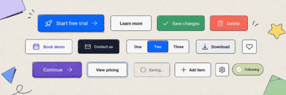
Designing a Clean Interface
A clean (and, therefore, good) design is one that has removed everything that stands in the way of the perfect “message”.
The first step to doing this is using wireframes; in fact, it is where everyone should start. This is because with the correct wireframe (example) and an appropriate level of preparation you can build the perfect hierarchy while also designing something that is visually appealing.
You will also need to be willing to use white-space in a good way. Always “stretch” your limits and go with generous paddings and spacings that can help the user focus more on the most important elements on your page. When you do this, keep it consistent across the website and the experience. This can even be done in the wireframing process – the UI process nails it down.


Think visually. Improve UX with Slickplan
Build intuitive user flows, stronger customer journeys and improve information architecture.
How Much is Too Much?
With a minimalist design, it can be difficult to know how much is enough. The best way to start is by looking at it. Throw an eye over the whole thing and try to envision how a user will see it. Think outside of your subjective view and attempt to understand the story behind it.
Keep in mind that every website should have an identity -that’s what defines and separates it from the rest. It’s what makes users remember their experience. In the process of building, try to identify UI elements that cloud the message you’re attempting to send.
For another way to test out your design, Smashing Magazine suggests subtracting elements until the design no longer works the way it needs to. When you’ve just about broken the site, you can be sure you’ve reached the optimal minimalist design. Just keep in mind, ‘broken’ is relative. It could mean broken from a technical point, from a usability point of view, or a combination of both.
Firefly Creative Blog offers the following advice: “If you find yourself in a tough spot thinking, ‘Something’s missing,’ first try taking something out, rather than putting something new in.”
Here are even more examples of some great minimalistic designs:
Photographer Website
Clothing Company
The main thing to remember about minimalist design is that it isn’t ‘one-size-fits-all’. Yes, it is popular. Yes, we should look at the trends – but we shouldn’t just immediately jump to imitate them. Instead, we should seek to understand them.
Even if you don’t decide to adopt a minimalist design, seeking inspiration from its principles and techniques can help simplify and benefit any website project. It’s one of the best ways to keep your website clutter-free.


 X
X