You may not have heard of microcopy, but you’ve definitely seen it. Microcopy are those small pieces of text that instruct, direct or inform users. It’s the copy that helps users know what to do, and ultimately significantly impacts a website’s user experience therefore should be considered during the content & ux planning stages of your site.
Copy That Should Not Be Ignored
Microcopy appears everywhere on a website, you’ll see it as error messages, on pop-ups, as email subject lines, and in those call to actions that encourage you to add an item to your shopping cart. Microcopy can come in many shapes and sizes, but in the end, its tone and clarity are what impact the user’s experience.
All copy should be user-focused, conversational, and easy to understand; but because microcopy often includes very little content that is almost always read by users, it especially needs a human touch. “Words on a screen can never take the place of a real conversation,” but with a human touch, it can remind users that real people are behind it.
🎬 Learn what Slickplan can do!
We filmed a short video to show you exactly how to use Slickplan
The Dangers of Bad Microcopy
You know bad microcopy when you see it. It’s that copy that is unengaging because it is vague, unclear, cluttered or robotic. Bad microcopy very often does not convert, and it can also discourage trust or satisfaction with your brand. When users have poor experiences from their interaction with your site, it can directly influence how they feel about your brand.
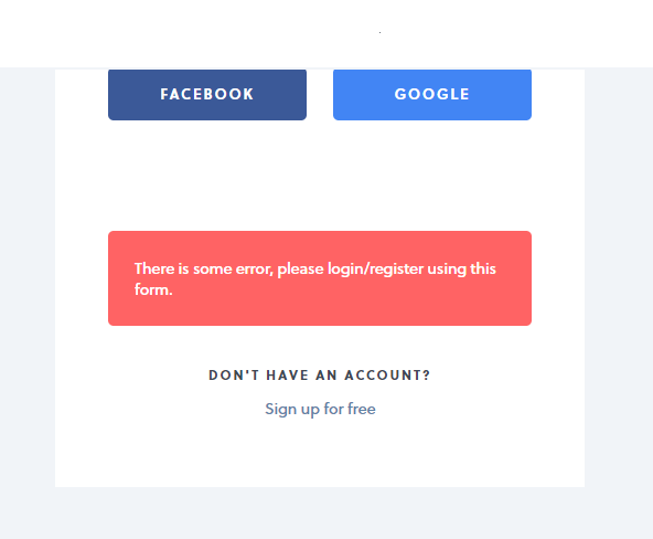
In this image, the error message gives the user no details of what the sign-in “issue” is, only that there is a problem. It recommends a form, but guides the user nowhere, leaving them confused about where to go next. By the way, that red box is not a button, meaning not only is microcopy important, but so is good button design.
In the above example, the user can either continue trying to log-in or give up entirely. With bad microcopy, users tend to choose the latter.
Don’t Guilt Your Users
Bad microcopy doesn’t just mean a lack of human engagement. Sometimes, it can mean too much. A common practice in microcopy is the use of shame-based practices that guilt users into taking action instead of connecting with them on a more natural level. While it may seem like an earnest attempt to think of their best interest, it is becoming increasingly apparent that it is not.
Please don’t leave! How often have you seen store owners begging visitors not to leave without purchasing something? It’s likely you haven’t because that would be annoying. However, when it comes to the internet, many businesses think it is okay to do it on their websites. Try to unsubscribe from a newsletter or close a pop-up. Chances are you’ll be greeted with microcopy that attempts to shame you into staying.
Don’t Be Weird
A brand should have personality, and one way to do that is with clever microcopy. However, if you plan to take this approach, you should make sure you fully understand your users so that they get it. Take Turbo Tax’s attempt at writing engaging microcopy:

If you didn’t already know the pop culture reference being used, this might come across as a desperate attempt to keep you on their email list. While some users may enjoy feeling needed in this way, others might just find it annoying. Desperation also doesn’t help encourage trust – users may start to wonder what else you’re willing to do to keep users on that email list.
The Definition of Good Microcopy
Good microcopy is one of the best ways to improve the user experience on any website, but how do you define it? This can be challenging because it depends on a combination of both your brand and your users. There are many ways to incorporate good microcopy into your site, as well as new technology to help you do it. On our blog, we recently discussed the rising popularity of chatbots as a new user experience, along with voice assistants peppering the corners of our homes. Why are these new features so popular? They answer our needs quickly. They’re clear and transparent. They feel human in their usefulness to our everyday lives.
UX writer, Ryan Cordell listed six questions to ask when attempting to create good microcopy in his The Startup article. They are:
- Is it useful?
- Is it succinct?
- Is it transparent?
- Does it sound human?
- Is the copy in the design?
- Is it actually useful?
For him, the main aspect of good microcopy is that it provides utility to the user, but three of the other guidelines could be summarized as clarity. Complicated language and over-wordiness for simple tasks comes off as disingenuous and unauthentic. In other words, a focus on clarity can help your microcopy sound more human. It should be clear to users what the ultimate goal is.

“Submit” versus “Submit payment” or “Continue” versus “Continue to next page” result in different experiences. For more real-world CTA wording ideas, see these call-to-action examples.
Make Your Users Feel Good
Users want to feel safe online – especially when it comes to providing their personal information such as an email for subscriptions or an address when buying a product. They need to know that they won’t get spammed. They need to know how their data will be used. They need to know that they are clicking in the right direction.
Good microcopy doesn’t just convert, but it also eases tensions and fears. Clearly outlining what a user can expect after each click, is not just optimal, but it is also considerate. Good microcopy helps eliminate fears from website users who have no idea where the next click might lead. It also supports users by giving them options and utilizing tactics such as predictive text, which remind users that ultimately, they are in charge and that they are not alone.

Hotels.com does a great job of laying out clear and succinct microcopy. Users understand what they can expect by continuing and are clearly explained all of their options. When a user selects, “Let’s Book” they are presented with a lightbox window that gives them the option to pay now or pay at the hotel, along with clear and succinct bullet lists that explain each option.
Have Fun With It
Good microcopy can be fun – when done correctly. However, as mentioned above, it can be easy to overdo, so make sure you have a well-defined brand voice and a good understanding of your audience before you do. However, if it fits your brand style guide for the tone of voice, don’t be afraid to be more human and have a little fun.
Fun microcopy is a great strategy for creating a good user experience because it is often conversational, relevant to the end user and familiar. By using a fun, conversational tone, such as with these examples, you can encourage conversions, improve the UX and reinforce your brand.
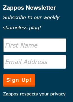
Zappos isn’t afraid to make a joke at their own expense.

How can you not smile at that?
Improving your Microcopy
If you’ve gotten this far and realized that you may need to update your microcopy, do not fear; it’s easy to improve your microcopy and ultimately improve conversions and user experience. Start by measuring the results of your microcopy so that you can make the appropriate adjustments. Then, connect it to Google Analytics – especially the call-to-actions, so that you can see how users are interacting with it and so you can identify potential conversion opportunities. You can also research what your users are seeking, to shine a light on what’s difficult to locate on your site. This strategy will help determine whether the problem is with navigation or microcopy.
Seek User Feedback
Your users can also help you improve your microcopy. Include them in the process by seeking out direct user feedback. By asking your users what makes the most sense to them, you are including them in the process of delivering an experience that they’d enjoy. That’s the point, right? Sometimes all it takes is a simple feedback button. But when teams are working at a larger scale, gathering input from many people to spot patterns, align on priorities, and avoid groupthink often requires employee feedback software that surfaces trends rather than isolated opinions.
Utilize A/B testing
When it comes to microcopy, sometimes the smallest changes can make the biggest impacts. In one example shared by Nick Babich, the editor-in-chief of UX Planet, a simple move from “Request a Quote” to “Request Pricing” caused a 161% increase in conversions for one company. The best way to identify these subtle tweaks is with A/B testing. It is especially recommended for websites that rely heavily on conversions.
Design as a Team
Because of how it works, microcopy is closely tied to both branding and the user experience. This also means that it should tie in with other aspects of web design, such as overall content and graphic design, since they all impact branding and the user experience. When creating microcopy, meet with the designer or developer to discuss options. Together the two of you can create microcopy that is better aligned with the needs of the user than if you did so individually.


Think visually. Improve UX with Slickplan
Build intuitive user flows, stronger customer journeys and improve information architecture.
Think Like a Consumer
We are all users of the world wide web – from shopping to socializing; so why not consider your own experiences when thinking of ways to improve your own microcopy. How do you feel when you come across microcopy on other websites? Did it drive you to take action, or did it cause you frustration? Even though, as website professionals, we have a greater understanding of how websites function, we’re still consumers. It’s okay to remember this when designing microcopy meant to engage others.


 X
X