Think you can’t get creative with a user registration form? Think again. User registration forms come in a variety of flavors, all designed to introduce site visitors to a website, convert them to users, or send them further down a sales funnel. They are literally the front door of many web-based projects and are, therefore, vital to creating an experience the user will love.
Creating Great User Sign Up Forms
Building sign up forms that add to the user experience rather than detract from it, involves more than merely looking at a few user registration examples. In addition to a guide on what to do, you’ll also need to think about why you are creating the form in the first place. Why do users need to register or sign up – and more importantly, why would they want to?
Perhaps your goal is gathering information for marketing campaigns. If this is the case, you may want to consider alternative methods, maybe even creating a funnel and asking later in the process. The point is, you must keep it simple. Regardless of how critical your needs are, ultimately, if the user is overwhelmed due to being asked too many questions, they probably will not complete your form.
More tips for user-friendly forms
- Keep the questions minimal.
- Place labels above the input fields.
- Tell users why you need their information and how you plan to use it.
- Avoid required fields as much as possible. Very few people like being told what to do.
- Do not use captchas.
- Separate the registration process from the checkout process.
- Provide a link to your privacy policy as well as any verification badges on the registration page.
Every aspect of user registration forms, from the order the questions are asked, to how easy it is to recover a lost password, can significantly impact the number of registrations your site receives. On top of that, a confusing form can lead to user error that makes the information gathered useless. That is why web and app developers must think as much about their registration pages as much as they do any other pieces of content – if not more.
🎬 Learn what Slickplan can do!
We filmed a short video to show you exactly how to use Slickplan
User Registration Examples
Although the role of the user registration form is straightforward, there is still plenty of room for creativity. Consider the examples below when sharing web mockups with your team. Below are 9 user registration examples that show just how different user registration forms can be.
BallPark
Ballpark is a subscription-based invoicing site that helps freelancers track their time and invoice clients. Their user registration page leads to a 14-day trial where the curious can try out the product for free.
The best thing about this signup form is how simple it is. There are only five areas of input for the user to complete, and no distracting content to keep them from doing it.
BallPark is true to its brand by keeping its registration form simple and easy to use. There are many minimalistic user registration examples around the Internet, but BallPark puts their signature touch on it by adding a user testimonial. Simple user registration forms such as this one ensure that users spend less time filling out forms. They also increase the chance of conversion.

Spreedly
Who says user registration forms must be static? Instead of the standard one-page form, payment infrastructure, Spreedly, registers its users with a short quiz.
Spreedly uses the quiz to determine its user’s best product offering before collecting their contact information. Their creative use of multiple pages makes it easy to gather more information without frustrating the user. In addition to being fun, the quiz also builds confidence with potential customers that they will be recommended the best products for their needs.
User signup forms with built-in interactives provide a more personalized experience for users. They are ideal for lead capturing because it helps sales teams know exactly which services to offer a potential customer.

Litmus
Do you need to capture payment information during the registration process? Make it easier on users by putting it on the second page.
Litmus, an email optimization service, provides a great example of this. They separate their registration form into two pages. The first page collects the user’s contact information, while the second collects payment information. The separate payment information pages make it easy for users to see what they are signing up for.
The Litmus product comes with a hefty price tag, so it is probably a good idea to place that information on a second page. By creating a second page to gather user payment information, Litmus can move users further down the sales funnel rather than attempting to sell them all on one page.

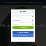
Facebook’s user registration page hasn’t changed in years, and it probably doesn’t need to. The social network only asks for four pieces of information to join its site, but it also provides reasons why on the same page.
Many websites choose to provide the benefits of joining on a separate page, but Facebook shows that this is possible on a single page. Their sign-up page has not changed in years, only adding a few things, such as a field for mobile numbers and an announcement that it is free to use the site.
Landing pages that feature user registration forms are common with social networks. These sites often do not need an extensive landing page, and can quickly relay what the site is about on the same page as the signup form.

Vimeo
Video hosting site, Vimeo, utilizes a popular format for user registration forms. In addition to letting users type in information, they can also bypass the process by signing in with social media.
This practice keeps users from having to create yet another password, while also preventing duplicate signups. Beyond the registration form, users gain additional social media options by connecting their profiles with the site they have registered on.
Social media signup pages can be configured with a variety of social media platforms, such as Twitter, Facebook, and LinkedIn. They can also be linked with Google, Apple ID or Google credentials.
Instant Checkmate
You won’t find a user registration form on Instant Checkmate’s homepage. Instead, you must try out the product before you are asked to sign up.
Instant Checkmate provides instant background searches on anyone. However, once your search is completed, you must complete their registration form and pay to receive the results.
The entice then register approach is a good way to let people experience a product before they commit to it. In addition to showing users what to expect, it keeps them in the sales loop longer. When executed effectively, website owners can also collect the email addresses of visitors and follow up with them when they do not sign up during the first visit.

Evernote
If you’ve ever tried to sign up to use this note taking app, you may have noticed that it took a little longer than usual. This is because, with this app, the user registration forms are only the first step in the process.
Evernote is an excellent example of user onboarding. Whereas its simple user registration form collects information about the user, user onboarding makes sure they know how to use the product. When the goal is user retention, these extra steps make a lot of difference.
User on-boarding is popular for SAAS websites, but it is also a good idea for apps. It focuses on encouraging repeat visits by not only providing a simple registration process but by also giving the user a reason to return.

Buffalo
Web design company, Buffalo’s uses their signup form to collect information about potential leads. Calling it the “Project Planner” this form provides plenty of options beyond the standard leave your name and number, and we’ll call you back.
In addition to providing their information, site visitors can also select their type of project, budget, and start time. The form clearly walks potential customers through everything Buffalo needs to get started on a project.
Typically speaking, less is more when it comes to user signup forms, but when the goal is getting as much information from a user as you possibly can, you must be creative. Forms that give clear options such as the user registration examples on the Buffalo website make it easy to gather the information you need without being overwhelming.


Think visually. Improve UX with Slickplan
Build intuitive user flows, stronger customer journeys and improve information architecture.
13 Creative
Design firm, 13 Creative, shows that email opt-in forms do not have to be boring. Following the stationery theme of the site, users are directed to enter their emails in a box that resembles card stock.
Although it can be easy to get lost in the design on sites like this one, 13 Creative keeps its email opt-in form simple. Users are told what they are opting into and do not have to complete a lot of steps.
The simple email opt-in form shows that it doesn’t take much to gather information from site users. The one on this site reminds website developers that it’s also okay to have a little fun with it.


 X
X