No one would build a house without a blueprint — and the same principle applies to websites and mobile apps. Without wireframing, teams end up guessing at structure, clients struggle to visualize layout and revisions pile up.
Wireframing is the process of creating simple, structural layouts that show what goes where on a page or screen before design begins, helping teams avoid costly rework and misalignment.
This guide explains what wireframes are, how they support better planning, and the steps to create them effectively.
Key takeaways
- Wireframes clarify structure early, helping teams avoid costly revisions, misalignment and unclear expectations.
- Choose the right wireframe fidelity level to validate ideas at the appropriate stage of your project.
- Wireframing increases efficiency by improving shared understanding, speeding up approvals and leading to a cleaner developer handoff.
What is wireframing? (definition + purpose)
A wireframe maps out the structure of a page or screen before detailed design work begins. It’s the stage of the UX design process focused on hierarchy, navigation and the placement of key elements. No colors, no typography, no branding — just the framework your user interface will sit on.
The goal is to help teams align on structure before moving into design details. They surface gaps in logic, reveal layout issues early, and make it easier to gather feedback while changes are still quick and inexpensive to make.
Wireframing speeds up iteration, reduces costly revisions and gives developers the clarity they need for a cleaner handoff.
Here’s how wireframes serve and support different teams throughout the design process:
- UX designers: explore structure, test layout ideas and refine interactions before visual design details
- Strategists: clarify information architecture and identify content needs
- Project managers: use wireframes as a single source of truth that reduces revisions, scope creep and late-stage surprises
- Developers: gain predictable spacing and clear layout intent for a cleaner handoff
- Agency owners: align clients early and prevent costly design rework
🎬 Learn what Slickplan can do!
We filmed a short video to show you exactly how to use Slickplan
Core wireframe components
All wireframes include a set of core page elements that define structure and functionality while making the layout easy to interpret.

Layout regions
The major structural regions of the interface, such as the header, hero area, body sections, sidebars, and footer.
Navigation
Primary navigation, secondary navigation, and contextual links that help users move between pages or screens.
Content placeholders
Headings, text blocks, image areas and media spaces represented with simple shapes or labels to convey hierarchy.
Interface elements
Buttons, links, tabs, filters, dropdowns and other interactive elements shown in their simplest form.
Input fields
Form elements such as text inputs, checkboxes, radio buttons, or select fields, depending on the screen’s purpose.
Reminder: Wireframes are not about visual polish — they’re about building a strong foundation for the rest of your project.
Types of wireframes: low, mid and high fidelity
Wireframes come in different levels of detail depending on the stage of your project. "Fidelity" simply refers to how closely a wireframe reflects the final product.
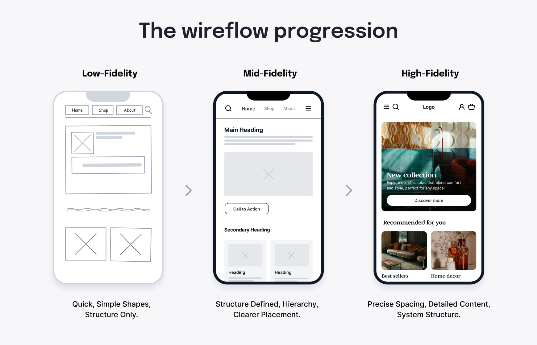
Choosing the right wireframe fidelity level helps teams move faster and avoid overworking early ideas.
Low-fidelity wireframes
Low-fidelity wireframes are quick, simple sketches.
They use basic shapes to show only the key components of a page, without adding unnecessary detail. Use them for early exploration, to generate ideas and to compare different layout options before anything is locked in.
Best for: brainstorming, quick iteration and aligning on overall structure
Mid-fidelity wireframes
Mid-fidelity wireframes add more definition and clarity.
They show spacing, hierarchy, navigation and content placement with clearer intent. This level is detailed enough for meaningful feedback yet still flexible for revisions.
Best for: team reviews, component planning, and preparing for development discussions
High-fidelity wireframes
High-fidelity wireframes are closest to the final design but still avoid the finer nuances of visual styling.
They include accurate content, precise spacing and detailed structure. This level is useful when a project needs clarity before visual design or when multiple stakeholders must approve the layout.
Best for: stakeholder approvals, complex systems, and polished handoff
How different roles use fidelity levels
- Strategists: lo-fi and mid-fidelity wireframes for exploring IA and content structure
- Project managers: mid-fidelity wireframes for clarity and tracking revisions
- Developers: mid- and high-fidelity wireframes for handoff and spacing consistency
- Agency owners: high-fidelity wireframes for client alignment and reducing redesign rounds
Wireframe vs mockup vs prototype
Now that we’ve defined fidelity, it’s easier to understand the difference between wireframes, mockups, and prototypes — and when to use each during a project.
Wireframes
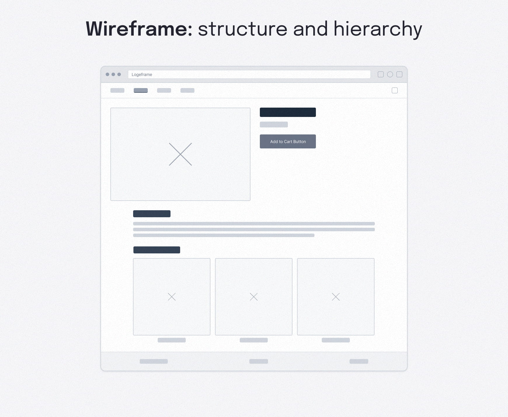
Wireframes outline structure. They emphasize layout, hierarchy and navigation without any visual styling.
Use these early to confirm what goes where before investing time in visual and UI design.
Mockups
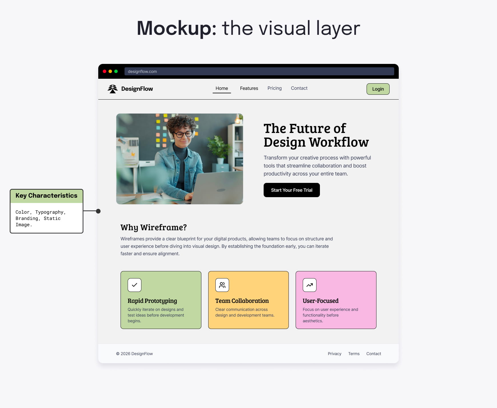
Mockups add the visual layer. They include color, typography, branding elements and imagery.
Use them once the structure is approved and you’re ready to refine the look and feel of the interface.
Prototypes
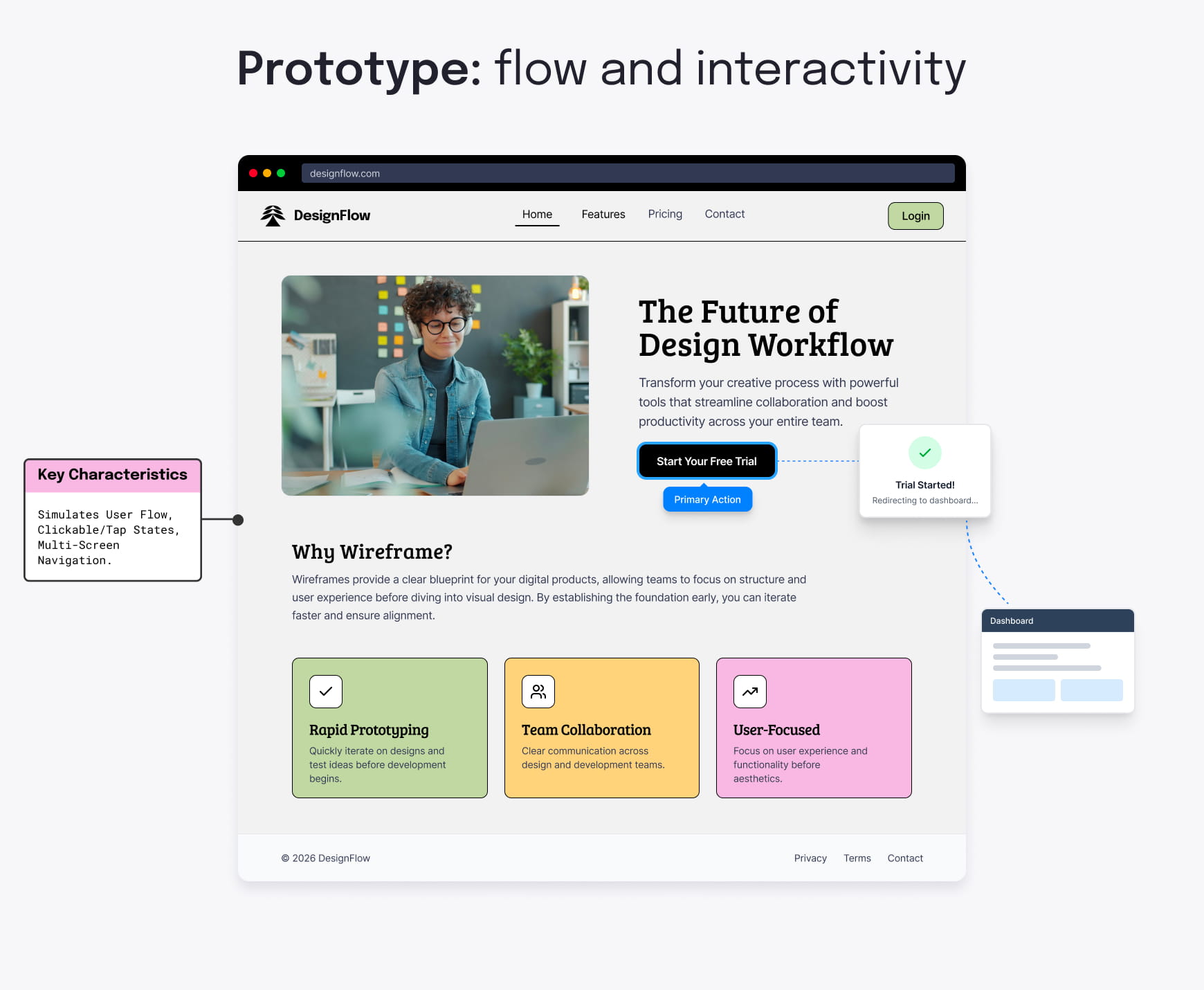
Prototypes add interactive elements and basic functionality to simulate real user behavior. They simulate how users move through a flow and are useful for testing, gathering user feedback, running demos and validating usability before development.
For a deeper comparison, check out our detailed wireframe vs prototype breakdown.
Quick comparison of fidelity levels
| Type | Fidelity | Best use |
|---|---|---|
| Wireframe | Low–mid | Explore structure, basic page layout and early stakeholder validation |
| Mockup | High | Align on visual design and branding |
| Prototype | High + interactive | User testing, interactive features and interaction approval |
Wireframe design best practices
Even the simplest wireframe can fall short if the foundation behind it isn’t well defined. A few practical habits make wireframes easier to understand, quicker to review and far more effective at preventing endless iterations.
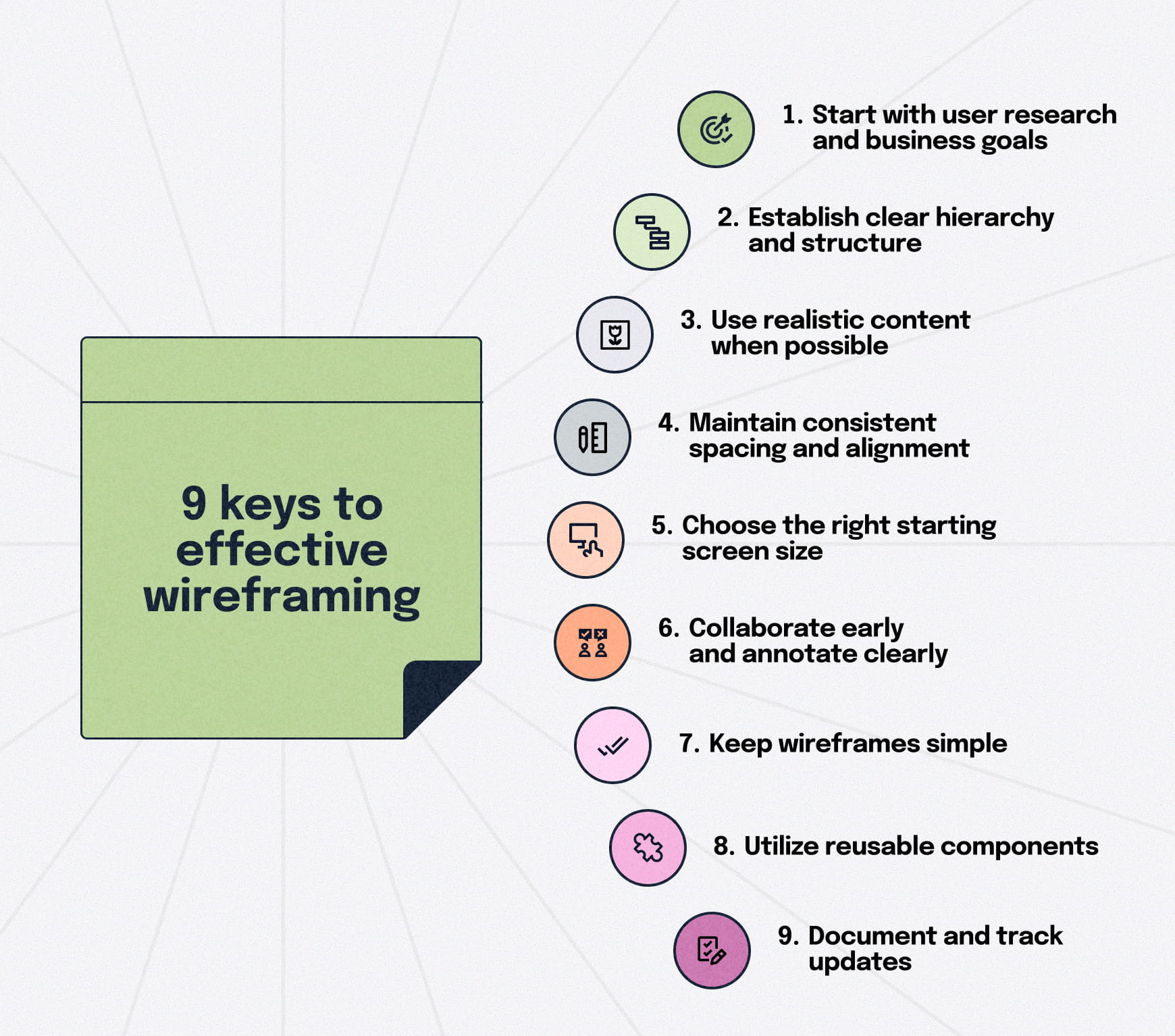
These best practices help teams stay aligned while keeping the focus on structure rather than aesthetics.
Start with user research and business goals
Effective wireframes start with clear intent. Align on user and business needs first. Consider what people want to accomplish along the user journey and what the business expects before opening any design tool. Know the problem before you build the solution.
Establish clear hierarchy and structure
A strong wireframe requires a clear understanding of what matters most on the page. Define the primary action, supporting content and the overall flow of information before refining layout details. To pressure-test that primary action, keep a few proven call-to-action examples handy while wireframing. Good hierarchy makes screens easier to scan, compare and iterate on — especially early in the process.
Use realistic content when possible
Even rough, approximate content is better than lorem ipsum placeholder text. It exposes layout issues early and gives the design team a more accurate sense of spacing and priority when layering in visuals.
Maintain consistent spacing and alignment
Predictable spacing between screen elements makes wireframes easier to interpret and gives developers a clearer path to implementation. Consistency also improves readability and scanning.
Choose the right starting screen size
Begin wireframing at the screen size most common for your users. For some, that means designing for mobile devices; for others, it means designing primarily for desktop. Starting where users spend the most time helps prioritize content and structure before scaling layouts.
Collaborate early and annotate clearly
Timely notes prevent early misunderstandings from turning into bigger problems and keep feedback focused on structure rather than styling, reducing downstream rework. Fortunately, today’s top design tools make it easy to leave pinpoint, contextual feedback. Slickplan’s Design Mockups tool supports this workflow with drop-pin commenting, making feedback easy to follow as wireframes evolve.
Keep wireframes simple
There will always be temptation to add more, but it’s critical to avoid colors, decoration, and design elements. Focus on core functionality early, and add detail only as approvals roll in. Wireframes are about structure, not aesthetics — adding detail too soon slows teams down.
Use reusable components
Using reusable components speeds up wireframing and makes layouts more consistent across screens. When sections repeat the same patterns, teams spend less time debating placement and structure and more time validating what matters. Components also make revisions easier because a single update can ripple through multiple screens.
Document and track updates
Wireframing is an iterative process; track updates and maintain a single source of truth so teams don’t work from outdated layouts. Clear documentation that captures key decisions and constraints speeds up reviews and handoff — especially later in the project when the original context is easy to lose.
Step-by-step wireframing process
A good wireframe is the result of a clear process, not haphazard napkin sketches. When teams follow the same steps, it’s easier to align on goals, avoid unnecessary work and move from idea to implementation without confusion.

The exact tools may change, but the underlying workflow for creating wireframes stays consistent.
Before diving into the steps, it’s important to understand the collaboration required throughout the process.
Collaboration and feedback throughout the process
Wireframing works best when feedback happens early and often — not at a single review point. Strategists, UX designers, PMs, developers and clients should all be involved at different stages as the structure evolves.
Sharing progress frequently helps teams spot gaps sooner, reduce rework and stay aligned as layouts become more defined.
1. Research and requirements
Start by understanding what users need to accomplish and what the business expects from each page or flow. This is where you define the problems the wireframes should solve—not the layouts themselves.
Having user personas to build user journeys around helps clarify requirements and minimizes surprises later in the project.
2. Information architecture and content inventory
Outline your site or app structure and list the content needed for each page. A clear hierarchy keeps wireframes grounded in real navigation and prevents teams from designing screens that don’t support actual user or business goals.
One of the best ways to collaboratively build your site structure is with a visual sitemap.
3. User flow mapping
Plan how users move through key tasks, interactions and pages before getting into layout specifics so you can develop navigation and the right cues. Visualize steps, decisions and alternate paths so you know which screens your wireframes need to cover.
Get started quickly with Figma user flow templates.
4. Initial sketching and layout exploration
Explore layout ideas quickly with low-fidelity sketches. At this stage, you’re focused on broad structural concepts, comparing options and validating page structures — not worrying about precision.
Paper, whiteboards or simple digital tools are enough.
5. Create digital wireframes
Move the most promising layouts into a tool like Figma and create low- or mid-fidelity wireframes. Focus on hierarchy, spacing and navigation.
Keep designs minimal so feedback stays centered on structure rather than styling.
6. Documentation and developer handoff
Once the structure is approved, finalize wireframes with the notes developers need: layout intent, important interactions and any constraints that informed the decisions.
Maintaining a single, documented version avoids confusion later when teams revisit why certain choices were made.
When to use wireframes (and when to skip them)
Wireframes are most valuable when they clarify structure before teams invest in visual design or development. They help reduce uncertainty, speed up decision-making and keep everyone aligned on what a page or flow needs to accomplish.

But they’re not required for every situation. Knowing when to use them—and when not to — keeps your process efficient.
Project kickoff
Building wireframes helps teams align early on layout, user flows, content needs and navigation before design work begins. They reduce assumptions and give everyone a shared starting point.
Pre-design strategy
Before exploring visual direction, wireframes validate structure and ensure the layout supports real user goals. Tools like user stories and story mapping help define the right sequence of pages or tasks before any design work begins.
Feature additions
When adding or updating features, wireframes show how new elements fit into existing patterns. They prevent teams from breaking established structure or introducing unnecessary complexity.
Developer discussions
Wireframes make layout intent clear for developers, helping confirm technical feasibility, spacing logic and interaction expectations before any code is written.
Client presentations
Wireframes let clients react to structure without being influenced by color or branding, keeping early feedback focused and preventing design churn. This requires careful fidelity selection — too simple may underwhelm stakeholders, while too much detail may raise premature visual concerns.
Agile integration
Create wireframes alongside sprints to explore and sketch ideas without slowing down delivery, enabling designers and developers to accurately estimate the effort required. The quick, low-cost iterations based on feedback from developers, stakeholders, and user testing perfectly align with Agile’s emphasis on flexibility and continuous improvement. For teams that prefer a Kanban board for designers, this approach supports continuous UX work alongside Scrum sprints rather than forcing design tasks into fixed timelines.
When to skip wireframes
If you’re making minor UI updates, working under tight deadlines or operating within a mature design system, wireframes may offer limited value. In these cases, moving directly to refined layouts or prototypes may be faster and just as effective.
The top wireframing tools
Wireframes can be created in almost any design or collaboration tool, but some make the job faster and more intuitive, depending on your workflow.
The wireframing tools below are commonly used across UX, product and web teams because they make it easy to move from rough structure to clearer layouts without getting pulled into visual design too early.
Figma
Best for real-time collaboration, reusable components and moving smoothly from low- to high-fidelity as ideas mature. Along with plenty of wireframe templates, Figma is also great for creating wireflows.
Balsamiq
Ideal for quick, low-fidelity sketches that keep conversations focused on structure rather than appearance.
Miro
Useful for the early stages of planning, workshops and mapping ideas before turning them into more defined wireframes.
Whimsical
Lightweight and fast for easily creating simple wireframes, especially when speed and clarity matter more than advanced features.
Build structural clarity early to improve everything that follows
Wireframing gives teams a shared starting point, reducing assumptions and making it easier to catch and resolve problems while it’s still early and less costly. That means reduced miscommunication, fewer design revisions and more accurate project estimates.
By choosing the right fidelity level at the right time, following a simple process and collaborating early, you can move through the design and development process with clarity rather than guesswork. A strong structure upfront makes every step that follows faster, smoother and more predictable.
Think visually. Improve UX with Slickplan
Build intuitive user flows, stronger customer journeys and improve information architecture.
Frequently asked questions
What is the meaning of wireframing?
Wireframing is the process of creating simple layouts that show the basic structure of a web page or screen before design begins. It focuses on hierarchy, navigation and core functionality, helping teams align early and resolve structural issues while changes are still quick and inexpensive to make.
Is wireframing UX or UI?
Wireframing is primarily a UX design activity because it defines how information is organized and how users move through a product. It also supports UI design by giving designers a clear structural foundation to build on. Most teams treat wireframing as the bridge between strategy, content and UI design.
What is wireframing vs prototyping?
Wireframing shows static structure — what goes where on a page or screen—without visual styling or interaction. Prototyping adds movement and behavior, simulating how users navigate or complete tasks. Teams use wireframes to validate layout early and prototypes to test usability and refine flow before development.
What is a wireframe example?
A wireframe example could be a simple homepage layout showing navigation, a hero section, supporting content blocks and a primary call to action. Another example is a step-by-step signup flow that outlines form fields, progress indicators and validation messages without any visual styling or branding.
What is the most important thing on a wireframe?
The most important element is a clear hierarchy — what users should notice first, what supports it and how the page guides their next action. Strong hierarchy helps teams make confident design decisions, keeps screens focused on user goals and prevents clutter that slows understanding.
How do you choose the right wireframe fidelity?
Choose fidelity based on project stage and decisions that need to be made. Use low-fidelity wireframes for quick exploration and early alignment, mid-fidelity for clearer structure and reviews, and high-fidelity wireframes when stakeholders need precision before visual design. The right fidelity level reduces rework by matching effort to the level of clarity required.


 X
X