It’s 2018, and this year it’s all about mobile. This should be no surprise either, as website traffic over mobile phones has increased substantially since 2016. This means every web designer should be paying attention to mobile website design trends because their users are likely using a mobile device.
An optimized mobile design is not only good for the user, but it’s also good for the business. In fact, many mobile design trends become popular because they improve website conversions. For this reason alone, it is a good idea to have some knowledge of today’s mobile design trends.
However, even when you follow those trends, putting them into action can be tricky. Designing for mobile websites is a bit more challenging than traditional sites. In addition to those foundational web design principles, you also need to focus heavily on page speed and simplicity. These types of websites require plenty of careful planning and solid information architecture. Luckily, Slickplan has the tools to help plan sites with the latest mobile design trends, so why not give them a try?
Here are six mobile website design trends that you should not ignore.
Flat design goes 3D
 Minimalism may have reached its peak when it comes to web design. The trend that some would argue began six years ago with the release of Windows 8, is facing growing criticism from new internet users.
The problem is, while veteran users understand the familiar icons that we’ve grown used to seeing, the new wave of mobile users do not. This is causing negative experiences when it comes to usability. Content may still be king, but usability is the transportation system of that kingdom. If you’re still relying on 2016’s flat design, you may be negatively impacting user experience.
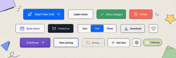
2018 however, focuses on flat design 2.0. This trend has more graphical design elements, not to the point that there’s unnecessary clutter, but enough to give users a better idea of what’s going on. You’ll see more focus on icon design. This trend incorporates more 3D UI elements. It plays around with shadows and lighting. It uses gradients. It’s still minimalistic but actually has signifiers and is designed to make site navigation more straightforward for those not as familiar with the icons of five years ago.
Eliminate the need to search
 Navigating a website through search is challenging enough on most sites, but it is ridiculously challenging on a mobile device. This year, one trend directly addresses this problem by making search less necessary.
As a culture, we’ve been talking about artificial intelligence for generations. It is the idea that machines can be taught information, retain it, and use that information to solve problems. We’ve been working on machine learning for years, and now the technology has made its way into web design.
One of the most popular examples of this is Google’s Siri. This technology has taught the world that machines can use our data to help us find information quickly – faster than we can search for it. Search boxes are quickly becoming a thing of the past.
In 2018, web designers and developers can take part in this trend by paying more attention to data collection, discovery, and analysis. Many times, website visitors provide a wealth of information that can be used to streamline processes and improve usability. You simply have to know what you are looking for.
If data discovery is more than you’d like to take on, there are, of course, solutions. Adobe makes artificial intelligence more accessible to web designers with its new product, Sensei. You can also use chatbots to engage site users based on their behavior and assist them before they become frustrated and leave.
🎬 Learn what Slickplan can do!
We filmed a short video to show you exactly how to use Slickplan
More movement, please
 Remember patiently waiting for a gif file to load when you were a kid? If you experienced the internet in its early years, you probably thought the name gif was a cruel joke. Thankfully, technology has improved. Internet speeds have improved. Computer processors have improved. Ladies and gentlemen, it is now safe to bring back the gif file.
2018 brings more movement to mobile web design with the use of animated objects such as gif and SVG files. Unlike videos, animations load quickly on mobile websites while providing a rich, multimedia experience. They help designers convey more information in a smaller amount of space – a critical need for mobile devices.
Unlike in the 90’s, animations won’t simply be used to illustrate a message. In 2018, they are the message. They give words personality, bring icons to life, and hold site visitors’ hands, so they don’t get lost. Gifs are regaining their glory because they are easy to make and fully customizable, making them any web designers dream. Add more movement to sites with animated logos and site elements.
Gifs aren’t the only way designers are adding movement in 2018 however. You’ll also see plenty of SVG animations. This type of graphic is made of vector images, rather than pixels, making them more scalable. They also don’t slow down page speed, making them perfect for mobile website design. This mobile design trend is prevalent on e-commerce sites. Moving products help make stores feel less virtual and likely encourages consumers to buy. When used to show 360 views of a product, it helps customers make informed buying decisions. It’s easy to see why this is one of many mobile website design trends that will stick around.
Animations do not have to be continual, however; sometimes a triggered animation is even more compelling. Triggered animations help increase website conversions because they force further action out of the site visitor. You can’t overlook the fun you can get from scrolling down and having an object move. Triggered animations encourage site visitors to continue traveling through a site, creating an immersive, interactive experience.
Let’s get visual
The experts may disagree about which aesthetic will dominate 2018, but it is apparent that visual appeal, in any form, is one of many mobile design trends that you’ll see maintaining its popularity this year.
Contrasting colors
 Today’s mobile websites range from bold and loud to subtle and minimal. Their shared goal: create an experience that is easy to read on mobile devices. For some designers, this means bold, striking colors combined with large fonts and customs graphics. For others, the use of contrasting colors with subtle fonts is less jarring on the reader’s eye.
Regardless of the direction that you choose to take with colors, there’s no question that they will be important in 2018. Although minimalism is still the goal, there is still plenty of options in color and contrast. This design trend helps designers create compelling experiences without putting too much load on a mobile website.
Typography
 When the design palette is small, every minute detail matters. On a mobile website, that minute detail might be the font, and this year, designers will be paying close attention to it.
Bold modern colors go well with bold modern fonts. When mobile users rarely spend more than a minute on a page, a bold front makes it easier to skim. It may even grab their attention. Designers may also take chances on more creative fonts, utilizing the serif family more, or even creating custom fonts.
Typography offers more possibilities than a choice of font, though, as typography cutouts are also becoming popular in 2018. In mobile website design, they combine video with typography by placing cut out letters over a moving background. This practice draws a user’s attention to the video, while also supporting the overall visual design of a site.
Illustrations
 2018 is all about getting the attention of site visitors without making a mobile website hard to navigate or slow to load. Users are naturally gravitating away from the large buttons and clickable images toward more streamlined mobile-friendly designs. However, pictures are still excellent for telling a story, and illustrations don’t appear to be going anywhere.
Illustrations help build personality and are often a practical way of conveying information. We definitely believe that custom drawings will continue to personalize websites in 2018.
Up and down, not left to right
 Although we read from left to right, user behavior is revealing that on mobile devices we navigate from the bottom up. Many times, users make it to the bottom of the page and find it difficult to quickly navigate to where they need to be. As a result, important pieces of content may get overlooked, and the site has low conversion rates.
The solution to this problem – make sticky menu items at the bottom of the site or send readers back to the top of the page with a button. We expect this to be one of many mobile website design trends that takes off in 2018.


Think visually. Improve UX with Slickplan
Build intuitive user flows, stronger customer journeys and improve information architecture.
It’s a party, not a lecture
 No matter where you go, social media has become a part of the cultural landscape, and website design is no different. In the case of mobile design, users have grown used to the instant gratification that they receive via social media and expect the same instant response elsewhere.
In website design, this is accomplished with micro-interactions. Micro-interactions enhance the site experience by providing feedback and movement to users. Site visitors stay engaged with real-time movement and response like what they are used to on Facebook or Slack. This mobile design trend brings the user into the conversation and makes it less likely for them to leave.


 Facebook
 X
X Youtube
 LinkedIn
 Vimeo
Vimeo