If you’ve been on any websites the last couple of years, you may have noticed the popularity of pageless websites. It wouldn’t be a surprise, because these endlessly scrolling websites have been called the future of website design.
Their pros and cons have been discussed from many points of view, including the technical considerations of page load time, their effect on SEO, and their low-maintenance.
User experience, however, is an entirely different consideration, and an important one to be considering when planning your website.
One size does not fit all
Some experts, such as Nathan B Weller in Digital Telepathy are advocates of pageless websites, stating that they create a beautiful user experience (such as this inspiring design) and tell an engaging story.
While it is true that an uninterrupted story is very convincing, it doesn’t always suit the business or the tasks your users are trying to accomplish. Think about large e-commerce sites such as Amazon.com; if they tried using a one-page experience how would you ever find anything? It is crucial to align the website navigation structure with customer expectations and usage patterns to ensure a positive user experience.
The fact is; users rarely come to a website only for a story. However, there are some sites that do exist for this purpose. Here are some beautifully designed examples:
Lost World’s Fairs Atlantis – https://lostworldsfairs.com/atlantis/

Angela Morelli Water – https://www.angelamorelli.com/water/

The Web Scroll Index – https://www.shibui.me/web/scroll/index.html

A little bit of this; a little bit of that
Even when the task you would like the user to complete does not involve a story, some sites have been able to combine storytelling with their primary call-to-action. Instead of putting the task first, they make the business decision to tell a juicy story first and then add the task at the bottom. Remember, form doesn’t always follow function.
You could also create a hybrid design — a pageless site with persistent navigation. A common approach is to use a horizontal navigation bar, which displays top-level links side by side in the header. The advantage to that is that you are able to tell a story, while still allowing users to accomplish tasks once they are sold.
Take this bubbly wine site for example. The point of the site is obviously to sell wine, and at the very bottom there is a button to buy it. They’ve made a business decision to sell the wine with a visual story before allowing the user to complete the primary user task of this website: complete a purchase. You might argue, then, that the primary objective of this website is to sell the wine, and then allow the user to purchase it. And that’s fine.

🎬 Learn what Slickplan can do!
We filmed a short video to show you exactly how to use Slickplan
One page doesn’t necessarily mean less work
Just because you are planning a pageless design, doesn’t mean you should put less time into planning it. Once you have made the decision to balance a business’s story with the user’s task, take time to create a well thought out structure.
When planning, consider these questions:
- What tasks will the user want to complete?
- In what order do these tasks make the most sense?
- In what order do they tell the best story?
Use your answers to plan a one –page navigation hierarchy that balances form with function.
Navigating around a single page
When you start designing your site, there are a few principles to keep in mind. First, you’ll need to make your messaging persistent. Including a search bar in the navigation menu can enhance the user experience by making site search more usable and frictionless.
This is especially true if there is the chance users might navigate backward or forward ‘mid-story’. Persistent navigation makes certain they don’t get lost. Rimmel London provides a great example of this in action.
Second, you need to make sure your users know there’s more content to scroll to; otherwise they may never get through the entire story. This can be done with simple graphics such as the arrow (shown below) and the ever-popular cut-off look.
![]()
Source: www.freelancelift.com
Organization still matters
Users need to be able to easily find their way around a one-page website. To help them with this, make sure there are no surprises and that all of the navigation matches the elements on the page. Including a footer navigation menu can also provide easy access to important subpages that might not fit in the primary menu.
Anything else can lead to confusion, frustration, and the eventual early exit. Well-designed navigation, on the other hand, shows all of the navigation options as well as the key tasks.
Consider this website: https://www.tamarindrestaurant.com/
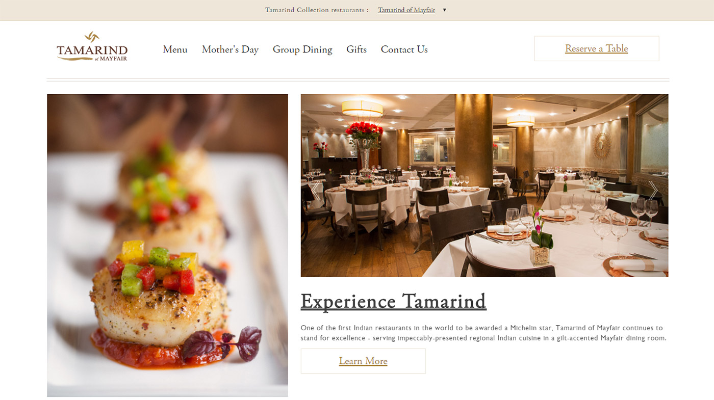
In this poor example, the restaurant’s website has persistent navigation, but it only relates to the menus and not the elements on the home page. Once the user is sold by the wonderful dining experience pictures, they should be able to easily get to a place to contact the restaurant, or reserve a table.


Think visually. Improve UX with Slickplan
Build intuitive user flows, stronger customer journeys and improve information architecture.
Don’t forget to lead
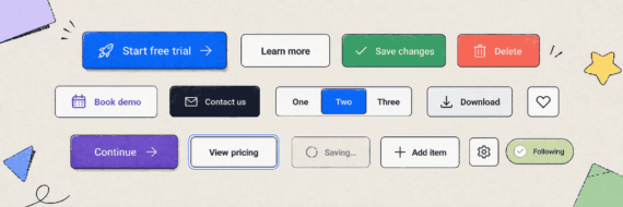
Just because you are designing a pageless website, doesn’t mean you no longer need to guide your users through the site. Utilizing user interface components such as menus, buttons, links, copy, and link text is essential for effective navigation.
Design a site that always shows the user where they are while simultaneously directing them to where you want them to go.
This is the goal of any website, regardless of how many pages it has. Additionally, showing a user where they are located within a site is the secondary purpose of navigation elements and should not be disregarded.
Here is a good example of this in action. This Lexus site highlights persistent navigation elements as the user comes to them. At any point of the single page, a user can look at the top and quickly navigate to where they want to go.

If you keep these tips in mind, you will be better able to create a pageless website that both the user and client will appreciate. With Slickplan at your fingertips and the user’s experience at the front of your mind, you are well equipped to join the ‘future of website design’.


 X
X