Last month Slickplan released a major upgrade… including an improved user experience, new interface and functionality updates to our most popular tool, the Sitemap Builder.
The response has been awesome and we’ve appreciated all the insights our users have shared with us. We are always striving to improve so that you can have the best experience, which is why we take constructive criticism very seriously. Thank you to everyone who took the time to reach out and share your thoughts with us!
So what has changed?
Much of the post launch feedback helped us understand that the new the page cell design was limiting users in a few different ways. After taking inventory of the responses and talking directly with users, we discovered specific things to improve:
Text label legibility
A fixed text size for page cell labels made it difficult for users with varying levels of vision to read comfortably. To fix this we created a toolbar menu that lets each individual user select the text size that works best for them. This setting can be set independently so that each user can view the sitemap the way they prefer without changing the view for other users.

I like your new design, but on the sitebuilder the names of the pages are too small and hard to read. Could you give the ability to change the font size? I have good vision but those that don’t might struggle.
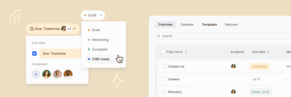
Page cell sizing
The new interface introduced a larger cell size to accommodate page properties, statuses, and other attributes without creating extra clicks when working with sitemaps. The larger sized cell limited the amount of pages visible for some users in the viewport, especially people on smaller sized monitors and laptops. To be inclusive for all we created a toolbar menu that lets users select their preferred page size.

The new UI without the ability to resize the sitemap builder boxes is limiting. The new look and feel makes each page box too large.


Design user-friendly sites with Slickplan
Use our easy drag-and-drop interface to ensure people can get where they want to go.
Text wrapping
Page names come in many different lengths which was limiting for longer titles. To address this we created text wrapping to accommodate up to three lines of copy within a page cell for almost every cell and text size.

Each Cell has more white space than necessary, and the font is too small. That extra whitespace could be useful for really long page titles, but those get truncated.
The Slickplan community as always was an immense help. We couldn’t have come up with these solutions to these obstacles without you. Feel free to leave us a comment below or reach out to our help staff if you have any questions.


 X
X