Have you considered a single page website for your sitemap architecture? What if you could say everything that you needed to say on a single page without the hassle of menus? The one page website makes this a possibility while also adding native responsiveness, an intense focus on content, and lowered design costs. However, with all great things, there is a cost, and this popular web design trend comes with its drawbacks.
Unlike traditional websites, a single page website features content sections that users access by scrolling down. There are no menu buttons to choose from; therefore, the content must be organized logically to prevent the urge to skip ahead. Also called long-form websites because the content tends to continue longer than on traditional sites, these one-page sites offer condensed versions of what used to be found on 3-4 pages.
The one-page design is popular because it gives designer more room to get creative, and as a result, can create a deeply immersive user experience. However, they aren’t the best choice for every situation. Before you decide to build a one page website, you’ll want to consider these benefits and drawbacks.
Why you should consider a single page design
Let’s start with the pros.
Ease of Use
One of the primary reasons people love single page websites is because they are easy to navigate. There isn’t much that is more simple than a one page website with a clear beginning, middle, and end. The ease of use of a one page website design makes it the perfect first for sites with a single purpose. Maybe you are selling one product, or have a story to tell – if so, the linear experience of this design makes keeping users focused on your goal an easy task.
Navigating a single page website is more beneficial than many people realize. With a one-page design, there is more scrolling and less clicking. This is good because many users prefer scrolling over clicking, increasing the likelihood of them staying engaged with your site. As long as the design is kept clean and simple, one-page designs provide a seamless and intuitive user experience.
User Engagement
Because it is so easy to stay on a one page website, it is also easier to stay engaged. This is why increased user engagement is often cited as a reason for using long-form, single page websites. This benefit comes with its challenges, however. Although a single page makes it easier to stay on one page, designers must ensure the content can be digested in a single page.
When a one page website is used to communicate a single message, increased user engagement is easy to obtain. Sometimes this means more graphics and less text. This site is an excellent example of an engaging one-page design that uses minimal text. The idea is to create a page that creates a journey for the user, so they are encouraged (and rewarded) for scrolling down.
More Focus on Content
If you think a single page makes it harder to deliver high-quality content, think again. Multi-page websites actually have less opportunity for creativity, because each page needs to be optimized, and the focus is often quantity over quality. With a one-page design, the focus is on that single page, leaving more bandwidth (and often budget) for the content.
This benefit makes the one page website perfect for digital storytellers. Instead of being limited to a story told in blocks that are spread out over multiple pages, they can create a linear story that is more natural to read.
There’s also more room for images with a one-page design. Instead of worrying about filling a page with content, designers can tell a story using a variety of mediums creating a more immersive experience for the user. Without the worry of creating logical links, the focus is spent on the content instead.
Better Conversions
An improved user experience is directly related to higher conversions; therefore, the one-page design naturally wins in this category as well. If you are creating a website to generate leads, sell a product or service or even build an email list, conversions are at the top of your list. A one page website improves your chances of a user taking whatever action you’d like them to complete.
A single page removes distracting variables and limits options. Your users won’t accidentally click to a different page and forget to sign up. They won’t get frustrated by slow loading pages after they decide to purchase. Everything is right there on the page, and if your content is compelling enough, there’s no reason for them to hesitate.
Multi-Device Support
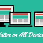
The last reason why a single page website is a good idea in many cases, is that it plays nice with mobile devices. Multi-page sites can be challenging to navigate on mobile devices, causing many users to go elsewhere, rather than deal with the hassle. While many multi-page website designs are responsive and optimized for mobile support, the one-page design is by far the easiest to navigate on any type of device.

🎬 Learn what Slickplan can do!
We filmed a short video to show you exactly how to use Slickplan
Why a single page design might not be for you
Don’t jump on the bandwagon just yet.
Too Much Information
In many situations, a single page is all you need for most content. However, this is not always the case as many types of websites should not use a single page design; these include blog sites, news websites, and web shops selling more than one website or service.
Even with excellent site architecture, a single webpage design poses difficult, if not impossible opportunities for balance. Too many words and the user loses interest. Too many graphics and the page load slows down to a snail’s pace. Even the most interesting journey becomes boring when it is too long. You simply cannot stuff too much information onto one page.
Limited Keyword Optimization
Search engines love content-rich, easy-to-read websites around a single topic, which is why the one page website is often good for SEO. However, even that benefit has its limitations. Search engine optimization also relies heavily on keyword optimization, and a single page design limits the number of keywords that can be optimized.
If you plan to use a single page website, you will need to take a specialized approach to SEO. First of all, you will need to choose your keywords very carefully, because you can only use a few. Too many keywords on a single page is spammy, and search engines do not promote spam. You’ll also have to pay special attention to your title tag, meta description, and URL – because you only get one.
Don’t forget, you’ll also have to work harder to ensure fast load times, that your content is of the highest quality (since you have fewer keywords to work with), and that you do plenty of link-building. It is possible to have good SEO on a one page website, but you will definitely have to work for it.
Not Easy to Share
If harder SEO wasn’t discouraging enough, fewer shares might also deter those looking to build a marketable one page website. The reason for this drawback is simple; when there is a lot of information on a single page, it is difficult to share. When a user decides to share your website, many times, only the top portion of the page is selected. Chances are, that’s not what they were looking to share.
Of course, there are creative ways to get around this, you could use social sharing buttons on specific portions of the page, but that requires some custom work and it may clutter the page. Once again you are met with the challenge of finding balance.
Likely to Confuse
The one-page design is not for amateurs. Although it requires fewer resources to build, it also puts a heavy emphasis on site architecture and the quality of the content. A one page website has a unique design that relies on content that flows in the same direction as the page. While this may seem straightforward, if not well-done, it can easily confuse and frustrate the user.
Although the one-page design is gaining popularity across the internet, there are still some people who find it disorienting. To prevent user frustration, designers must pay special attention to how long visitors stay on the page before they experience scrolling fatigue. Once that threshold is determined, keep the content within those parameters.
Fewer Analytics
Although you can employ usability testing to optimize a one-page design, you won’t have much luck finding many other options for analytics. Since it is a single page, Google Analytics will only be able to identify who your visitors are and how long they stay on the page – and not the content they are interacting with most.
This poses challenges in many ways. Fewer analytics make it difficult to improve conversions (although single page designs tend to have better conversions). It also makes it difficult to identify why people are leaving, which could reduce bounce rates – a direct impact on SEO.
Plan smarter content with Slickplan
A collaborative workspace to handle all your content needs. Plan, gather and create together.
No Ability to Scale
The final drawback to utilizing a one page website is the lack of scalability. If your needs change, or you discover that it truly is too much information, you will need to do a full redesign. There is no adding on to a one-page design. Like the United States Post Office, if it fits, it ships.


 X
X

