Flat design hasn’t been around very long, but it is already experiencing a bit of a revolution. The first iteration of flat design, known as Flat Design 1.0, exploded onto the web design scene around 2011, with dramatic design principles that challenged what many considered the standard. Now, less than ten years later, designers are seeing a new type of flat design, a more moderate iteration, known as flat design 2.0.
Flat Design Simplifies the Web
Flat design 1.0 softened the web. It did away with shadows and gradients. It removed both raised and sunken buttons. Flat designers sought out visuals that were more real and relatable, rather than forcing users to endure gaudy textures and elements. Designers moved toward 2D design, utilizing more standard color palettes and creating a simpler user interface. Not only did flat design 1.0 work well on many websites, but it’s simplified approach was also just in time for the growing smartphone audience.
The initial push towards flat design was most recognizable in designs used by Apple, specifically in the icons used for the iPhone. At first, flattened icons initially appeared in their app store and were only seen within their ecosystem. However, as Apple devices became more popular, so did their design. Designers in all industries began adopting the flat design that was seen throughout Apple until it became recognizable in day-to-day life.

The change to flat design happened quickly. The seven-year period didn’t leave much room for users to catch up, leading to poor user experience in many cases. Whereas flat design minimized unnecessary elements and reduced much of the gaudiness of the web, it also failed to consider the idea that some users need more direction. The popular trend was destined to fail because it was too simple.
🎬 Learn what Slickplan can do!
We filmed a short video to show you exactly how to use Slickplan
A New Approach to Flat Design
Flat Design 1.0 was adopted so fast that it left very little room for most people to catch up. This led to problems. The new design was becoming “too flat” for a growing number of users, forcing designers to try a different approach.
The largest problem with flat design is that it creates what’s known as “weak signifiers.” Users do not know what to do. Website design is supposed to help guide users, but these flat elements significantly fail at this task. Instead, they cause users to lose focus, and do a poor job of driving conversion, as shown in a recent Nielsen-Norman eye tracking and heatmap study.
Even something as simple as buttons, which are essential drivers for user action and conversion, lose their effectiveness in flat design 1.0. Instead, their appeal is lost to a user’s vision. The effect of flat design on buttons was so noticeable that some designers have researched better options, comparing them with other options in shapes, sizes, and padding. In the end, the “raised button” look was the most effective.
As designers struggled to find a happy medium, the old school design techniques were starting to look more desirable, yet few could ignore the success of flat design. It was time to combine the growing love of nostalgia with tried and true modern design fundamentals. Flat Design 2.0 was born.
What’s New With Flat 2.0
Flat Design 2.0 has many of the benefits of its predecessor, but with some noticeable upgrades. Here are four features that you can expect to see with this trend:
1. Gradients
Gradients give designers plenty of space to create within the limited palette of flat design colors. Designers work with what they have to create exciting new designs that give users a different experience while maintaining relative simplicity.

2. Color Palettes
Flat design 1.0 limited colors, but designers have even more to work within the newest version. The newest version does more with colors, getting creative in ways that are much more daring than a few years ago. When combined with gradients, the possibilities are endless.

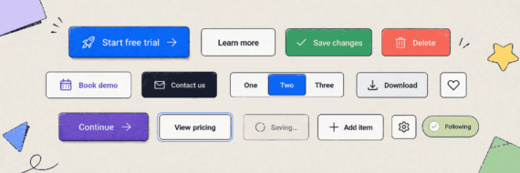
3. Shadows and Depth
Just like the old days, drop shadows, raised elements, and sunken buttons are still the trademark of flat design. They are especially helpful for drawing attention to calls-to-action, differentiating elements from other on-page content, and inspiring action from a user. These elements should be used to drive an action, not just look good.

4. Animation
The use of website animation is not new, but you can expect to see even more of it with flat design 2.0. Today’s flat design includes updated elements such as those that move with the page or change color on hover or action as well as the standard banner sliders. Although they are a safe addition to any modern flat design site, moderation is key. Too many animations can be distracting, slow down the site or lead the user directly back to the search engine they came from.

Flat Design 2.0 offers some definite benefits over its predecessor, but it is still essential to use flat design elements, both old and new, wisely. When designing, leave the appropriate amount of space, choose accessible colors and contrast and utilize a hierarchy of action and elements on your pages. These design fundamentals still matter regardless of how flat you decide to go.
You’ll also want to pay special attention to the user experience when using flat design, especially since user experience nearly killed the first version of it. Flat design works best with plenty of space and a defined structure. However, when content is added, clutter can quickly occur. Prevent design headaches by starting flat design web projects with a style guide that spells out recommended formatting for headings, subheadings, bulleted lists, paragraph lists and image size for the best results.
Getting Started With Flat Design 2.0
If you aren’t already utilizing flat design in your web design, it’s easy to get started. As explained above, this design is rapidly evolving, and the hardest part is keeping track of the current trends. The easiest way to do this is by first understanding what everyone else is doing. Then, to make sure the design works with your users, conduct usability testing.
Flat Design Inspiration
Your competitors are often an excellent source of inspiration. Start by conducting a competitor analysis. What elements are they using? What updates have they made? You’ll want to look deeper than their logo or color scheme – try and understand how they approach elements of interaction. Look at their website from many devices to see how it responds on tablets, laptops, and smartphones. The idea is to understand how they interact with visitors to create actionable steps and gauge how intuitive those steps are. Both the strengths and weaknesses of your competitors’ sites can help you design projects that incorporate all the benefits of flat design.
Social media is also a good source of data about current flat design trends. Social media icons and apps are often the first to change with the trends, giving many designers a heads up as to what’s next. When watching these channels, make sure to keep your website updated as well. Outdated social media icons can make a site look dated, which is risky in today’s constantly updated world wide web.

Don’t Lose Your Users
Once you’ve planned your flat design, it is a good idea to run a usability test on real, human users, if you can. Understanding how your users interact with your website and organization online is crucial to making any needed design changes. Don’t be afraid to ask users what they like or don’t like, or what is confusing or easy to use on your site today. Getting honest, candid answers from potential users helps any web presence. Plus, usability testing can help improve the usability of any site, so completing one is generally a good idea. If you are short on time, try this quick usability test to help create more UX-friendly designs.


Share & refine designs with Slickplan
Add mockups from Figma or your computer to ensure UX/UI is moving in the right direction.
It’s Not All or Nothing
Flat Design 2.0 isn’t for everyone, but many of its principles can compliment web designs of all types. It’s easy to find places where gentle Flat Design 2.0 updates may fit into your current design. The most obvious places are areas that deal with contrast, color usage, and page hierarchy. If none of these stand out, use your competitor analysis to find places where your organization can make improvements. You can also talk to your stakeholders about your organizational and audience goals and see where flat design could fit in. Could it better connect your visitors to those goals?
If you like the aesthetics of flat design but aren’t sure if your site could benefit from it, sometimes the numbers can provide clues. Share your mockups with your team, check your analytics — Are users completing the tasks you want them to complete? If not, some of your design elements may need an upgrade – why not upgrade to flat design 2.0? Need to prove it will work? Run an A/B test to test out design elements and track the data. Numbers help validate design changes to decision makers and give designers the freedom to do what they do best.


 Facebook
 X
X Youtube
 LinkedIn
 Vimeo
Vimeo