When you’re planning a website, it’s easy to get lost in the details. Between the architecture and the color palette, there’s a lot to think about – especially if usability and the user’s experience is your primary concern. However, you shouldn’t overlook the importance of web design typography. When done correctly, it can lead to a more immersive experience and improve readability. Plus, with plenty of options to choose from, finding the perfect typography design is easier than ever before.
Typography is More Than Letters
Just like other aspects of web design, there is plenty of room to get creative with your typography. However, choosing powerful fonts for your design involves more than selecting something that just looks good. As with any type of design strategy, there are several techniques involved.
Choosing the right font for your project is not only about trends. Sure, you don’t necessarily want to use the font everyone is using. That seems like an obvious choice, but if you don’t consider your product’s individual voice, it might not work, no matter how popular this font is. Start with the basics. Do I want my product to be fun and casual? Then a nice sans serif font would be the way to go. Or maybe I’m designing a banking website? Some classic serif font would be a better option.

Focusing on typography during the website planning process is important. Use it to help create websites that speak to their users – not just through words, but also through the characters that create those words.
🎬 Learn what Slickplan can do!
We filmed a short video to show you exactly how to use Slickplan
Typography Design and the User Experience
Every web designer understands the importance of content. Every designer also knows that how you present that content will impact whether people read it. Typography takes content to its root core – the individual characters. Whereas design strategy can often compete with content strategy in terms of website planning, typography is the safe middle ground.
Fabio da Cruz from Best Response Media tells us words can only express so much. Yes, they can relay information, but it can be challenging to express sentiment, and even more challenging to evoke emotion using words alone. When combined with visuals, such as typography, you can communicate a complete message, instead of flat data.

This attribute makes typography design extremely valuable for any website design strategy. Unlike face to face communication, websites must rely on their content to provide users with an experience they want to interact with. However, with so many typography options at their fingertips, how does anyone choose?
The right typefaces can encourage the reader to look at the characters in front of them. They can literally stop them from scrolling and capture their attention. Once they start looking, they may also start reading it.
For Anna Acuña, design team lead at Coalition Technologies, deciding on a font is one of the first steps in any project: “Selecting—or even creating—the right font determines the voice with which your brand speaks, displays the attitude your company values, and forms your relationship with your audience.”
You’re delivering an experience. Now make it count!
Good Typography = High Legibility
All typography is not created equal. The wrong typeface could lead to poor legibility. You then would be causing more problems than if you hadn’t messed with typography design in the first place.
The art of typography is matching the typeface with not only the user but also the platform. That means using font combinations that are appropriate for the web, sticking to techniques that improve readability, and arranging content in a way that is easy to read.
Even with the perfect design strategy (from an aesthetic point of view) it is easy to create something that isn’t legible. It doesn’t matter how ‘pretty’ it is, if users can’t read it, you are absolutely missing the point.
Here are some ways to ensure your typography design doesn’t wreck your user experience:
Keep it in scale.

Consistency is essential for high readability. If your fonts are all over the place, your users may be as well. Ratios for headers, body text, spacing, and line length all help improve readability. Use tools such as modularscale.com or type-scale.com to ensure your ratios are correct.
Colors are fun but take heed.

There should be a contrast between your text and your background. The recommended ratio is at least 3:1 for large text and 4.5:1 for small text. Check your contrast using tools such as Tanaguru. Stay away from red and green and absolutely test the design before you launch.
Watch the length.

Most people think of character design when they think about typography, but how you arrange those characters is also typography design. Length is important. Leave space between the lines, 30% above the character is a good guide.
Think about the audience.

People will access your website from many devices. Your typeface should be flexible enough to look good on all of them. Choose a typeface that works in multiple sizes and weights and responsive fonts for mobile design.
Typography as Part of Your Design Strategy
Understand that the typography on any website or application matters – not just for aesthetics, but also for usability. The challenging part is selecting the best fonts. One of the best things about modern typography design is the fact that there are literally thousands of examples at your fingertips. Discover different ideas online and use free and paid services’ font libraries.
Want an easy way to find the perfect fonts for your website design? Try Google Fonts; a free hosted collection of premium font families. Google provides free web fonts as well as suggestions for complementary pairings. Adobe Fonts (formerly Typekit) also offers a similar service for a monthly subscription fee. For something a bit more custom, you could purchase proprietary fonts from companies such as Fonts.com, Myfonts.com, or FontShop.
Custom fonts are amazing at creating an immersive experience for your users or reinforcing a brand image. However, system fonts such as Arial, Helvetica, Courier, and Times New Roman still offer great usability. Sometimes, tried-and-true web fonts are a quick and easy solution.
Try these popular web fonts in your next design:
Montserrat

Futura

Museo

Gibson

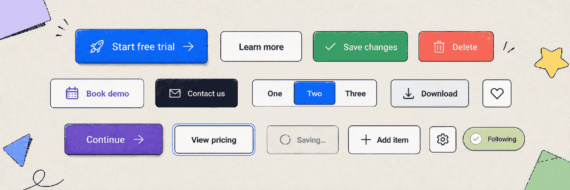
Using Multiple Fonts
With so many fonts to choose from, it’s probably no surprise that you may be tempted to use more than one. Before you fill your site with various forms of character art, keep in mind that you can go overboard. It’s generally a good idea to keep the number of fonts to three or less. When using more than three fonts, it may not just wreck your layout but may also totally ruin the user experience. Make it easier on your users, try and vary the weight and style of one typeface to create a unique look.
If you decide to use mulitple typefaces in your design, make sure they’re complimentary, or at least neutral

Remember the goal of typography should be drawing the user to the content, not amazing them with the typography design.
8 Inspiring Typography Mockups
Looking for inspiration for your typography design? These font combinations help users understand exactly what your website is about.
The Modern Classic
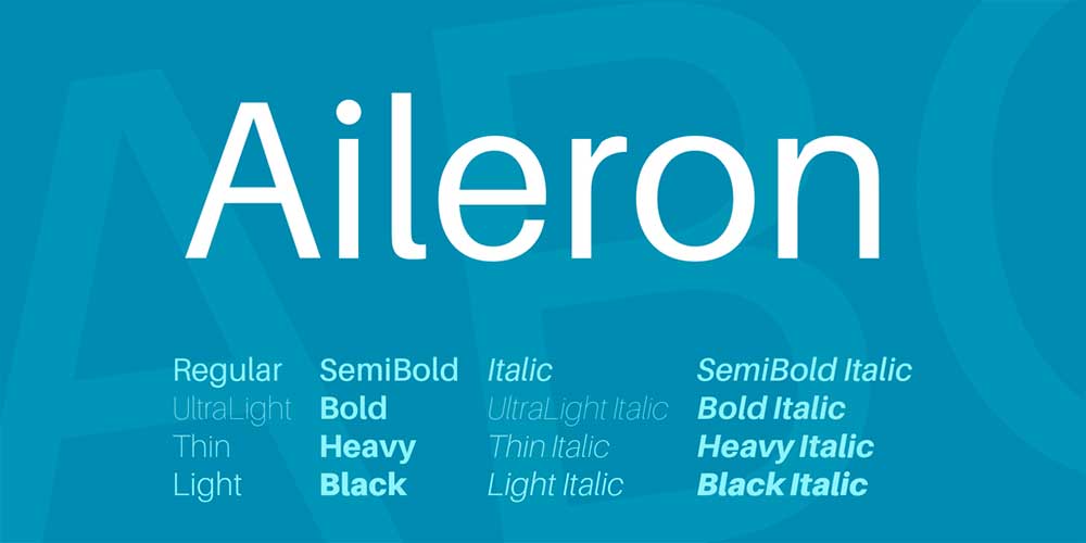
This font pairing uses multiple sizes and weights of the custom font Aileron. Aileron is a sans serif font designed by Dot Colon in 2017. The flexible typeface is a softer alternative to Helvetica.
The Design Website

This typeface is designed by Łukasz Dziedzic to go big. The smaller sizes of this font have a somewhat transparent feel, while the larger sizes grab your attention. The perfect blend of warm and strong.
When Looks Matter
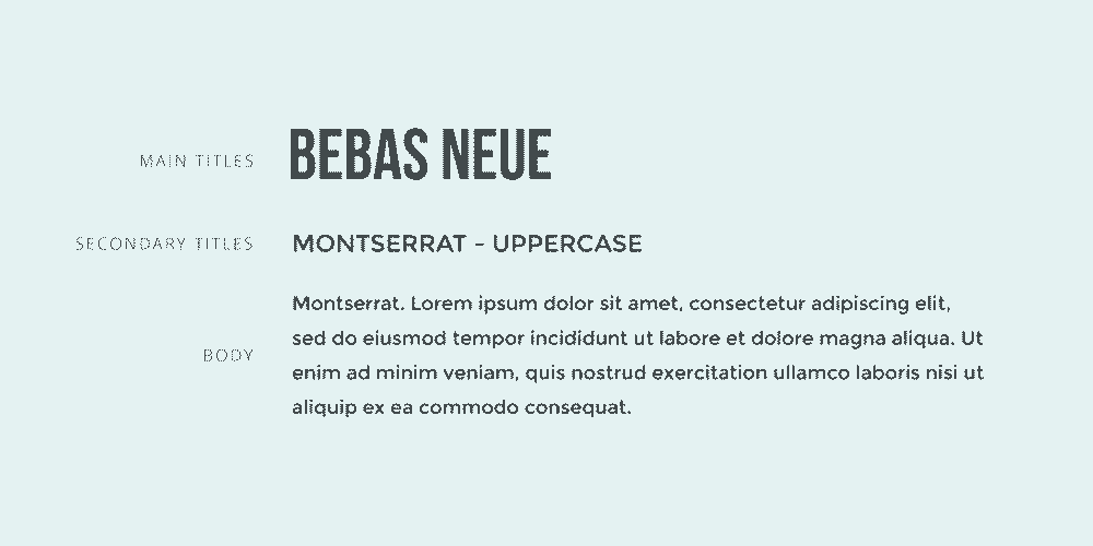
Sometimes you want your typography to be attractive, like when you are selling fashion. This font pairing takes the popular capitals of Bebas Neue and pairs it with the Argentinian inspired Montserrat for the text.
Download Bebas Neue Download Montserrat
Industrial Meets Website

Some websites prefer to get straight to the point – good typography can help. Clean geometric lines are the hallmark of Norwester and Kollektiv.
Download Norwester Download Kollektif
Urban Chic

Various Montserrat fonts come together to create an urban feel for your design projects. Within this font family, you’ll find plenty of variations in weight and contrast – giving honor to the city where it earned its name.
A Little Formal

It can be challenging to find the perfect web-friendly script font. However, Sacramento delivers. The Sacramento font is inspired by the hand lettering designs of the 50s and 60s. When paired with Montserrat, the combination gives off a more casual feel.
Play With Color
 Sometimes a little color can make a big difference, especially when added to the extremely web-friendly Libre Baskerville and slightly playful Nixie One.

Share & refine designs with Slickplan
Add mockups from Figma or your computer to ensure UX/UI is moving in the right direction.
Attention Grabber

Grab your reader’s attention with a popular open sans font, then add some geometric curves and arches with Cooper Hewitt. These sans serif fonts are easy on the eyes and optimized for multiple interfaces.
Download Open Sans Download Cooper HewittCan’t make up your mind? Make a list and share it with your team for feedback. If one font doesn’t quite fit your needs, try using identifont.com to suggest alternatives.
Once you’ve selected the typography for your website or application, the next step is testing. Test your choices to ensure they are readable on multiple devices. Gather feedback from members of your team, test users, and key decision-makers. Then, once you have your feedback, apply those fonts to the content you’ve already organized with Slickplan’s website content planner for a polished preview of the final results.
If all of this sounds daunting, it doesn’t have to be. Slickplan makes every aspect of website planning easy. From hosting and sharing mockups of your designs to planning the information architecture, take your website from concept to completion with fewer logistics and more creativity.


 X
X