Like many businesses and brands, you no doubt want to reach various personas and consumers. Often, those differences between consumers aren’t just based on geography or needs, but they are also generational.
From tweens and teens to Baby Boomers, different generations of people have specific needs when it comes to user-first design. What works for one or two generations may not work for others. As younger consumers continue to evolve the way we interact digitally, older generations often have to “catch up” and re-familiarize themselves with new adaptations, functionality, and expectations on the web. That’s why user-first web design is an essential part of planning for any website project, from redesigns to brand evolutions.
Designing Across Generations Means Designing for Inclusivity
Generational user-first web design isn’t just built to be a more convenient way for different age groups to browse websites and digital applications. It’s also part of accessibility — or rather, inclusivity.
The Web Content Accessibility Guidelines (WCAG) continues to advance as the needs of audiences change. While websites don’t have to adhere to section 508 of the Americans with Disabilities Act, per se, it’s still advised that brands meet the needs of users of all abilities.
As of this publishing, the WCAG 2.0 and 2.1 are the most recent editions to web accessibility, and offer tips for meeting A (required), AA (ideal), and AAA (suggested) standards which includes but is not limited to:
- Captions and/or transcriptions for videos and transcriptions for audio files
- Contrast ratios and use of color to convey meaning
- Audio control settings for audio and video media
- Appropriate font size and line spacing for ease of reading
- Ability to tab through website with keyboard controls
- Limited or low use of flashing or animated graphics
But while individuals who rely on screen readers and assistive software on their desktops and smartphones benefit from these guidelines, they also help ensure consistent, easy-to-access experiences for users of all ages.
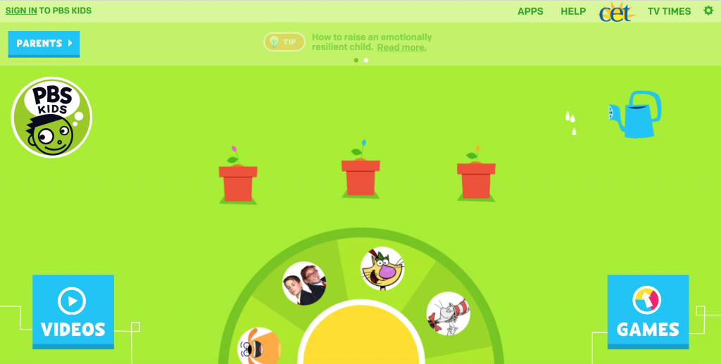
Designing for Children
It may seem odd to many of us that children are becoming accustomed to using the internet, and while they’re not searching like adults who are trying to solve problems, answer questions about their health or wellness, or purchase products, there are still ways to reach this young audience.
One common thrend for children is bright colors and easy-to-understand sounds. But it’s important to advance these types of features as children get older. For example, for children ages 3 to 5 — bright, simple colors and shapes are appealing and easy to understand. But once they’re 6 or 7 years old, this approach might seem too young.
There are, however, some standard tactics when considering user-first design for websites aimed at children, including:
- Bright colors are attractive to young eyes. As long as they meet contrast ratios for accessibility, bright colors that align with your product or brand keep children’s attention, aligning with many other educational tools they see in their day-to-day life, from storybooks to children’s toys.
- Content should be aimed at the age of the audience you’re targeting. This content should especially be uncluttered, with only short words and sentences appearing at a time.
- Easy-to-read fonts and typography are essential. This is especially important for learning-centered content or interactive tools that ensure children can easily scan the page and understand the content, if written simply (see previous bullet).
- Obvious navigation makes it easy to take the next step. In learning websites, using “next” screens or steps can be influential in their learning. Avoid cluttering with too many options, which could send the young user in the wrong direction. And, like all call-to-actions, limit to one per page to make the experience intuitive.
- Use characters and storylines to tell your story. Depending on your brand and message, consider characters and storyline experiences to lead children through a journey and keep their attention interactive. This can be an especially helpful tactic for educational tools.
Check out more tips for designing websites for children from Smashing Magazine.
🎬 Learn what Slickplan can do!
We filmed a short video to show you exactly how to use Slickplan
Designing for Tweens and Teens
Since the inception of the internet, the younger generations — especially teens and tweens — are the generations reinventing how the web works and how we use it. And if your brand is attempting to reach these audiences, there are some helpful ways to do just that.
While teens and tweens are certainly older than the child-age audience we mentioned previously, some of the principles of simplicity and easy-to-read fonts, colors, and navigation still apply. You’ll see this as a common thread for all generations.

But tweens and teens, naturally, have waning attention and want to invest their time into things that interest them and their needs most. On top of the standard accessibility needs, consider the following recommendations for this young audience:
- Keep content interesting and engaging, especially depending on the conversion or action you expect this audience to take. Likewise, write well. Nielsen Norman Group recommends keeping content to a sixth grade reading level for all generations to ensure literacy and readability for all.
- Avoid clutter, from content to design. Tweens and teens are the earliest adopters of new technology, especially on mobile devices, and they’re commonly multitasking across sites and applications. Keeping your content clear and uncluttered gives them the space to focus on what they need most.
- Bright colors can also be helpful for teens and tweens, especially if the message is the most important takeaway. Avoid overusing color and causing clutter, though, and keep call-to-actions and next steps clear and easy to see.
- Bridge the gap by incorporating social-like interaction with the site. Message boards and chatbots can be especially helpful for this audience, as they’re one of the highest texting audiences on mobile, according to Pew Research.
Designing for Adults
As the needs for children and teens rely on easy-to-follow colors, call-to-actions, and content — those guidelines are also recommended for young adults and adults.
Whether attempting to reach college-age audiences or professional 30-somethings, the common elements of great web design and content are integral to all age groups. Especially as more people pick up mobile devices like smartphones and tablets and rely on them for online browsing beyond their laptops and desktops.
We could break this group into Generation X and Millennials, but the truth is, many of those in these generations use websites in similar styles. By and large, these groups of adults are looking to complete a task online, find an answer to a question, or reach a company or brand for conversion.

Take these tips — which are common for all good website usability — when designing for adults:
- Follow accessibility guidelines from WCAG. Accessibility is about inclusivity. Make sure your design is functional for all users on all devices. From tabbing through content to contrast ratios, your web design should be easy to browse no matter the software or device from which it’s accessed.
- Be clear with conversion opportunities. A good rule of thumb is that you should have at least one call-to-action on every page. But ideally, make that call-to-action strong enough to stand out on its own. Generation X and Millennials are multitaskers by nature, but cluttering your page with too many tasks can make it easy to walk away. A clear call-to-action or conversion is essential.
- Invest in foundational SEO opportunities. Meta descriptions, page titles, and keyword-infused content is helpful for these generations, who often start their web experience on a search engine. In order to be found, take the time to draft unique page titles and meta descriptions to stand out from your competition.
- Navigation matters. Make navigation clear, simple, and use language that makes sense to your target audience. Avoid cliche or industry jargon terms, and be transparent about what the page will deliver before they click. The appearance of these menus, including dropdowns and mobile experiences, should be consistent no matter where a user travels on the site.
- Break up content and write to your audience, not over them. According to user studies, these groups are less likely to turn their cheek to longer-form content, especially if it’s written well. Simple content (skip the jargon and over-complicated formats) with easy-to-scan bulleted lists, paragraphs, and subheadings make it easy for these groups to understand the gist of what you’re trying to say. As early as 1997, Nielsen Norman Group was encouraging people to write succinctly, and user experience expert Gerry McGovern says the first rule of web experience is simplicity.
Designing for Older Adults and Seniors
Today’s older adults (typically referred to as Baby Boomers) and senior citizens are the least tech-savvy audiences on the web. However, this isn’t just regarding abilities, but also the common effects of aging, including vision and hearing loss and changes in dexterity.
According to a Nielsen Norman Group study, the success rate for completing online tasks for ages 65 and up was 55.3% – nearly 20% lower than the success rate for the same tasks among younger age groups.

However, because these generations weren’t raised with technology like today’s teens and Millennials, they are less likely to be nimble across smaller devices, like mobile phones, especially. Designing with these audiences in mind can make their experience more efficient and effective.
- Bigger is better. When designing for aging populations, tiny text doesn’t cut it. These groups are less likely to be browsing content on smartphones, where screens and fonts are naturally smaller. Instead, make sure the desktop experience offers a text size option and naturally uses a larger, sans serif font that can be easily read.
- Be clear. This is a great rule of thumb for all age groups. Make sure microcopy or instructional text is easy to understand, lacks jargon, and accurately describes what happens next, especially when providing sequential options.
- White space is key. Avoid crowding options, especially conversion opportunities or buttons, so that this audience can easily see and interact with the content on your site.
- Keep accessibility in top-of-mind. Hard-to-see colors should be avoided for all ages, but for aging users, it’s especially important that everything on your site is easy to see and interact with, no matter which page they’re on.
- Make contact information easy to find. Older generations are less likely to do all of their tasks online, and still prefer having an in-person method to reach out to when in need. A clearly visible phone number or “contact us” page in the navigation is essential. Even chatbots can be a helpful tool if they need help completing a task.
- Keep it simple. Aging users are less likely to be impressed with animations and flash. Background videos can be distracting for many users, and for this group, it’s best to keep things simple, easy to read and understand, and brief, if possible.
If you’re looking for other ways to bridge the gap with Baby Boomers, retirees and senior citizens, check out these helpful tips for designing for seniors from Smashing Magazine.


Think visually. Improve UX with Slickplan
Build intuitive user flows, stronger customer journeys and improve information architecture.
Remember, Your Audience Defines Your Success
If you’re building a website just for your company to feel good about itself, you’re probably not going to gain or keep an audience for long.
Understanding who you’re building a website for, and the intended purpose of their visit, will help your team prioritize the design experience, no matter the age of the end user. But remember: If you’re particularly designing for a certain generation, meet them where they are based on their needs and experiences. Your brand will gain a new ambassador in the process.


 X
X