Website button design is where user decisions become action. Every signup, demo request, checkout and publish flow depends on web buttons that are clear, clickable and easy to trust.
Even with strong information architecture, clear content and a polished layout, unclear or inaccessible web page buttons can create hesitation, missed clicks and stalled conversions.
This guide breaks down the core concepts behind effective button design, including button hierarchy, labels, placement, button states, accessibility, mobile tap targets as well as common mistakes to avoid.
Key takeaways
- Buttons are decision points, not decoration
- One clear primary action per screen reduces friction and improves conversion
- Text should describe outcomes, not interface actions
- Clear button states build trust by showing users when an action is available, selected, loading or complete
- Accessibility and usability improvements benefit all users, not just edge cases
Website button design best practices
Before getting into button types, states and accessibility details, it helps to define the baseline rules that make buttons easier to understand and act on.
Use these principles as a quick reference for stronger website button design:
| Button design rules and principles |
|---|
| 🎯 Use one primary action per screen or logical step |
| 👆 Make buttons look clickable in their default state |
| ✍️ Write outcome-focused labels that explain what happens next |
| 🔄 Define default, hover, focus, active, disabled and loading states |
| 🧭 Keep button hierarchy consistent across templates and workflows |
| ♿ Use accessible contrast, visible focus states and semantic button elements |
| 📱 Make mobile buttons large enough to tap comfortably |
| 🧪 Test buttons in real page context, not just in isolated design files |
At a high level, effective app and website button design comes down to five things:
- Purpose : what decision or task the button supports
- Hierarchy: how important the action is
- Label: what the button says
- State: how it responds
- Accessibility: who can use it
Together, these create a repeatable button system.
🎬 Learn what Slickplan can do!
We filmed a short video to show you exactly how to use Slickplan
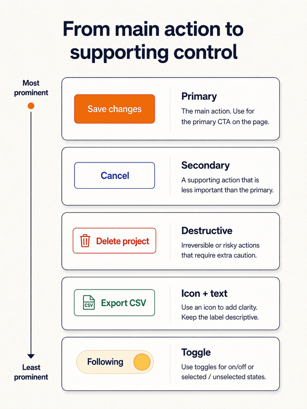
Button hierarchy: designing a clear decision system
Good button design creates a clear decision path. Users should be able to scan a screen and understand the main action, the backup option and any risky choices.
That is what hierarchy does: it turns a group of controls into a decision system.
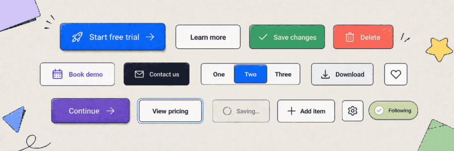
Most button systems include five core types:
- Primary
- Secondary
- Destructive
- Icon or icon-plus-text
- Toggle buttons
The exact visual treatment can vary by brand, from rounded corners to square edges, but the logic should stay consistent. Good visual hierarchy helps the most important buttons stand out without making every action compete for attention. If a primary button is bold and color-filled on one page, it shouldn’t become subtle on another just because a team preferred a different aesthetic.
Primary buttons
Primary buttons represent the most important action in a given context.
Think “Start free trial,” “Save changes,” “Proceed to checkout” or “Publish page.”
A good rule of thumb: each screen or step should have one clear answer to the question, “What should the user do next?”
Primary buttons usually have the highest contrast in the palette, a filled style and the strongest placement. They often appear at the end of forms, near key decision points or after content that supports the action.
The usual best practice is one primary button per logical step. The main exception is when the same action is repeated for convenience, like a sticky CTA in the top menu that follows the scroll and mirrors the main button farther up the page.
Secondary and tertiary buttons
Secondary buttons handle lower-priority actions on the same screen.
These include options like “Cancel,” “Back,” “Skip for now” or “Maybe later.”
They should remain clear and readable, but shouldn’t compete with the main action.
Many teams use outline, ghost or neutral button styles for secondary actions. These reduce emphasis while preserving visibility and help maintain consistency across pages.
Tertiary actions are the lightest-weight in the group. Generally, these may appear as text buttons or very subtle links, such as “Advanced settings,” “View details” or “Learn more.”
Grouping matters here.
In left-to-right interfaces, a common pattern is the primary action to the right and the secondary action to the left or below. What matters most is not the specific layout choice, but the consistency of the pattern.
Destructive buttons
Destructive actions should feel riskier than standard actions.
Buttons should help users move forward, but they should also slow users down when an action carries risk.
An action like “Delete account,” “Discard changes” or “Remove project” should stand out as dangerous, not just visually distinct.
A consistent danger-coded color, often red, helps reinforce that meaning. The label should also be explicit. “Delete project” is much clearer than “Remove.”
In higher-risk cases, destructive actions should be deliberately slowed down with confirmation dialogs, undo options or extra verification steps.
The goal is not to add friction everywhere; it’s to prevent irreversible mistakes.
Icon buttons and icon-plus-text buttons
Icon-only buttons work best when the action is highly familiar or space is extremely limited, like in a dense dashboard toolbar. Even then, they still need accessible names so assistive technologies can announce them correctly.
Search, filter and settings icons may be familiar in dense interfaces, but labels are still clearer when space allows. For most web page buttons, icon-plus-text is safer because it removes ambiguity.
A download icon next to “Export CSV” reinforces the action. An arrow next to “Next step” can help with direction. The icon should support meaning, not replace it.
Toggle buttons and selected states
Toggle buttons differ from one-time action buttons because they maintain a selected state.
Examples include “Follow,” “Favorite,” “Selected” filters and view toggles that remain active after interaction.
These controls need clear visual changes and active states so users can tell whether something is on, off, selected or applied (like “Follow” → “Following”). That feedback may come through fill changes, outlines, icon changes or label changes, but it needs to be obvious.
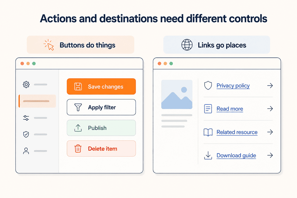
Buttons vs links: Use the right element for the job
Buttons and links serve different purposes.
Buttons trigger actions on the page, like submitting a form, saving changes, opening a modal or deleting an item.
Links move the user somewhere else, taking them to another page, section, resource or file.
That sounds simple, but teams blur the line constantly.
A “Save changes” control inside account settings should behave like a button because it performs an action right there.
A “Privacy policy” item in the footer should behave like a link because it takes users somewhere else.
A “Start free trial” control may look like a button, but if it navigates to a signup page, it should still behave predictably as a link-style CTA rather than a randomly styled element.
When buttons and links look interchangeable, people can’t predict what will happen next. That uncertainty increases hesitation, misclicks and tracking problems. It also weakens accessibility because semantics affect keyboards, screen readers and browser behavior.
Use buttons for:
- Form submissions
- Saving, publishing or deleting
- Opening modals
- Applying settings
- Toggle controls
- Actions that change the current screen or system state
Use links for:
- In-text navigation
- Related resources
- Secondary navigation
- Footer items
- Supporting references
- Downloads or files, depending on behavior and context
Simple rule: buttons do things; links go places.
Define that distinction early so your visual style and user expectations stay aligned.
Planning button roles across your website
Button decisions should happen during planning, not after the page is already designed.
When teams wait until handoff to decide what a button should say, how prominent it should be or where it belongs, they usually end up patching UX problems instead of designing a coherent flow.
If you’re working through a redesign, start with a broader foundation, like how to design a website, and then refine the interaction details that move people through the page. From there, map key actions across your core page types.
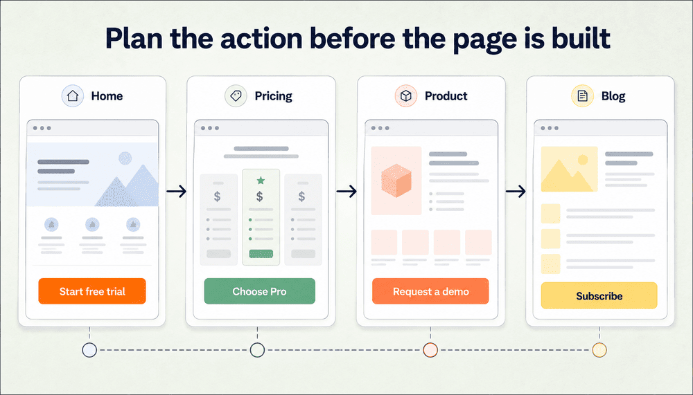
On a home page, that may be “Sign up” or “Book a demo.” On pricing, it might be “Start a 14-day free trial.” On a product page, it could be “Request quote” or “See it in action.” On a blog post, a softer CTA like “Subscribe” or “Read next” may fit better. In an account dashboard, actions become more task-specific, like “Export sitemap,” “Create project,” “Log out” or “Publish changes.”
Planning button roles early makes a few things easier:
- You define one primary action per context
- Supporting actions stay secondary instead of competing
- Tracking and event naming become easier to standardize
- Content, UX and dev teams share the same intent across IA, UI and UX decisions
This is where visual planning helps. A user flow can show where people need reassurance, where a CTA appears too early and where too many actions compete for attention. Reviewing user flow diagram examples can help teams get inspiration and spot those decision points before the page reaches design.
The same logic applies at the site level. Different types of website structure create different button needs, from simple brochure sites with a few clear CTAs to larger ecommerce, SaaS or content-heavy sites with many paths through the experience.
Website button design examples by page type
Button design decisions change depending on where the button appears and what the user is trying to do. A homepage CTA, pricing button and dashboard action may all use the same design system, but they should not all carry the same level of urgency or explanation.
Here are common website button design examples by page type:
Homepage hero CTA
A homepage hero button should point users toward the main business goal without forcing too many competing choices. For a SaaS site, that might be “Start free trial,” “Book a demo” or “See how it works.”
If there is a secondary action, such as “See how it works” or “View examples,” it should look clearly less important than the primary CTA.
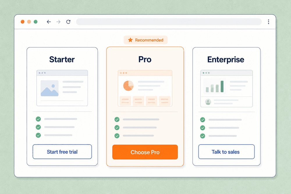
Pricing page button
Pricing page buttons should help users choose a plan with confidence. Labels like “Start free trial,” “Choose Pro” or “Talk to sales” are clearer than generic options like “Get started” when multiple plans appear side by side.
The button hierarchy should also match the plan hierarchy. If one plan is recommended, its CTA can receive stronger visual emphasis, but the other plan’s buttons still need to remain easy to compare.
Product page CTA
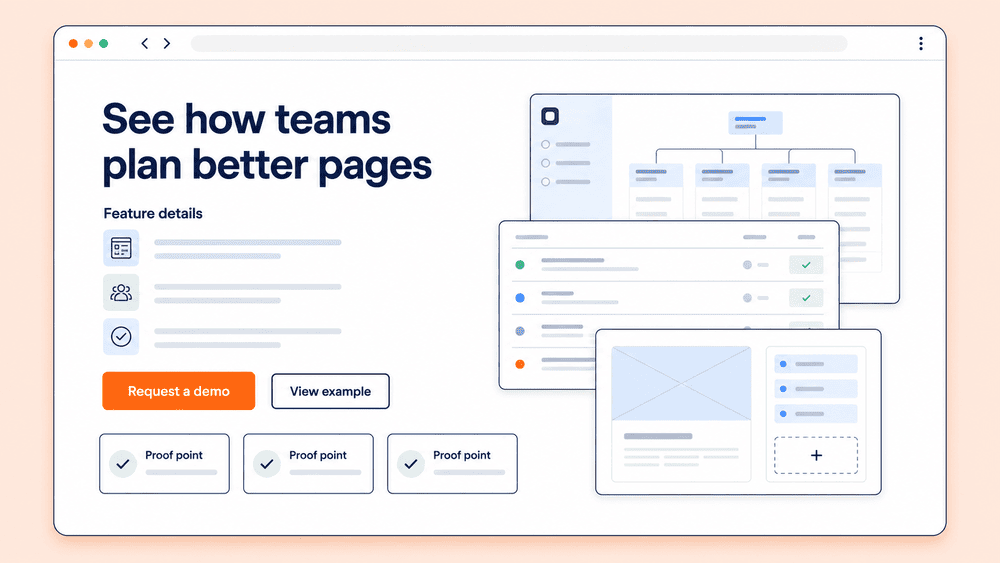
A product page CTA should match the user’s level of readiness. For high-intent visitors, “Request a demo,” “Start free trial” or “Create project” may work well. For earlier-stage visitors, a softer action like “See features” or “View example” may be more appropriate.
The key is to place the button near the product details, proof points or examples that support the decision.
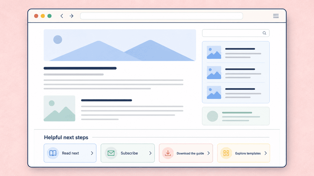
Blog or resource CTA
Blog CTAs should usually feel lighter than product or pricing CTAs. A reader may not be ready to buy immediately, so options like “Read next,” “Subscribe,” “Download the guide” or “Explore templates” often fit better than a hard sales CTA.
The best resource-page buttons match the reader’s current intent and give them a useful next step.
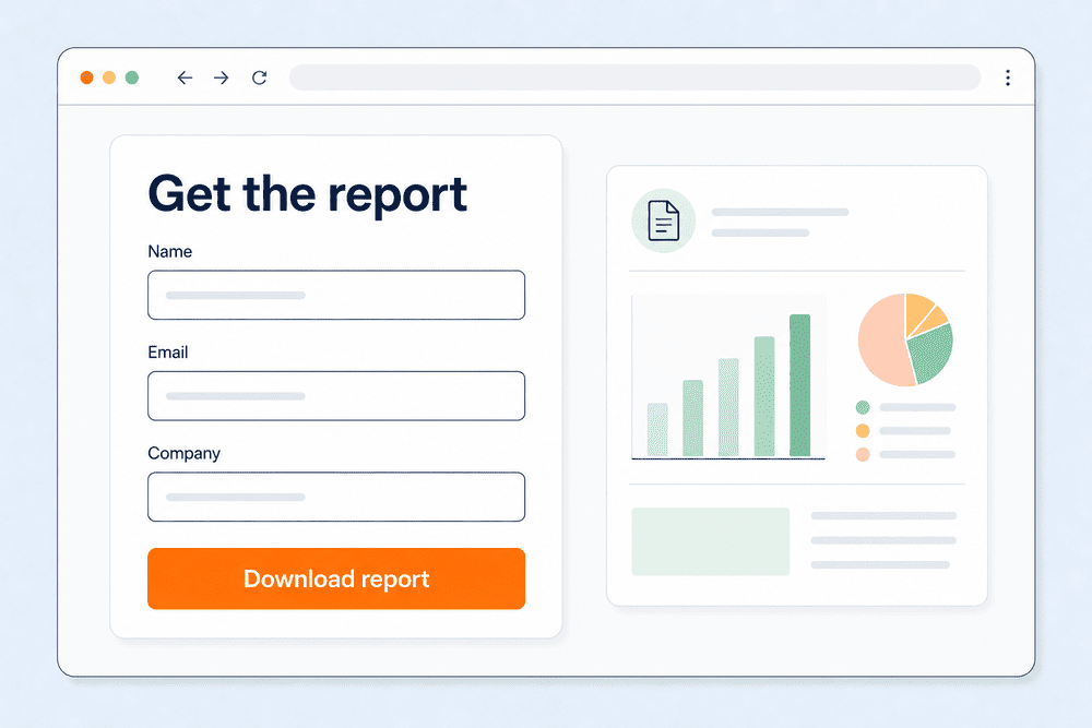
Form submit button
A form submit button should describe the action clearly. “Send message,” “Create account,” “Download report” or “Save changes” gives users more confidence than “Submit.”
If the form requires effort, the button should reinforce the outcome users receive after completing it.
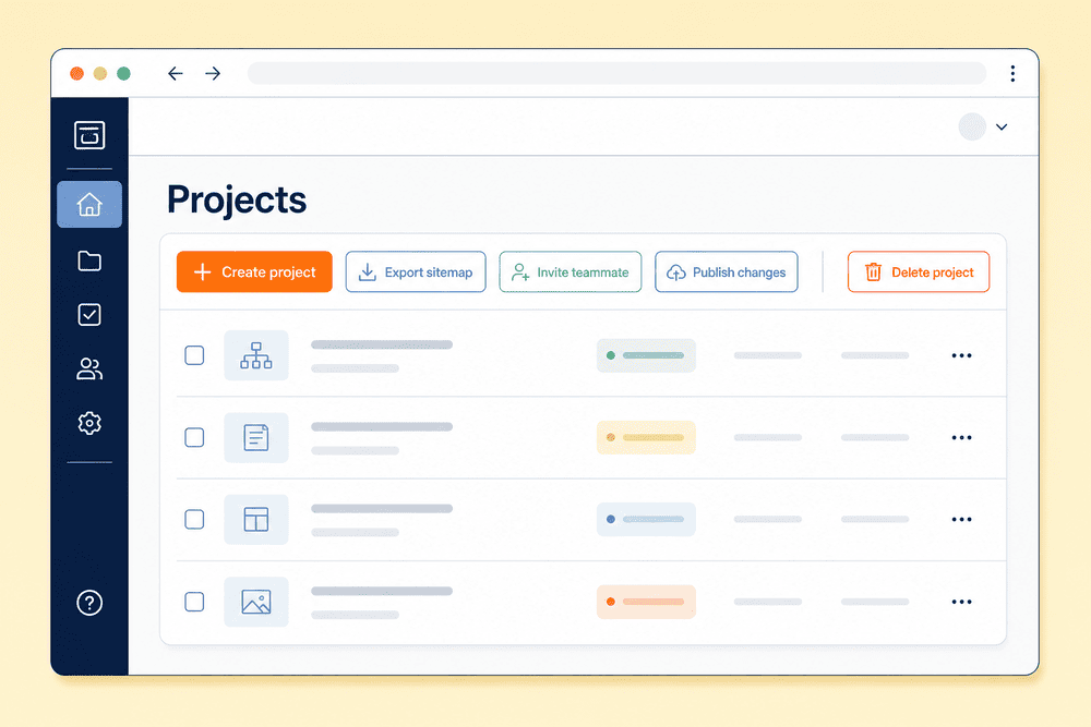
Dashboard or account action button
Dashboard buttons should prioritize task clarity. Labels like “Export sitemap,” “Create project,” “Publish changes” or “Invite teammate” are specific and action-oriented.
For high-impact actions, such as deleting, publishing or changing permissions, visual treatment and confirmation steps should make the risk obvious.
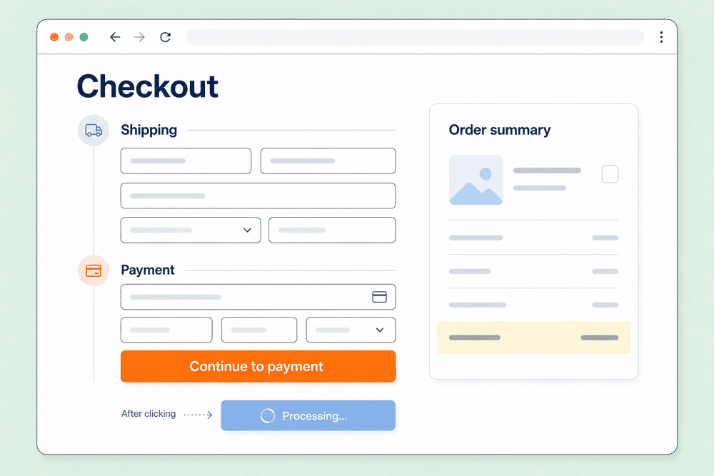
Ecommerce checkout button
Checkout buttons should reduce hesitation and make the next step unmistakable. Labels like “Continue to payment,” “Place order” or “Review order” are clearer than vague labels like “Next.”
Because checkout flows are high-stakes, button states matter here too. Loading, disabled and confirmation states help prevent duplicate orders, missed steps and user uncertainty.
Button states: communicating system feedback
Users judge interface reliability by how controls respond. State changes, or how buttons react automatically to user interaction, aren’t cosmetic details; they’re system feedback.
When a button reacts clearly, users know the interface heard them. When that feedback is weak, delayed or missing, the experience can feel broken even if the action is working.
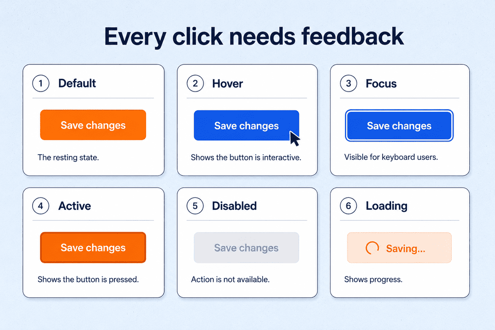
A reliable website button design system should define these core states:
- Default
- Hover
- Focus
- Active or pressed
- Disabled
- Loading
Desktop and mobile behavior will differ, but the underlying goal is the same: every state should communicate something useful.
For a modern component reference, Material Design’s button guidelines are useful for comparing button types, emphasis levels and when buttons should or shouldn’t be used.
Default state
The default state is the resting appearance. It should look interactive without relying on hover. Shape, contrast, spacing and label clarity all contribute here. If a button only looks clickable once a pointer lands on it, the default state is not strong enough.
Hover state
Hover is a helpful enhancement for pointer devices, but it’s not a substitute for good default styling. A slight background shift, border change or shadow adjustment is usually enough. Extreme inversions or flashy transitions can reduce clarity.
Focus state
Focus states are critical for keyboard users and assistive technologies. They should be obvious, not subtle. Strong outlines with clear contrast are far more reliable than tiny glows. This is one of the simplest places to improve usability quickly.
Active or pressed state
This is the moment the button confirms interaction. A slight darkening, compression or shadow change can help the button feel responsive. It should register instantly and resolve quickly.
Disabled state
Disabled controls communicate that an action is currently unavailable. The mistake many teams make is making them so faint that they become unreadable. A disabled button should still be understandable and paired with context when possible, like helper text explaining what’s missing.
Loading state
If an action takes more than a moment, the button should show progress. Changing the label to “Saving…” or “Publishing…” often provides more clarity than a generic spinner alone. Loading states also reduce double-clicking and build user confidence by showing that the action is still in progress.
Accessibility for web page buttons: modern best practices
Accessible buttons aren’t an optional layer added at the end. W3C accessibility guidelines give teams a baseline for building interfaces that work for more people. Better button accessibility improves clarity for everyone, whether they click, tap, use a keyboard or rely on a screen reader.
This is where strong semantics, contrast, visible focus states, clear labels and usable touch targets come together.
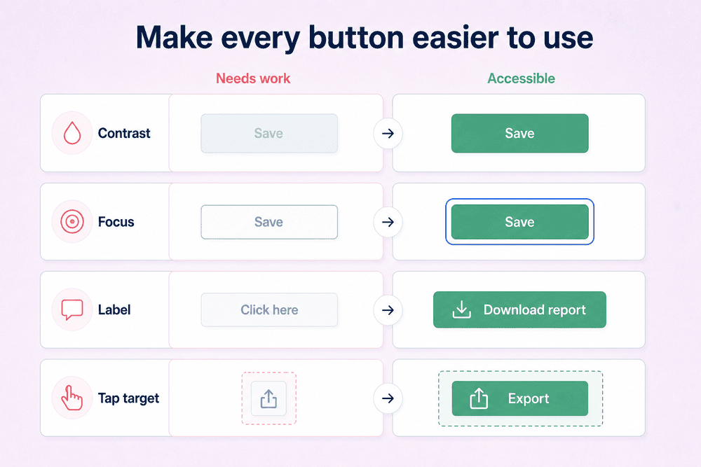
Accessibility is easier to apply when teams have clear measurements to check against. Exact requirements can vary by standard and context, but these are useful benchmarks for web page buttons:
| Accessibility check | Recommended benchmark |
|---|---|
| Touch target size | Aim for at least 44x44px for comfortable tapping |
| Physical touch area | Aim for roughly 7x7mm or larger on touchscreens |
| Mobile/platform target | Use 48pt or comparable platform guidance when designing for mobile interfaces |
| Button text contrast | Maintain at least 4.5:1 contrast for normal text |
| Button boundary contrast | Maintain at least 3:1 contrast for meaningful UI component boundaries |
| Focus state | Provide a visible focus state for keyboard users |
| Color dependence | Do not rely on color alone to communicate state, risk or availability |
These measurements aren’t a substitute for testing, but they give designers, writers and developers a shared baseline. A button should be readable, distinguishable, keyboard-accessible and large enough to activate without precision tapping or frustration.
Semantics and native elements
Use native <button> elements for actions whenever possible and define the right type attribute when the button appears inside a form. Semantic buttons provide keyboard behavior, focus handling and accessibility support by default. Teams lose that built-in behavior when they recreate button behavior with clickable <div> or <span> elements.
Contrast and legibility
Buttons need enough color contrast to be seen and understood across states. That includes text contrast inside the button and visual separation from the page background. Outline buttons need just as much scrutiny as filled buttons because low-contrast borders can disappear quickly.
Labels and accessible names
Every action should have a label that makes the outcome clear. “Download report” is stronger than “Go.” Icon-only controls need accessible names so screen readers can announce the action, not just the icon.
Focus order and keyboard support
Buttons should appear in a logical focus order and remain operable by keyboard. That means visible focus indicators, correct tab flow and predictable behavior when users press Enter or Space, for example.
Mobile button design and touch targets
Designing buttons for mobile websites and apps comes with a few extra variables: smaller screens, less precise input and no hover state to clarify what’s clickable.
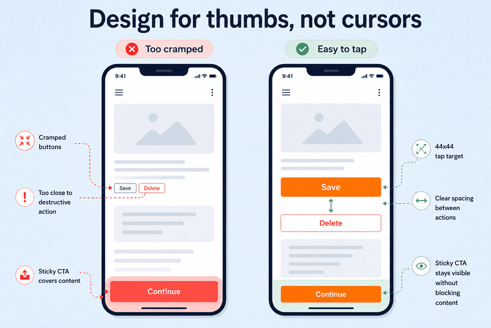
Touch changes the rules. Fingers are less precise than cursors, and reach zones — the areas of the screen users can comfortably reach — matter far more.
That means web page buttons cannot simply inherit desktop sizing, spacing and placement.
Tap targets and spacing
A minimum target around 44x44px is a common baseline because it reduces accidental taps and makes actions more comfortable. Spacing also matters, especially when destructive and non-destructive actions appear near each other. This matters even more in long forms, where small buttons or cramped spacing can make completion feel harder than it needs to be.
Thumb reach and placement
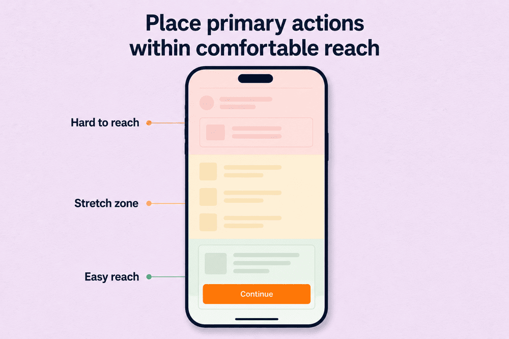
On larger phones, bottom and center areas are easier to reach than top corners. Primary actions within apps or site pages should sit where users can comfortably interact with them, especially on repeated or high-priority flows.
Sticky CTAs and scrolling
Sticky CTAs can help on long pages, but only when they don’t crowd the screen or overlap important UI. A persistent action bar that hides content, collides with chat widgets or obscures form controls quickly becomes a usability problem.
Floating buttons can also work for chat, help or high-priority actions, but they need the same restraint.
As you work through these decisions, user testing and heatmapping can validate whether mobile buttons are easy to find, understand and tap.
Button labels: How to write clear button text
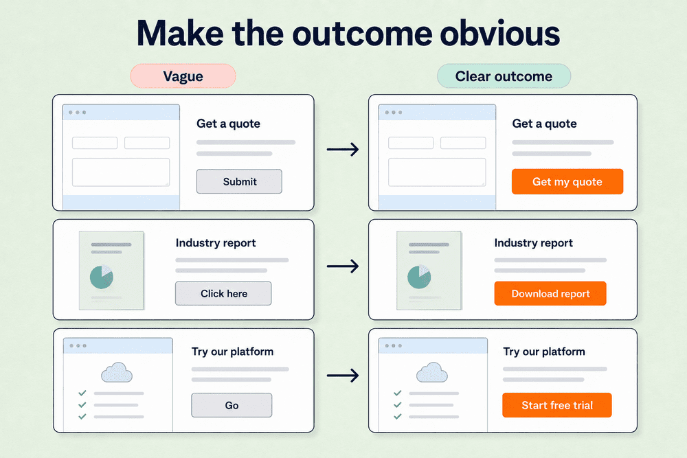
Button labels should tell users what will happen after they click or tap. The best labels are short, specific and tied to the outcome of the action.
Start with a clear verb when possible. “Download report,” “Save changes,” “Create account” and “Invite teammate” are easier to understand than vague labels like “Submit,” “Go” or “Click here.”
Good button copy usually follows a few simple rules:
- Use action verbs
- Match the label to the outcome
- Keep the copy short and specific
- Avoid clever or vague microcopy
- Make destructive actions explicit
- Use the same label for the same action across the site
Destructive actions need extra clarity. “Delete project” is stronger than “Remove” because it tells users exactly what they are about to do. For lower-risk actions, the same principle still applies: the label should reduce uncertainty, not create it.
Button labels also need to match the surrounding context. A button that says “Download report” should download a report. A button that says “Start free trial” should take users into a trial flow, not a generic contact form.
A useful test for button text is WYLTIWLT, short for “would you like to/I would like to.”
Put the button label after both of those phrases and see if it still makes sense.
For example, “Download the report” works because both “Would you like to download the report?” and “I would like to download the report” make sense.
On the flipside, “More information” fails because “Would you like to more information?” and “I would like to more information” don’t make grammatical sense.
It’s not a perfect test, but it is a quick way to check whether a button label starts with an action and can be understood from both the website’s point of view and the visitor’s point of view.
First-person labels like “Start my trial” or “Download my report” can make the action feel more personal, but they don’t always pass the WYLTIWLT test cleanly. Use them only when they sound natural in context. When in doubt, a neutral verb-object label like “Start free trial” or “Download report” is usually clearer.
Conversion-focused CTAs
CTA buttons sit at the intersection of UX design and business goals. The goal is to create buttons that are clear enough to understand immediately and persuasive enough to move qualified users forward.
That doesn’t mean every page needs louder buttons. It means each page needs the right action, the right supporting context and the right level of visual emphasis.
Write CTA copy around outcomes
Strong button text describes what users get or do next. “Get my quote,” “Download report” and “Start 14-day free trial” are clearer than vague labels like “Click here” or “Submit.”
For more CTA copy ideas, see our breakdown of call-to-action examples (and why they work).
Match placement to decision readiness
Buttons perform better when they appear near the information that supports the decision. That may be after benefits, feature summaries, social proof or pricing context. Randomly dropping a CTA into the middle of a paragraph rarely helps.
Measure the full context, not just the button
A weak value proposition, confusing form or cluttered page cannot be fixed with button color alone. Measure the button, but also evaluate the surrounding page experience.
Useful CTA performance signals include:
- CTA click-through rate: Are users noticing and clicking the button?
- Form completion rate: Are users finishing the flow after they click?
- Signup or demo conversion: Is the button helping qualified visitors take the intended next step?
- Heatmaps: Are users seeing the CTA, missing it or tapping nearby elements instead?
- A/B testing: Do different labels, placements or visual treatments change behavior?
- Mobile tap behavior: Are users tapping comfortably, mis-tapping or abandoning on smaller screens?
For conversion optimization, the goal isn’t to optimize the button in isolation. It’s to understand whether the CTA, surrounding content and user flow are working together.
Common mistakes
Most button problems are easy to spot once you know what to look for. They show up as hesitation, missed actions, confusing scans or accidental clicks.
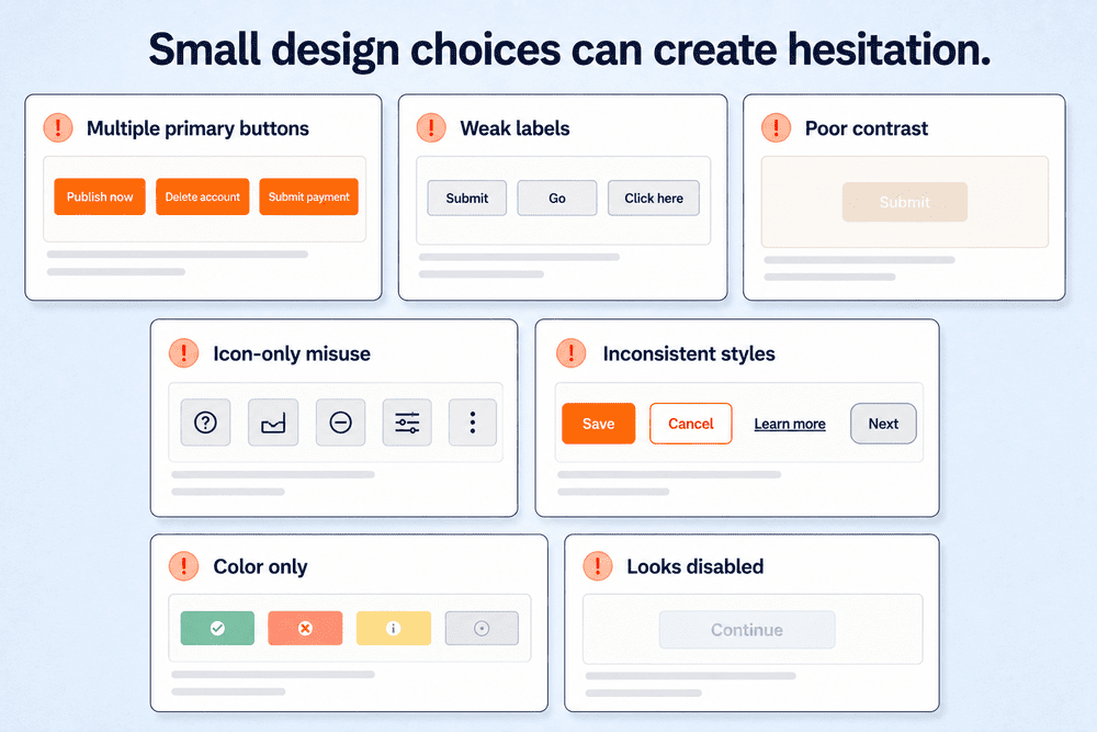
Multiple primary buttons
When every action looks primary, nothing feels primary. Too many high-emphasis buttons force users to stop, compare options and decide which action actually matters instead of moving naturally toward the best next step.
Weak or generic labels
Labels like “Submit,” “Go” or “Click here” create uncertainty because they don’t explain what happens next. Outcome-based copy reduces ambiguity.
Poor contrast
Buttons that blend into hero images, gradients or similarly colored sections can disappear in real conditions, even if they looked fine during design review.
Icon-only misuse
Icons without labels can work in familiar, space-constrained contexts, but overusing them makes actions harder to understand and easier to miss.
Inconsistent styles and behavior
When different pages invent different button patterns purely for creative reasons, users lose the benefit of recognition. Consistency is part of usability, not just brand polish.
Buttons that rely only on color
Color can support meaning, but it shouldn’t be the only way a button communicates state, risk or availability. Pair color changes with labels, icons, outlines, helper text or other visual cues so users can understand the button even if color perception varies.
Secondary buttons that look disabled
Secondary buttons should be lower emphasis, not unclear or inactive-looking. If an outline, ghost or text button is too faint, users may assume it is unavailable. Keep secondary actions readable and clearly interactive, even when they are visually quieter than the primary action.
Button checklist
Use this checklist to audit website buttons before launch or during a redesign.
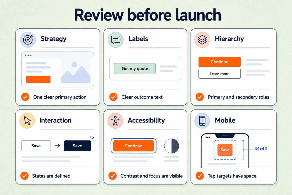
Strategy
- Does each page or step have one clear primary action?
- Are supporting actions visually subordinated?
- Are buttons placed near the information users need to make a decision?
Labels
- Does each button label describe the outcome clearly?
- Have vague labels been replaced with specific language?
- Are destructive actions explicitly labeled?
Hierarchy
- Are primary, secondary and destructive actions clearly differentiated?
- Is button hierarchy consistent across templates, pages and workflows?
Interaction
- Are default, hover, focus, active, disabled and loading states defined for each major button type?
- Do buttons feel responsive without over-animating?
Accessibility
- Are semantic
<button>elements used where appropriate? - Are focus states visible?
- Do contrast and accessible names hold up across states?
Mobile
- Are tap targets large enough?
- Are destructive actions spaced safely?
- Do sticky CTAs stay visible without covering content or form controls?
- Is there consistent sizing and enough padding across repeated button patterns?


Share & refine designs with Slickplan
Add mockups from Figma or your computer to ensure UX/UI is moving in the right direction.
Turn button design into a repeatable system
Buttons are not just interface elements; they’re commitment points. They’re where users decide whether to continue, submit, confirm, explore or leave.
That’s why small improvements in website button design can create meaningful gains in usability and conversion.
Start with your most important flows, like signup, contact, checkout or account creation. Review each button’s purpose, hierarchy, label, state and accessibility. Then test the interaction, clean up anything that creates hesitation and turn the strongest patterns into reusable rules.
From there, use design mockups to standardize user-friendly button patterns across the rest of the site before they reach development.
What is a web button?
A web button is an interactive element that helps users take action on a website. Common examples include submitting a form, starting a signup flow, saving changes or completing checkout. Good web buttons use clear labels, visible styling and feedback states so users know what will happen next.
How do you design website buttons?
Start with the button's purpose. Decide what action the user needs to take, how important it is and where it belongs in the page flow. Then refine hierarchy, label, size, spacing, states and accessibility. Strong website button design makes the next step clear without making every action compete for attention.
What is the standard size of a button on a website?
There's no single standard button size for every website, but buttons should be large enough to read, click or tap comfortably. For mobile button design, a tap target around 44x44px is a common baseline. Desktop buttons can vary more, as long as the label is legible and spacing feels clear.
How do you create a button style?
Create a button style by defining its visual system: shape, size, color, typography, spacing, border, icon use and states. Include styles for primary, secondary, destructive, disabled, focus, hover and loading states. The key is consistency, so the same type of action looks and behaves the same across the site.
How do I make my own buttons?
Use a semantic `<button>` element for actions like submitting forms, saving changes or opening modals. Then style it with CSS to match your design system. Give the button a clear label, visible focus state and enough contrast. If the element sends users to another page, use a link instead.
What are button states?
Button states are the visual and functional changes a button uses to communicate interaction to a user. Common button states include default, hover, focus, active, disabled and loading. These states create clarity and help users understand when a button is available, selected, pressed, unavailable or processing an action.
What makes a CTA button effective?
An effective CTA button combines a clear action, strong visual contrast, relevant placement and outcome-focused copy. It should appear near the information that supports the decision and make the next step obvious without competing with too many other actions.
What is the difference between a button and a link?
A button triggers an action on the current page or system, such as submitting a form, saving changes, opening a modal or applying a setting. A link takes users somewhere else, such as another page, section, resource or file. Think of it like this: buttons do things; links go places.


 Facebook
 X
X Youtube
 LinkedIn
 Vimeo
Vimeo