What is a Mood Board?
Mood boards are to designers what outlines are to writers. They are a way to collect and organize the thoughts and ideas for a design project; from color palettes to typography. Mood boards help designers and stakeholders visualize where a project is going, before it even starts.
You can make your mood board physical or digital, either way, using a mood board is ideal for communicating a project’s visual direction and is more effective than a verbal discussion. Presenting a mood board, or two, can give your client a more accurate picture of how their final website will look and feel. This may otherwise not be accomplished until it’s too late in the design process. Ultimately, using mood boards can save time and money, while also making both you and the client more prepared.

🎬 Learn what Slickplan can do!
We filmed a short video to show you exactly how to use Slickplan
It Starts with Inspiration
Web design agency, ProtoFuse, explains that mood boards are ideal for setting branding guidelines, communication styles, and personality. They are more than just a means to pitch design ideas. They are an introduction to your proposed design style. A mood board should be unique to every project. Don’t reuse or re-purpose old mood boards even if they are for the same client. Create something new and fresh each time. Your clients want to stand apart from their competitors and giving them a custom, personalized mood board can demonstrate your commitment to helping them achieve this.
Why we recommend starting every design project with a mood board:
They organize your inspirations.
Janie Kliever, a graphic designer and writer, points out that mood boards help you gather ideas and inspiration for a project. You can create as many boards as you’d like, to organize your different concepts. You may have a collection of fonts and colors in mind that fit a particular theme. On the other hand, you may have an image or phrase you are using for inspiration, that doesn’t fit the same theme, but which you also wouldn’t mind exploring. Set up a mood board for each, then elaborate. Show them to your client and help them decide which represents their organization best!
They bring life to the client’s vision.
Your client may have many stakeholders weighing in with their own unique desires for the website design. Many times these wishes are communicated verbally and provide very little actual direction for a designer to build on. Using mood boards to present your vision of stakeholder requests is a great way to present their ideas back to them, visually, and to make sure you are all on the same page with design concepts. Bringing your client’s ideas to life can ease their anxiety and give them the confidence they need to move forward with a design strategy!
What mood boards aren’t.
You want to make sure you don’t get carried away with mood boards though. Remember, the mood board is not the actual project, it’s just a technique to give life to the project’s direction before you actually start work on the final product. Eric Sharp with Protofuse points out that when constructing a mood board, you shouldn’t focus on specific pages, content, the sitemap, or the user flow of a website. Instead, help your client visualize fonts, colors, and an emotional mood. Save major UX and UI design decisions for the actual website work.
The Anatomy of a Mood Board
While there are no set guidelines that specify when a mood board is considered complete, there are definitely some elements to pick and choose from when deciding what to include. Remember to keep in mind your client’s brand image and culture when looking for inspiration.
Choose a color palette.
According to Kissmetrics and NeilPatel.com, 85% of shoppers place color as a primary reason for why they are buying a particular product. Start by asking whether your client already has an established color palette in their visual brand strategy. If not, try coming up with a couple options that you feel work well with the visual assets that your client already has. This can help create a sense of familiarity and continuity with your designs.
Clients may ask you to choose a new direction altogether. When starting from scratch, begin by thinking about what colors might represent the brand’s philosophy and what emotions they may want to convey to website visitors. Highly saturated reds, oranges, and yellows can evoke energy and excitement which might be just the thing to build some buzz for a consumer product or entertainment related website. Consider more calming blues or muted colors for organizations that want to build consumer trust and confidence like banks, finance, or insurance based websites.

Source: Coverwallet
Colors can really help to set the emotional mood of your website project. Learn more about the meaning of different colors from graf1x.
Once you have an idea for the base color, consider using a palette generator to help decide on what other colors might make good compliments:
Coordinate typography.
It’s a good idea to present at least 3 font variations that compliment each other. The different font styles may represent different hierarchies of design. For example, a certain font may be used for titles, another for menus, and one for content. Even calls to action may have their own designated font. Check out this great tool over at typotheque.com for testing out font combinations.

Include a few photos or illustrations.
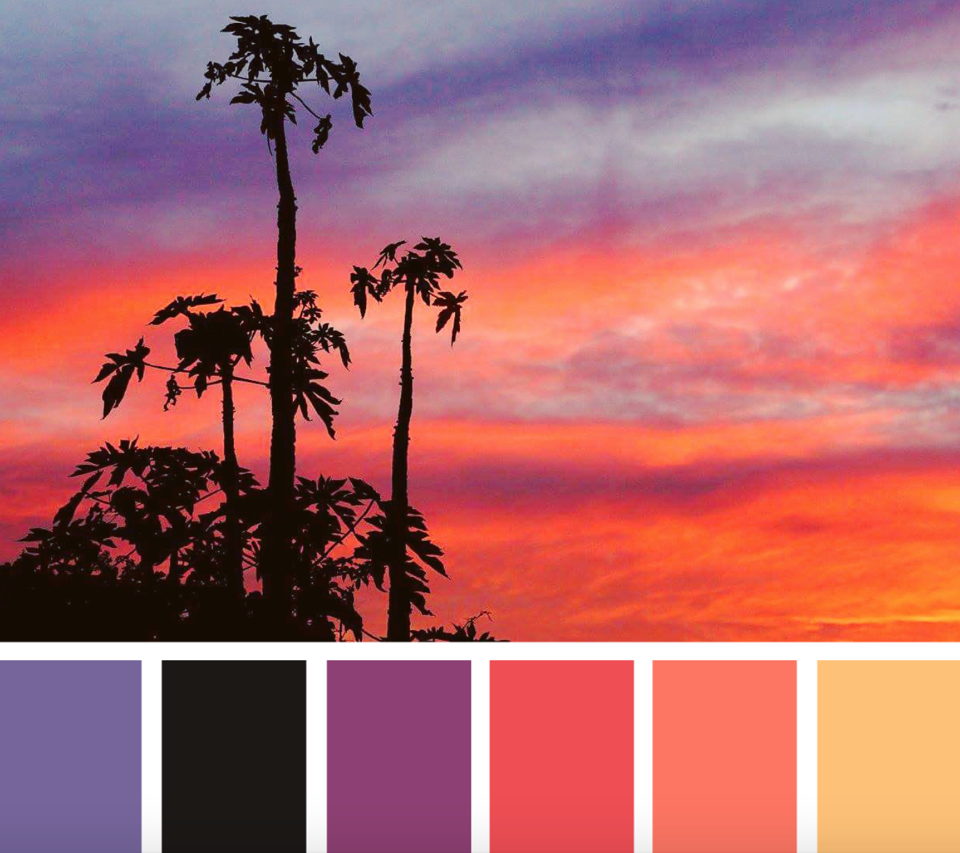
When adding photos or illustrations, be selective and keep in mind that less may be more. Adding imagery is a great way to showcase how your color palette and typography were inspired. Photos and illustrations also help to build the emotion from the color palette. For example, the pairing of a color palette of blues, purples, and pinks with a beautiful image of a beach at sunset can help to evoke emotions of fun and relaxation. Consider a variety of images that each reflect different aspects of your client’s brand philosophy or the emotions you want to convey with the website. Photos can be great stand-ins for concepts and illustrations, which works well to align the mood board to that of the brand’s offering or intent. Here are a few great places we recommend, to find imagery:

Embellish with menus, navigation, and icons.
If you have been inspired by specific design elements such as a slick menu layout or a charming icon collection, be sure to incorporate it into your mood board. Including these elements into your mood board can show how all the aspects of your ideas can work together harmoniously. It can be very helpful for the design team to know in advance what types of design elements the client prefers. Use these elements to give your client an idea of what the design elements of the finished product may be similar to or actually include. Getting approval on the styling of these design elements early on can help to cut down on future revisions.
![]()
Tips for Creating Your Mood Board
The perfect mood board is one that harmonizes the creative ideas of a designer, with the visions of decision-makers. It is a practice that is both imaginative and practical. Mood boards set the visual tone of the website so that users experience a clear and unified message. We came up with some tips to help you make the most of your mood board:
Think of it as a collection.
Unlike a mock-up, which is a sketch of your ideas for a website, a mood board is more of a collection of creativity that will be used to influence that sketch. Designers should collect elements that represent the final website in the most abstract way. You’re creating a mood, not a website.
Create more than one.
Since a business culture usually has many dimensions, it may be hard to pinpoint which direction to take when designing a website. By presenting two or three mood boards you can focus on unique aspects, see how they work together when combined, and seek out further inspiration. Think about testing a few different mood board scenarios with clients, stakeholders, and even people in their target audience. The client will be able to form opinions about what they like and dislike as well as gain insight into what resonates with their audience, ultimately helping them to make decisions.

Make it easy to follow.
You may be showing you mood board to several people within your client’s organization. Remember that everyone who sees it might not be a graphic designer. Ensure your mood board is free of jargon and is easy to follow. Make sure all of the elements flow together to form a common theme. You can even label images and provide descriptions. Do whatever’s necessary to communicate the big picture.
Plan to collaborate.
Mood boards are not merely about communicating your ideas, they’re also about reaching an agreement with everyone involved. For a designer, this means considering the overall aesthetics as well as the needs of the user and the client. When creating and presenting mood boards, seek feedback from your team often and look for opportunities to make changes.
Looking to share your mood boards online and gain feedback from your clients and stakeholders? Consider checking out Slickplan’s Design Mock-up tool. Easily upload your mood board images and create a centralized hub for the collective discussion.
Seek inspiration from others.
Looking through a variety of design work from others can help to jump start your own creative process. There are plenty of great sources for inspiration out there but we really like the 4 below:

Be willing to be abstract.
Mood boards provide an opportunity to metaphorically ‘let your hair down’ and get creative. That means you should be willing to include images that aren’t necessarily directly related to the client’s business. Sure, you’re working on their website, but perhaps your inspiration came from that relaxing tropical vacation you had a few months ago. Tell your client’s story with a mood board.
Use designs specific to the project.
Using website design elements like buttons, forms, or icons as inspiration can actually be quite time-saving in the long run. Incorporating these types of elements into a mood board may help give clients an idea of what your final design may include. Just remember to keep your mood board about the feel of the design and not the actual design. If they end up liking the website elements too, even better!
Create mood boards for specific sections.
Sometimes creating one board for an entire website can be overwhelming to look at. Try creating multiple separate boards, each with a more narrow focus. This helps to focus attention when a mood board has to convey a large quantity of information.
Think visually. Improve UX with Slickplan
Build intuitive user flows, stronger customer journeys and improve information architecture.
Ready to get started?
Check out some of these great examples of mood boards to get yourself inspired!


 X
X

