There’s no shortage of UX portfolios for hiring managers to review; the issue is making yours clearly demonstrate how you think as a UX designer and why you’re a good fit.
The strongest UX design portfolios don’t rely on visual flash or cleverness; they show structure, decision-making and outcomes — how you think, problem solve and create value. Use this guide to understand what a complete UX portfolio should look like and how to build one at every stage of your career.
Key takeaways
- Show your process clearly — top-tier UX portfolios focus on decisions, your design thinking process and problem-solving, not just final screens.
- Make your thinking easy to follow — the best UX portfolio examples highlight research, structure and outcomes in a way that’s quick to scan and understand.
- Curate, don’t accumulate — a few clear case studies that explain how you think are more effective than a long list of projects.
What is a UX portfolio?
A UX portfolio is a collection of UX case studies that show how a designer approaches problems, makes design decisions and delivers value — not just a bunch of UI screenshots. It’s the evidence of a designer’s ability to understand user needs and use UX design to meet them while navigating business constraints. In practice, it’s also a risk-reduction tool for the people evaluating your work.
🎬 Learn what Slickplan can do!
We filmed a short video to show you exactly how to use Slickplan
What to include in a UX portfolio
Compelling UX portfolios should effectively demonstrate how a designer thinks, makes decisions and delivers value. Companies aren’t looking for inspiration — they’re looking for confidence in your UX design process.
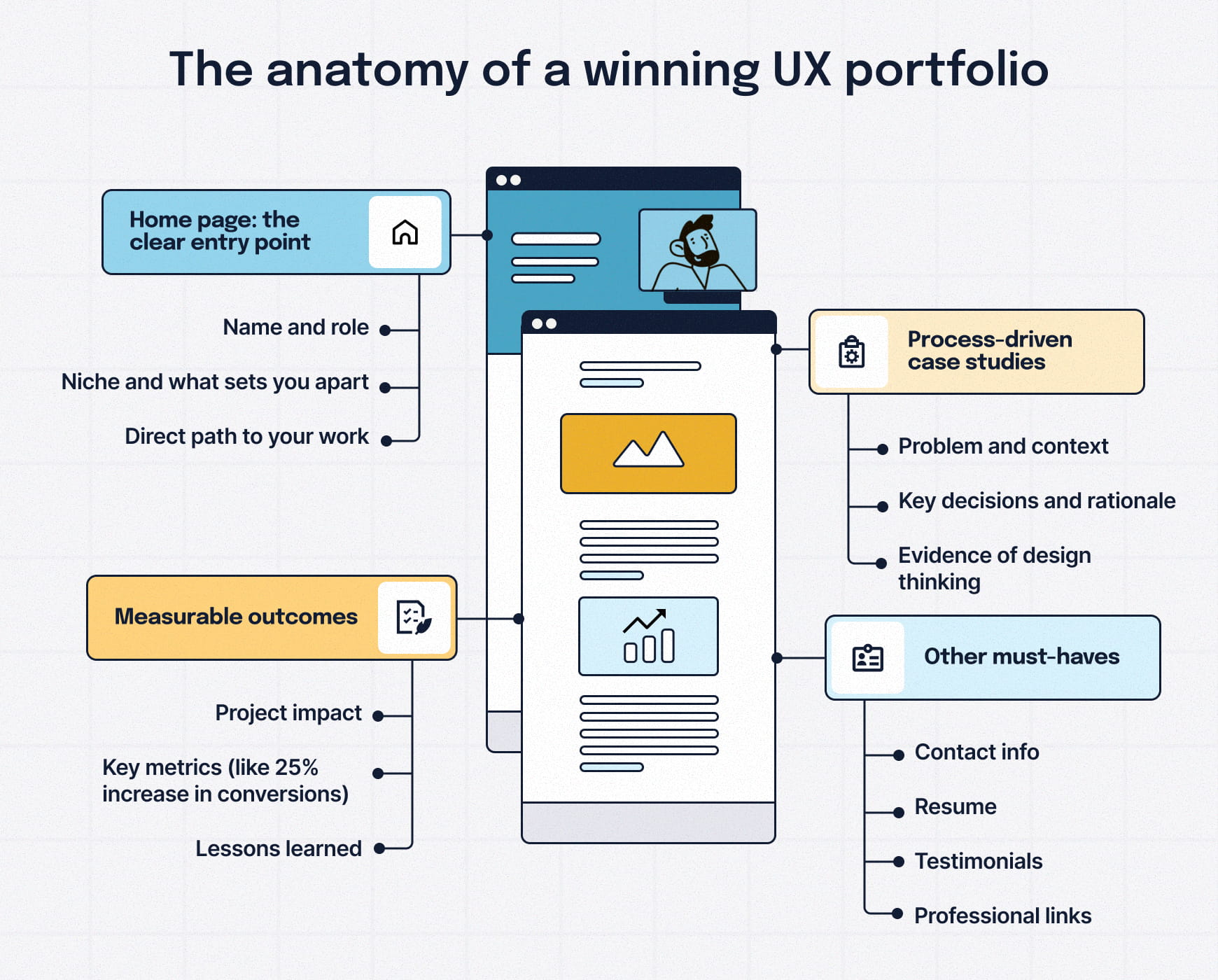
Alongside a brief UX designer resume, the best portfolios consistently include the following.
A clear entry point that sets context
Your portfolio’s home page should immediately clarify your role, focus and the type of problems you work on that set you apart. Reviewers should understand who the work is for and what you specialize in within seconds.
Case studies that explain decisions
Screenshots alone don’t show UX skill. Powerful case studies quickly frame the problem, the designer’s role and then the in-depth reasoning behind key decisions — not just the final outcome.
A visible UX process
Great portfolios make the UX design process easy to follow, from UX research and framing to mapping user journeys through to wireframing, structure and validation. The level of detail should match your experience.
Visuals that support the story
The visual elements matter. UX portfolios should showcase how the process translated into effective interaction design, clear interfaces, thoughtful layouts and other visual elements like color palette and font choices.
Measurable outcomes and impact
Effective UX portfolios show what changed because of the work. That might be improved usability, clearer workflows, increased trust or measurable product results — not just a finished design. Be mindful of getting permission to share metrics.
Focused curation of case studies
A few exceptional case studies outweigh a lengthy list of projects. Each project should earn its place by demonstrating clear thinking, not just visual variety. Aim for three to five detailed examples showcasing your skills and versatility.
Other UX design portfolio must-haves:
- Contact information and professional links like LinkedIn, Behance or Dribbble
- Resume download option or embedded LinkedIn profile for easy access
- Testimonials from colleagues, managers or clients when available
- Clear navigation that allows visitors to easily explore your work
- Professional domain name that reflects your brand identity
- UX design tools you’re proficient with, where relevant
Bottom line: in 2026, hiring managers prioritize a designer’s problem-solving process over a collection of polished visual designs.
UX portfolio case studies worth learning from
Case studies are where a UX designer’s portfolio moves from style to substance. The strongest UX portfolio examples consistently do three things well:
- Clearly frame the problem and context
- Show how research and UX decisions shaped the solution
- Connect the work to outcomes, impact or learning
The UX designer portfolio examples below are great examples because they strike the right balance between story, process and results. Each one shows how the designer thinks — not just what they shipped.
They lean into detailing the process by including research summaries, user flows, wireframes, and usability findings to explain decisions as they happened. The focus isn’t on polish, but on how insights turned into design choices.
Sam Weston | Grubhub: improving ordering through iterative UX decisions
Sam’s Grubhub case study meticulously documents the UX process, methodically showing how deep user research, exploration and iteration led to confident UX decisions.
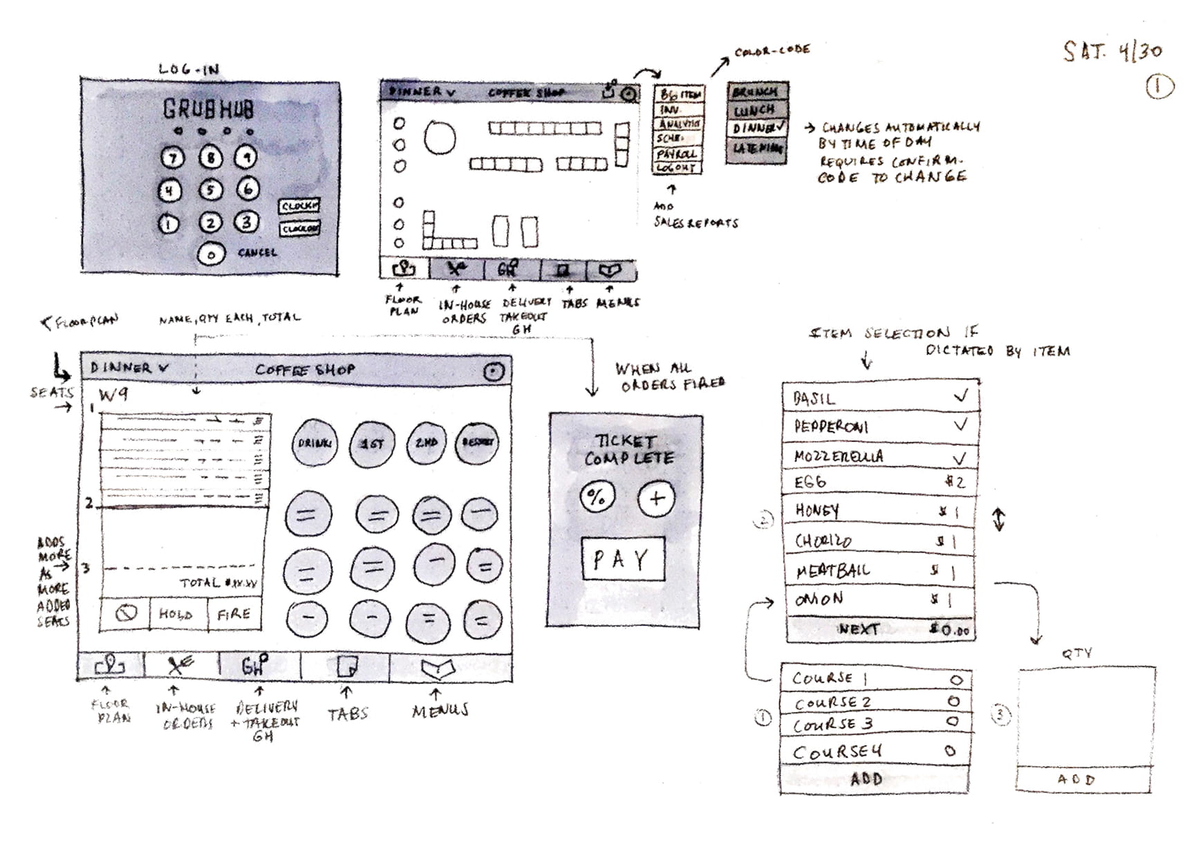
Source: Sam Weston
He does an excellent job documenting assumptions, constraints and fieldwork, connecting usability findings directly to changes in flows and interactions. The case study emphasizes how the UX design process is a living one.
Simon Pan | Uber: perfecting the pickup
Simon’s UX portfolio example for Uber is a hyper-detailed explanation of his team’s work to reduce confusion and friction during the pickup experience. An excellent example of how real-world research translated into concrete UX/UI decisions, clearly laying out his workflow, thought process and product design skillset.
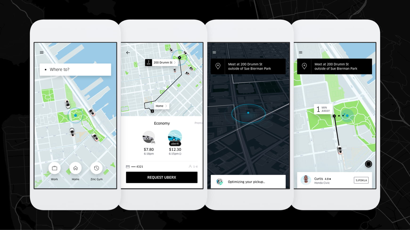
Source: Simon Pan
Research observations, testing and usability findings informed changes to flows, user interface and interactions over time, leading to notable improvements. The result is a compelling example of design thinking.
Daniel Autry | The Washington Post: enhancing the 2020 election user experience for younger audiences
Daniel’s Washington Post example is a concise, outcome-focused case study anchored in UX work that was delivered in a high-visibility context.
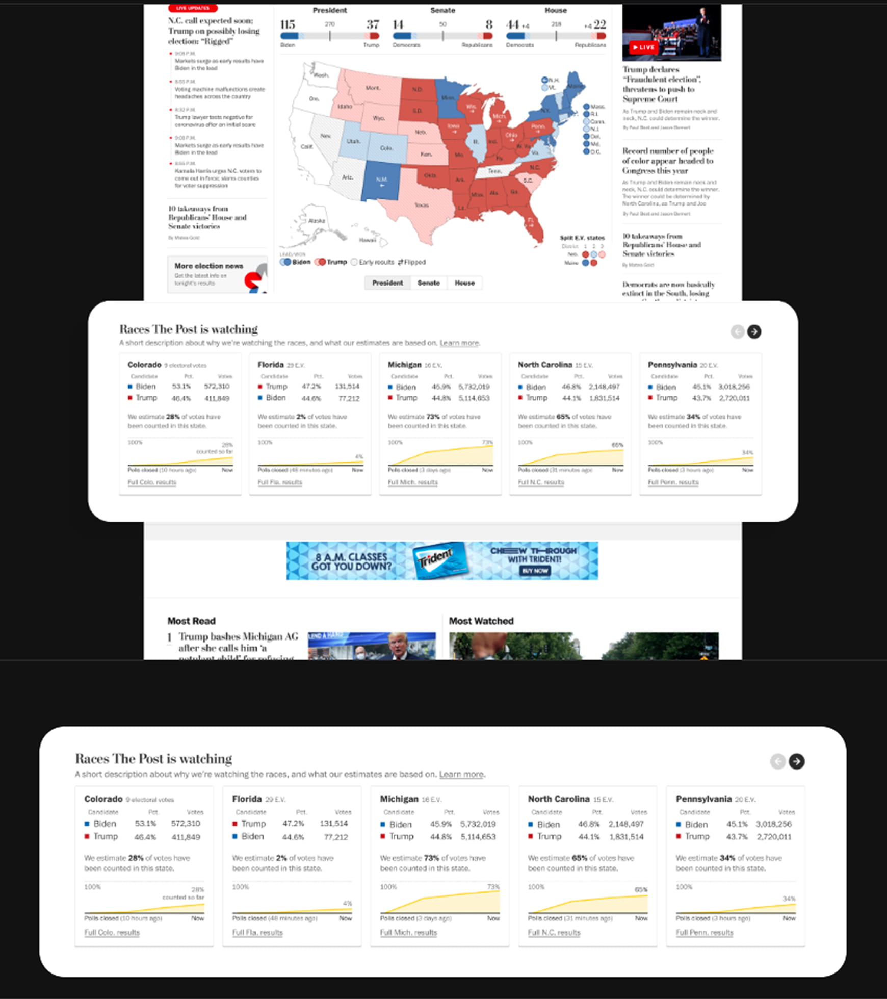
Source: Daniel Autry
It shows how UX decisions shaped core aspects of the 2020 Presidential Election coverage experience, improving usability and engagement in a high-stakes editorial environment.
Ellen Covey | MarcoPolo World School: building trust with parents
Ellen’s portfolio website features a process-oriented case study for MarcoPolo World School, which stands out for its clarity. The project is framed around improving install-to-trial rates by identifying and designing solutions that build trust with parents.
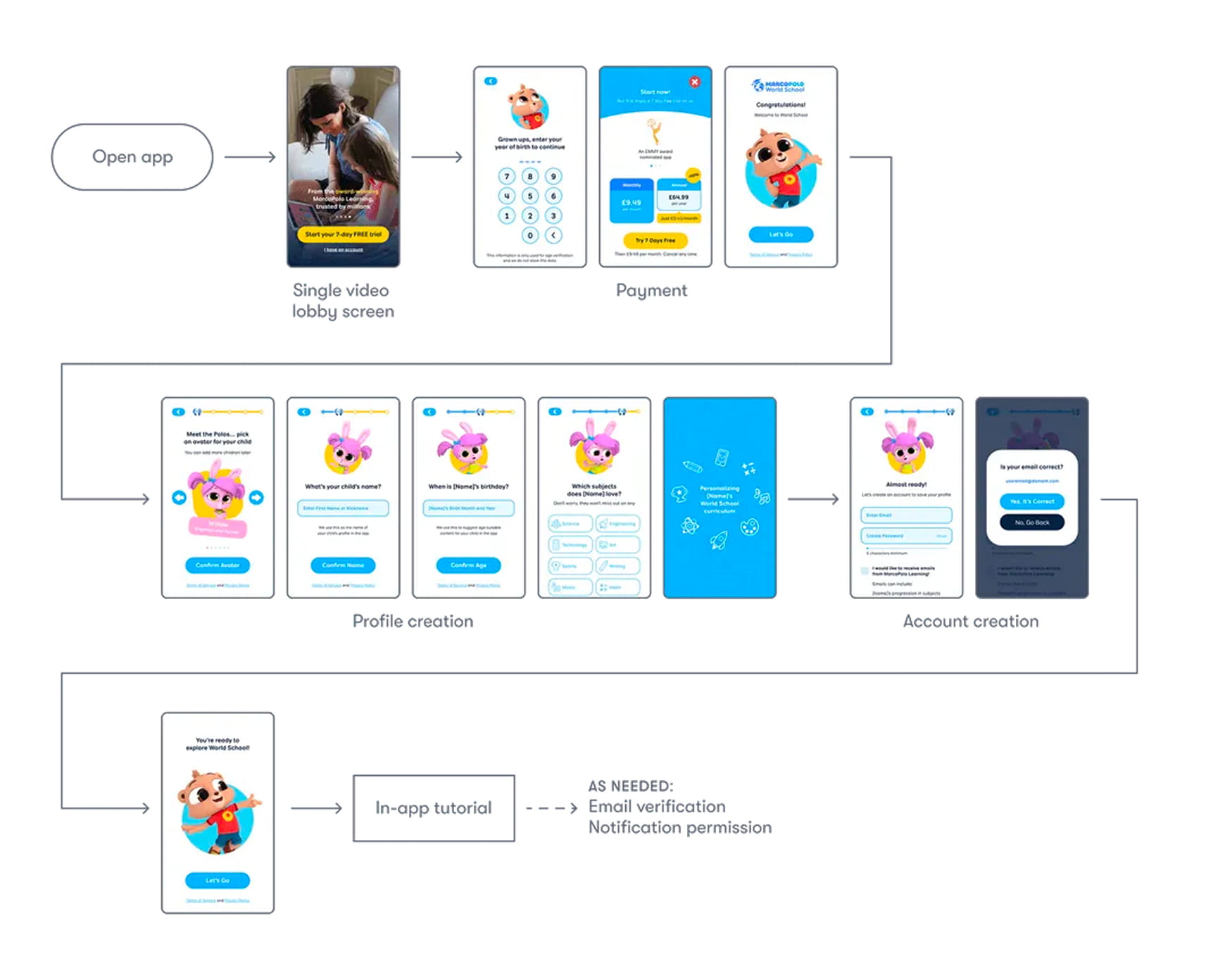
Source: Ellen Covey
By highlighting user complaints and then walking through the user journey and user flows, the case study makes it easy to understand why she made specific choices and how UX decisions balanced usability, trust-building and business goals.
Steph Parrott | Square: redesigning invoicing to drive adoption
Steph’s Square case study stands out for how clearly it connects UX decisions to user needs and operational pain points. She details a mature UX process: synthesizing research from support data, surveys and interviews, defining jobs-to-be-done, validating ideas through repeated usability testing and prioritizing features based on measurable impact.
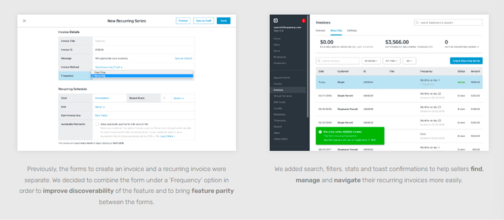
Source: Steph Parrott
Steph documents how incremental UX improvements — like invoice timelines, reminders and recurring payments — compound into meaningful gains in product adoption and trust.
How to create case studies and a UX portfolio that gets you hired
Case studies are the meat and potatoes of a UX portfolio, so it’s crucial to understand the patterns behind what makes them effective and apply those to your own work, context and experience level.
The steps below focus on structure, clarity and decision-making visibility.
Think of your own portfolio as a UX project. Apply the same user-centric design principles you’d use for any other design challenge. Consider your users — hiring managers, recruiters and potential clients — and their goals, constraints and context when they review your work.
At a high level, strong UX case studies follow the same core structure, regardless of industry or experience level.
Related | Check out our cheatsheet for answering common UX designer interview questions
Structure UX design portfolio examples around problem-solving, not deliverables
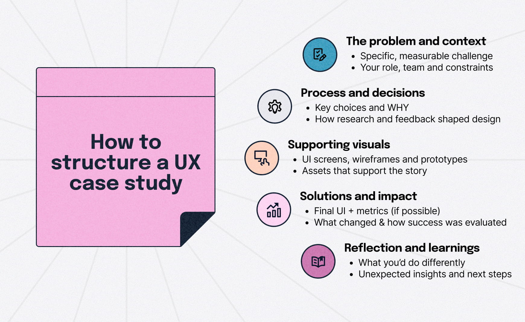
The best UX case studies follow a consistent narrative pattern, even when the projects differ. Each should make these things clear:
- The specific, measurable problem and context
- Your role and responsibilities, plus team size
- The constraints you were working within
- The key decisions you made and why
This structure helps reviewers quickly understand what problem you tackled, how you approached it and why your decisions mattered.
Include UI screens, wireframes, user personas, prototypes and more that support the story. If a reader can’t explain your reasoning or understand what your UX design skills are after reading your examples, it needs tightening.
Show just enough UX process to build trust
Once the problem is clear, you don’t need to show every small step to prove you follow a UX process. The goal is to make your thinking visible, not recite every move for the sake of it.
Focus on:
- How research informed decisions
- How designs evolved based on your process
- How insights translated into structure or interaction changes
- How feedback or testing shaped iterations
Early-career designers can show more process to establish rigor. Senior designers should focus on synthesis, prioritization and results.
Make results clear, even without metrics
After walking through your process, outcomes help reviewers assess effectiveness and reduce hiring risk. When possible, include quantifiable results.
What to include:
- Usability metrics
- Increases in KPIs (be specific, think along the lines of "25% increase in trial sign-ups")
- Reduced friction or confusion
- Increased trust or clarity
If metrics are sensitive or unavailable, which is often the case with companies not wanting to share internal processes, explain what changed and how success was evaluated.
Designers will have password-protected case studies for that reason.
Reflect on outcomes and lessons learned
This final step is about judgment and growth, not polish.
Include honest reflection in your lessons learned section. Discuss what you would approach differently, unexpected insights that emerged and next steps that were planned or implemented.
This signals growth mindset and critical thinking, both qualities valued by reviewers and potential clients.
Curate ruthlessly and refine over time
As your skills and goals change, your UX portfolio should evolve with them. Audit your existing work and select a small set of projects that represent different problem types, solutions or stages of your career.
Regularly:
- Remove weaker or outdated projects
- Refine case studies as your thinking improves
- Align your portfolio with the roles you’re targeting
Three to five in-depth case studies showcasing relevant work will always outperform a long list of loosely explained projects any day.
Before publishing, have a few people navigate your portfolio and note where they hesitate, get confused or miss key information; then refine accordingly.
The framework below summarizes how these elements come together in a strong UX case study.
Choosing a platform for your UX design portfolio
Once your case studies are structured clearly, the next decision is where and how to present them. Where your portfolio lives is less important than what’s in it, but it still matters.
Self-hosted sites like WordPress offer the most control, customization and flexibility. UX-specific platforms like UXfolio are built specifically for portfolios and can be an easy option for designers early in their careers.
Behance and Dribbble are vibrant communities for UX professionals with millions of UX design portfolio examples, making them useful places to catalog and share your work.
Start with a clear portfolio landing page
Your portfolio’s landing page should act as a signpost, not a visual showcase. Its job is to orient the reader quickly and point them to the work that matters.
A strong entry point typically makes three things clear:
- Your role or focus, such as UX/UI designer, product design, web applications or visual design
- The types of problems you work on, such as products, platforms, workflows or systems
- A direct path to your case studies
All case study thumbnails should include the project title, use a compelling visual and align with the overall look and feel of your site to support quick scanning.
Reviewers typically spend a few minutes scanning a portfolio, so your home page should accomplish all of the above within a few seconds. Avoid long introductions or vague statements.
SF-based design team leader Joy Liu notes,
“I spend no more than 5 minutes reviewing your work.”
Clarity and conciseness are crucial; hiring managers want to get to your work fast. When in doubt, keep it clean; minimalist design is always appreciated and in style.
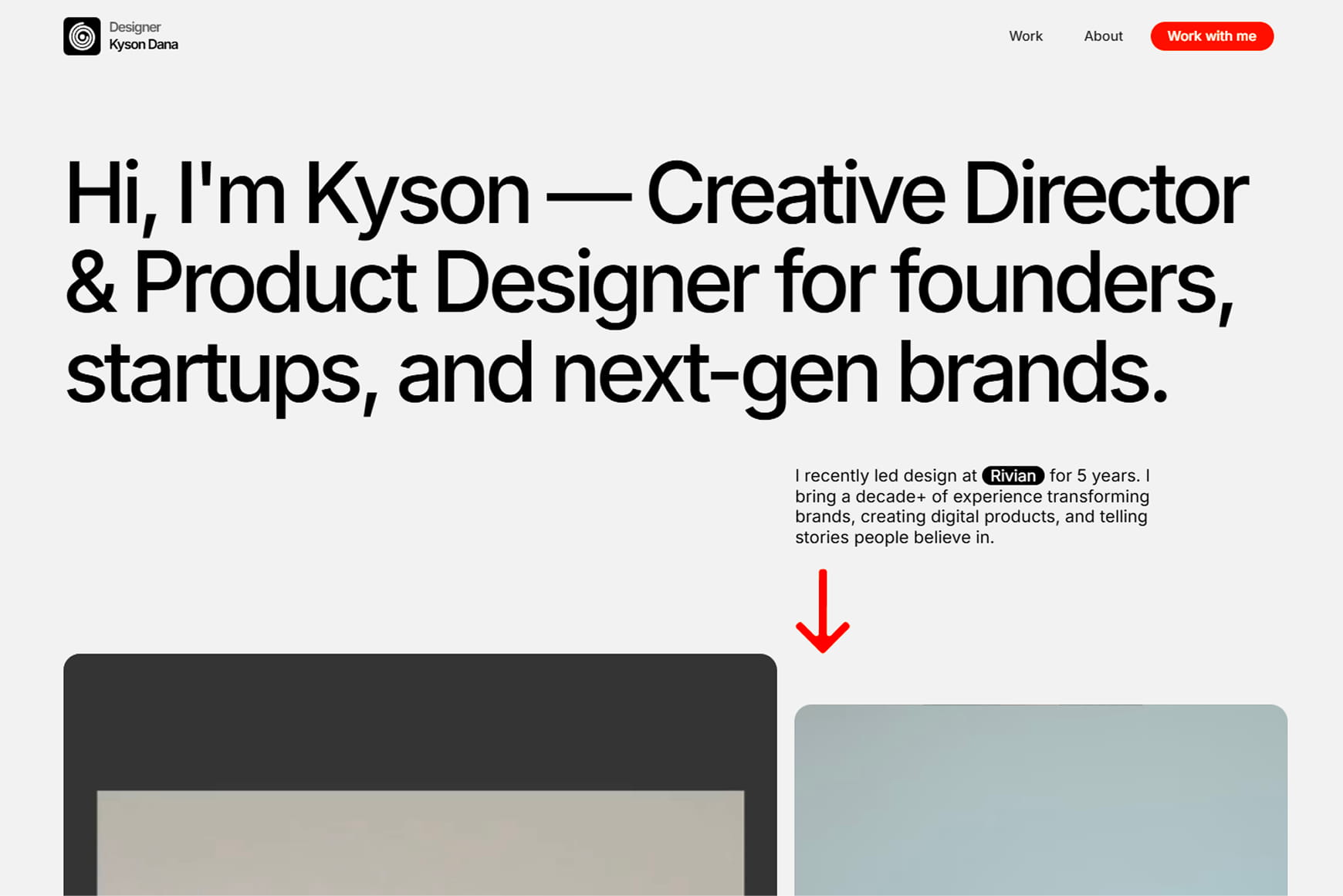
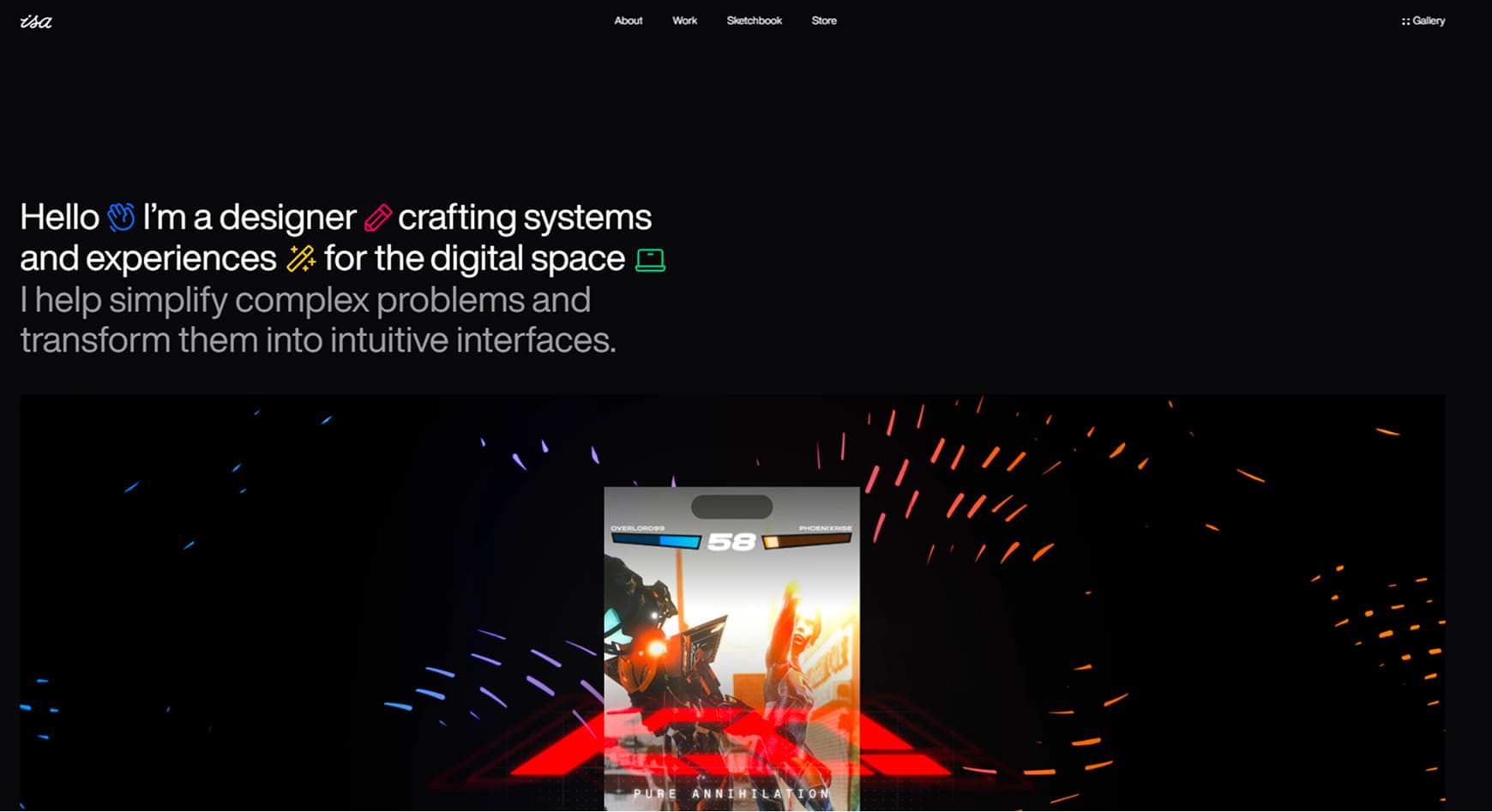
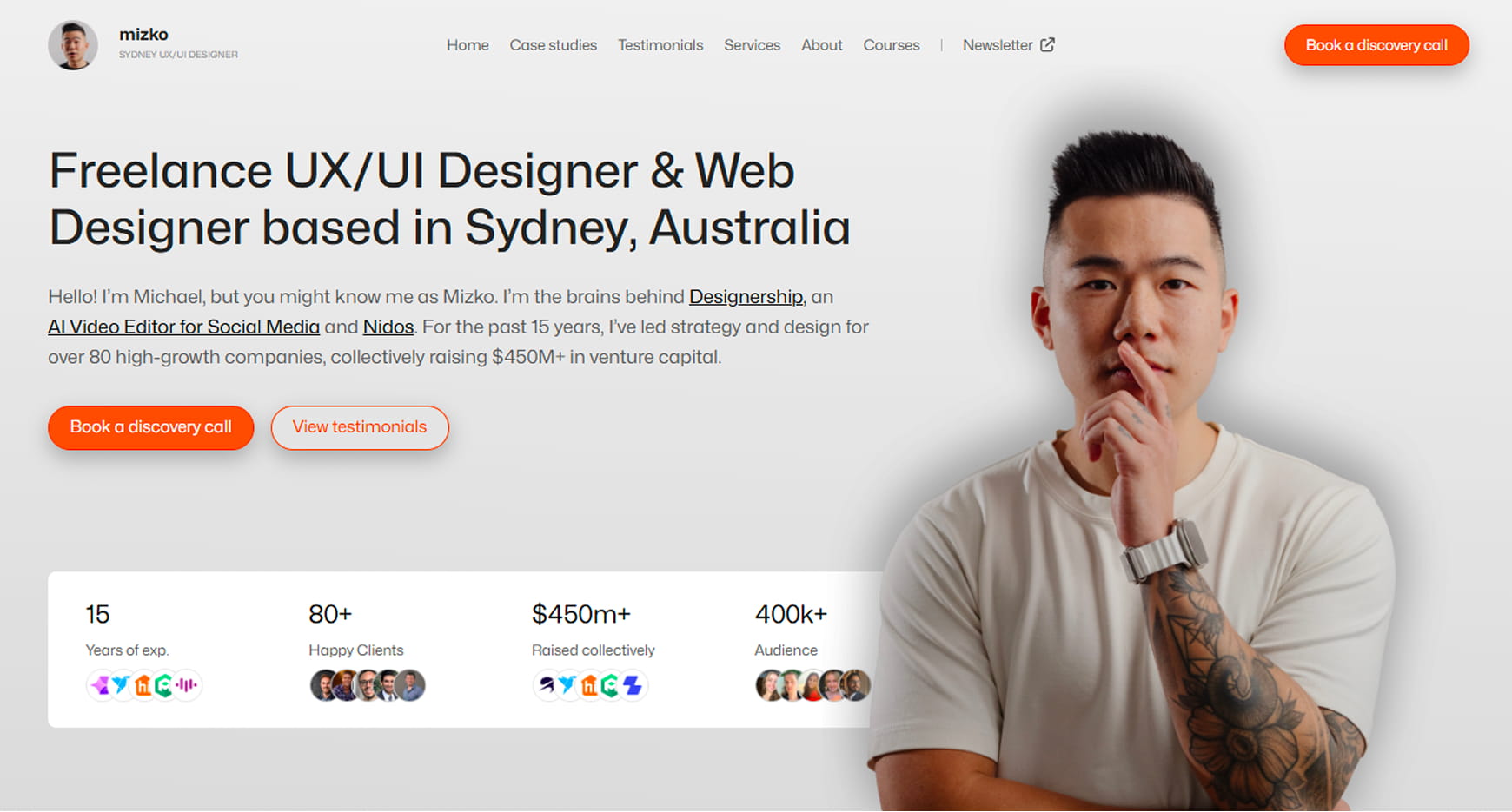
Here are a few landing page examples:
Source: Kyson Dana
A clear role, strong hierarchy and an immediate path to case studies make this a textbook example of a portfolio landing page that prioritizes scanning.
Source: Isa Pinheiro
A focused, minimal landing page that prioritizes clarity and directs attention quickly to case studies.
Source: Mizko
This landing page blends strong personal branding with clear navigation, showing how expression can coexist with usability.
Common portfolio mistakes to avoid in 2026
No one wants to lose an opportunity because of avoidable mistakes. The issues below make it harder for potential employers to evaluate your thinking, process and overall fit.
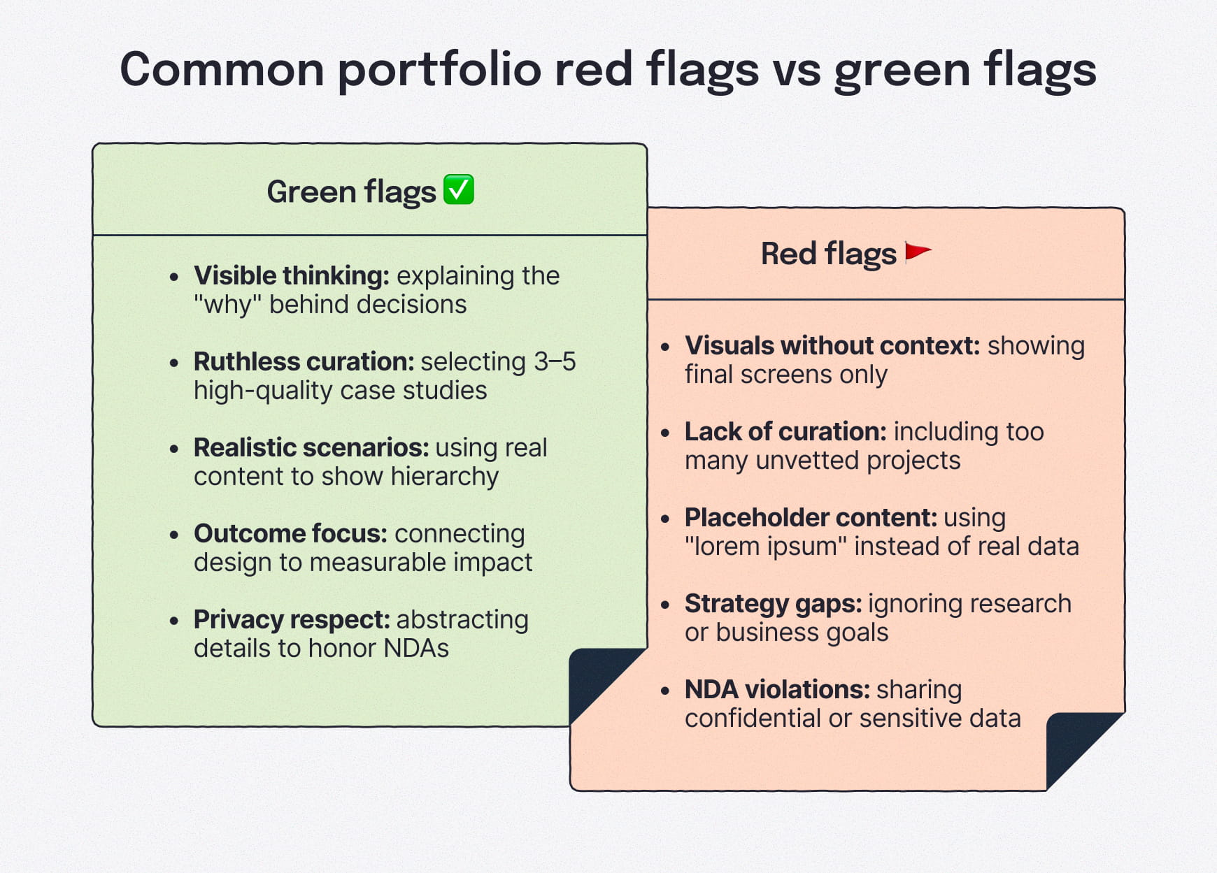
Showing only final designs without explaining decisions
Polished screens without context don’t demonstrate UX thinking on their own. When portfolios skip problem framing, UX research and rationale, reviewers can’t assess how decisions were made or why the solution works.
Great UX portfolios make thinking visible.
Including too many projects instead of curating a few strong ones
More work ≠ a better portfolio. Large collections of loosely explained projects often dilute the impact of the best work and signal weak judgment.
A small set of three to five well-structured case studies is easier to evaluate and more convincing.
Using placeholder content instead of realistic examples
Lorem ipsum hides important UX decisions. Realistic content helps reviewers understand hierarchy, information architecture and how designs function in real scenarios.
Using real content signals attention to detail and practical thinking.
Overemphasizing visuals while ignoring UX strategy
UX portfolios aren’t graphic design galleries. When visuals dominate without explanation of research, constraints or rationale, it becomes difficult to assess UX skills. Visuals should support the story, not replace it.
This is particularly important in agile UX workflows, where designers continuously test assumptions, adapt to feedback and refine solutions alongside product teams.
Mishandling confidential or proprietary work
Sharing sensitive data or internal details can create professional risk. When projects are under NDA, make note of that and then focus on process, learnings and abstracted outcomes rather than client-specific information.
When necessary, restrict access or anonymize details responsibly.
Making it hard to contact you
Broken links, missing contact information on the about page or hidden calls to action can quietly kill opportunities. If someone wants to reach out, the path should be obvious and reliable.
Your portfolio should never create friction at the moment of interest.
Making basic design and accessibility blunders
Don’t overlook the web design basics. Build a fast-loading site, optimize images and ensure your portfolio website is ready for mobile.
Proper attention to accessibility, like adequate color contrast and readable fonts, signals awareness of inclusive design principles.
Most of these mistakes are easy to fix once you know what to look for, and addressing them can dramatically improve how your portfolio is received.
What about UX portfolios and case studies for UX beginners?
Early-career UX portfolios don’t need shipped products to be credible. What matters is clear thinking, well-reasoned decision-making and documentation of your problem-solving skills. Focus on what you learned and how that thinking carries forward.
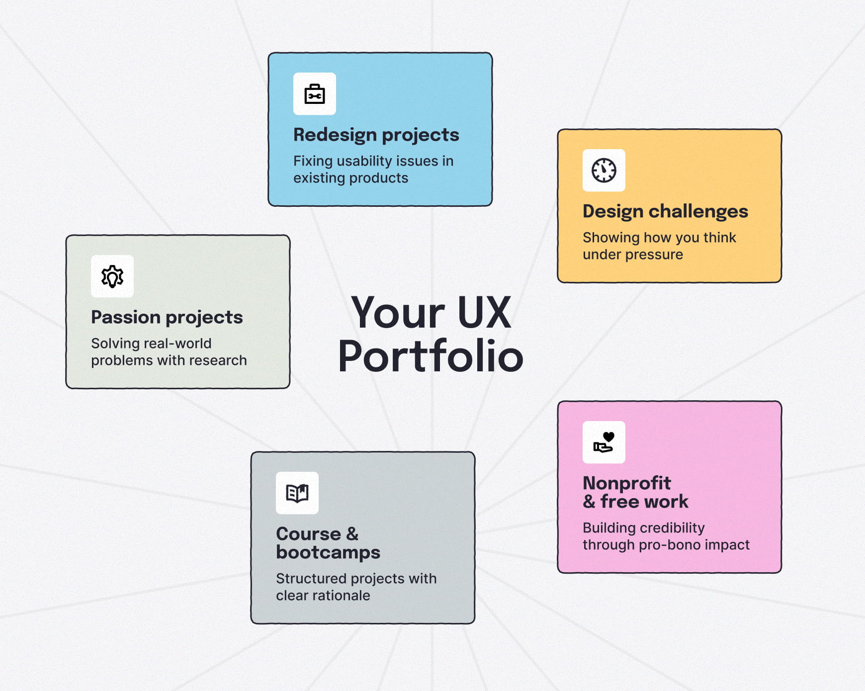
It starts with building a solid foundation of UX skills, then applying them through opportunities with low barriers to entry. There are many ways to gain experience that would translate to credible case studies and look great to potential employers.
Redesign projects
Unsolicited redesigns of existing products, clearly labeled as conceptual, that focus on identifying usability issues and proposing evidence-based improvements.
Passion projects or spec work
Self-initiated projects based on real problems you’ve observed or experienced, supported by research and validation to justify design choices.
Course or bootcamp projects
Capstone or coursework design projects that include constraints, research, iteration and clear rationale for design choices.
Free, discounted or nonprofit work
Real-world projects with stakeholders, timelines and tradeoffs that demonstrate collaboration and impact. Offering free or discounted work early on can be frustrating, but it is a viable way to build confidence and case studies.
Design challenges
Hackathons or design challenges show how you think and prioritize under pressure. These are best used as supporting work, not core case studies.
In all cases, what matters most is being transparent about the context and intentional about how you frame your work.
Build a UX design portfolio that gets you results
A UX portfolio isn’t about having the most projects or the flashiest visuals. It’s about reducing uncertainty for the people reviewing your work.
Focus on clear case studies, visible decision-making and outcomes that show impact. Curate a small set of projects that explain why choices were made, not just what shipped. Treat your portfolio like a UX project of its own, with hiring managers, recruiters and potential clients as the primary audience.
If someone can understand your role, process and value within a few minutes, your portfolio is doing its job.
Think visually. Improve UX with Slickplan
Build intuitive user flows, stronger customer journeys and improve information architecture.
Frequently asked questions
What are absolute must-haves in a UX portfolio?
A UX portfolio must include a concise home page, well-structured case studies, a visible UX process and clear outcomes or impact. Portfolios should explain decisions, not just present final designs, while being easy for reviewers to scan, understand and evaluate quickly.
Do UX designers need a portfolio?
Yes. A portfolio is the primary way UX designers demonstrate design thinking, problem-solving and decision-making. Resumes list experience, but portfolios show how you work, making them essential for roles across UX, product design and interaction design.
How do you create a UX portfolio with limited UX experience?
Use spec work, redesigns, classwork from a UX academy or volunteer work. Focus on documenting your process clearly: defining problems, conducting research, exploring solutions and reflecting on outcomes. At that stage, reviewers and potential clients care more about how you think than whether the work shipped.
How many case studies should a UX portfolio include?
Most UX portfolios perform best with three to five detailed case studies. A few highly impactful examples are more effective than many shallow ones. Each should earn its keep by clearly demonstrating UX design work, decision-making and impact.
What do hiring managers look for in a UX portfolio?
Hiring managers look for clarity, structured thinking and evidence of impact. They want to understand your role, how you approached problems, how decisions were made and what changed as a result. They don't want a set of screenshots without explanation.


 X
X