In 2015, Google announced and rolled out their “mobile-friendly” algorithm update, which meant mobile-friendly and responsive websites would get prioritized in rankings for better user experience (UX).
Web administrators around the world prepared for the shift, and it took on a trending name, “Mobilegeddon.” Google even rolled out a mobile-friendly testing tool to help people check the mobile health of their website.
But on July 1 of this year, Google took it a step further, rolling out the mobile-first algorithm. Where Mobilegeddon gave favor to mobile sites, the newest iteration, according to Google, “predominantly uses the mobile version of the content for indexing and ranking.”
Why Mobile-first Matters
Today, more than half of all searches are performed on a mobile device, and nearly 95% of those mobile searches happen with Google. And the user experience on mobile versus desktop hasn’t changed much as search experts at Moz have found that mobile search queries are practically as long as desktop search queries.
It’s likely not surprising, mobile phones and mobile data are more accessible for people, especially in communities or regions where high speed cable internet may not be. Mobile phones also serve as the primary communication device these days, as more than 50% of American homes are “wireless only.”

Because Google remains the powerhouse for search, they’ve been driving change to meet the growing and shifting demands of the ever-mobile audience. As web and UX professionals, it’s important to deliver websites and content that meet your audience where they are, regardless of the device they choose.
If you’re working toward bettering your mobile UX, keep reading. In 2026, new trends in design are leading the way with mobile-first experiences.
Mobile SEO Factors
A few things haven’t changed much in the era of desktop-to-mobile search growth, especially when it comes to the foundation of your website.
Choosing a content management system (CMS) that allows flexibility to build your site and control your technical search engine optimization and on-page content is essential to success on any device. In your CMS, you’ll want to be sure you can control the foundational elements of digital experience:
- Page titles – At between 65 and 75 characters, your page title should accurately and uniquely describe the content of your page. This acts as a clue for search engines to properly index your page for search users, whether on desktop or mobile.
- Page descriptions – While less important in the keyword influence than several years ago, page descriptions tell search users what a page is about. These should be uniquely written for each page, and ideally encourage search users to click the page link.
- On-page content – Building user-friendly content is the key to a positive UX, but weaving in keywords that you know they’re using can give you a boost on search, too.
- Schema – Schema gives extra boost to your pages by telling Google and search engines what the page is specifically about. This is important when it comes to who, what, when, and where queries.
- Images, video, and media – Your images, video embedding, and other media should be optimized to load quickly and fit on a mobile device. A flexible CMS should give you the ability to adjust media sizes to optimize them.
You’ll also want to ensure you submit the proper sitemap to webmaster tools, such as Google Search Console, and make sure all your pages can be crawled, meaning they’re not blocked from robots.
How Slickplan can help: If you’re ready to start putting words on the page, but want to make sure you’re checking all the SEO boxes and other best practices, check out the Slickplan Content Planner tool.
🎬 Learn what Slickplan can do!
We filmed a short video to show you exactly how to use Slickplan
Importance of Mobile Navigation
While it’s true that many searches on Google take place from a mobile device — and it could be easily deduced that users are navigating to interior webpages to answer their question — it doesn’t mean they find what they need and leave the site.

According to Nielsen Norman Group, navigation is used more on mobile than on desktop. With this knowledge, it’s become increasingly important that information architecture and navigation terms remain clear and intuitive, as well as visible on mobile devices.
Nielsen Norman Group also cautions the overuse of hamburger menus. While UX professionals know what the hamburger means (a symbol of three horizontal lines), it’s not familiar to all users, especially those with lower tech literacy.
In any case, keeping navigation visible is favorable for all audiences. Start with an intuitive sitemap that lays out the website and its page relationships clearly. Then, make navigation “sticky” in mobile, and labeling the menu appropriately with high contrast and clues that it’s “clickable” can be helpful to people on mobile devices.
How Slickplan can help: To ensure you’re thinking through your navigation, and how many levels you’re proposing to your users, check out Slickplan’s Site Map tool to map your site’s architecture.
Design for Everywhere
Nielsen Norman Group is one of many UX professional networks emphasizing that mobile-first doesn’t mean mobile-only. Ensuring your site works on mobile devices, like tablets and smartphones, doesn’t mean it will work perfectly on desktop.

Likewise, building a responsive site on desktop first means you need to consider pre-launch testing of your design on devices of all sizes. Through all of this, your design, no matter the screen size, must be an inclusive experience. With around 15% of the world’s population experiencing some form of disability, following accessibility guidelines like Web Content Accessibility Guidelines (WCAG) ensures your site meets their needs.
When considering a mobile design experience, whether you start with mobile or you start with desktop, keep an eye on the functionality and ease of use of things like:
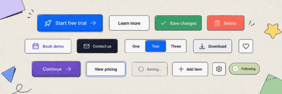
- Keep your brand colors and design simple. Busy designs look busier on smaller devices. That includes your color palette: Stick with simple and contrast-friendly, especially for users who have color blindness.
- Make the navigation intuitive and easy to reach. To eliminate long scrolls, make the navigation ‘sticky’ to the top of the screen, and label hamburger menus with “Menu” for users who may not be familiar with the hamburger icon.
- Ensure phone numbers and calls to action are in easy reach. Ensuring mobile button design is “thumb friendly” can help them convert quicker.
- Keep media file sizes minimal. While you may be able to resize images in your CMS, it’s best to resize them before you upload, so you’re optimizing your storage space and site load time from the start.
- Embed media rather than upload. If you have videos on your site, consider uploading them to YouTube and embedding them, which saves space on your site. YouTube is a bonus because it automatically makes its videos responsive for your site, no matter where you embed them.
- Test animation and JavaScript first. Not all animation or JavaScript works on mobile the way it does on desktop, and some users might have JavaScript disabled on their mobile device. Test this first or build around the need when considering the mobile audience.
How Slickplan can help: Need help putting a design together and getting appropriate feedback from your team? Check out Slickplan’s Design Mockup and User Flow tools.
Page Speed Carries Weight
In 2018, Google rolled out a speed update that impacted websites around the world. This, of course, was an effort to get answers to people as soon as possible, with as little delay or load time as possible. That’s why page speed became a much bigger weight, especially as mobile-first took over the headlines.

Slow-loading pages are less likely to be prioritized, indexed, and ranked by Google search engine spiders, or any other search engines. Only if the content is highly relevant and well-written will it continue to succeed.
Before you assume you can keep slow pages because they have great content, remember that people are expecting faster downloads these days. Even a one-second delay in page load can decrease page views, conversions, and customer satisfaction. According to Kissmetrics, nearly 47% of consumers expect a site to load in two seconds or less, so there’s no time to spare if you need to improve your website’s speed experience.
If you’re guilty of slow page load speed, check elements most guilty including:
- HTTP requests, including redirects
- Image sizes
- Code, including JavaScript or CSS
- Amount of text
- Hosting options or solutions
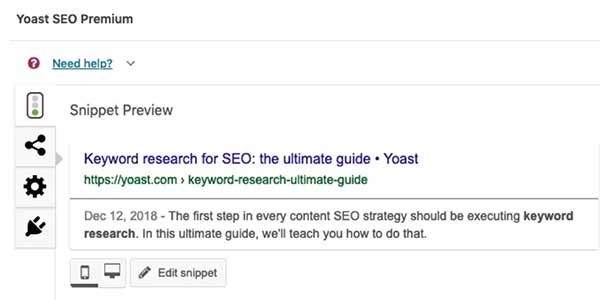
The Fold Exists, But Its Value Varies
When websites first came to be in the early 1990s, whatever was visible on the screen, without scrolling, was considered “above the fold” — an old newspaper phrase with the same meaning. It still holds true: When content is first visible to users, they’re likely to engage with it. Such is the case with search engine result pages (SERPs), which often display advertisements, videos, and rich snippets above the fold. According to Google studies, this results in higher engagement and click rate.
But when it comes to websites, the fold is losing its value. In 2010, Nielsen Norman Group studied above- and below-the-fold mobile UX and found that above-the-fold clicks accounted for 80% of people’s time. But by 2018, that number had dropped to just 57%.
With our handheld devices, from tablets to smartphones, we’re more inclined to scroll, and understand that not everything can be on that tiny screen at once.
Still, placing important information like calls-to-action and callouts above the fold is a good practice when considering mobile-first. Your logo, navigation, and vital “need to know” content should always appear higher on the page, whenever possible. Work with your team in building mockups that take these elements into account.
Implement UX Testing
Before you go live with your new site, it’s a good plan to get it in front of real people. Whether in the wireframe and prototyping stage, or in the pre-launch testing phase, having real feedback from users will help you eliminate any obstacles on mobile.
By putting the website or app in the hands of your users, you have the opportunity to watch them:
- Use the navigation
- Site or app search
- Read content
- Engage with conversions
- Complete online forms
- Browse articles or marketing
While you test with users, ask them to be vocal about what they find difficult or challenging. By hearing and understanding their struggles, you and your team can make improvements when your site is ready to go live. Check out tips from Treehouse on running a real-life mobile user test.
How Slickplan can help: Before you get your website or app off the ground, try building a user flow to plan for possible obstacles and paths in their journey. Check out Slickplan User Flow tool to get started.
Google’s Usability Report is Your Friend
If you’ve registered your site with Google’s webmaster suite, you’ll be happy to learn they’re keeping a close eye on your site’s mobile usability with its mobile usability report.
This report tracks any errors in your mobile presence including:
- If you’re using incompatible plugins, such as Flash, that are no longer supported by mobile browsers
- Content wider than the screen, which can cause a poor UX or necessary scrolling for your users
- Text too small to read, which impacts readability and accessibility for people, often requiring users to “pinch to zoom”
- Links or clickable elements are too close, making it hard for people to take the action they want
Aside from that, the usability report can just tell you, in general, if a page or your whole site is mobile-friendly or not. If it’s not, you’ll get a list of ways to improve the experience.


Think visually. Improve UX with Slickplan
Build intuitive user flows, stronger customer journeys and improve information architecture.
Get Your Site Mobile
Don’t wait on your website’s mobile-friendliness. People around the globe are relying on mobile devices more than ever — from using it as their main communication line to relying on it as their personal computer. By ignoring what they need, you’re abandoning an opportunity to connect with potential consumers and advocates for your brand.


 X
X