Terms like UX, UI, IA and IxD frequently appear in digital design, but each one has a distinct meaning that shapes how a website, app or product works and feels. Understanding them improves communication, reduces confusion and creates smoother workflows across design, content and development.
This guide provides clear definitions and simple comparisons to help you understand how these four design concepts connect and differ. A glossary you can reference anytime these digital design terms come up.
UX vs IA vs UI vs IxD: what’s the difference?
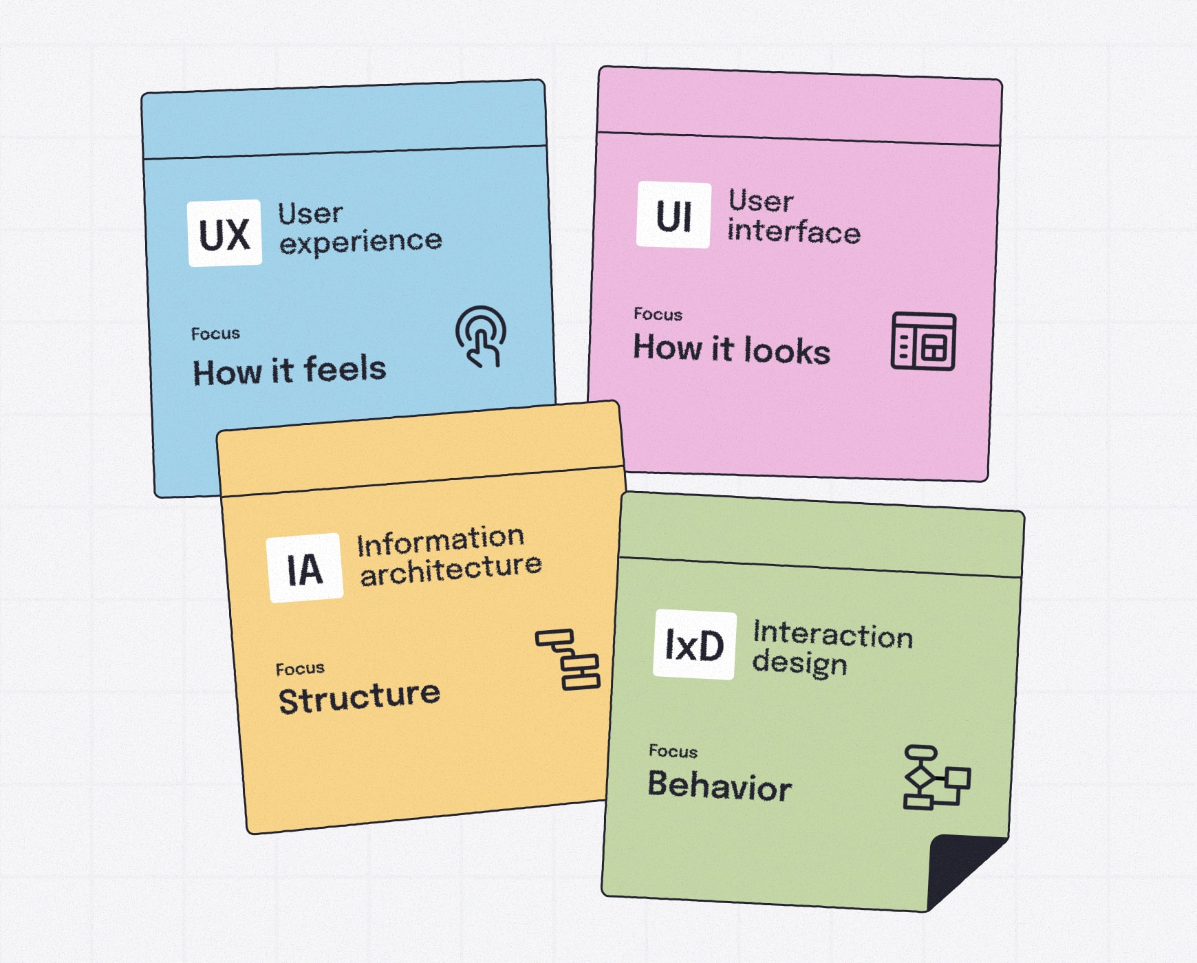
Here’s an at-a-glance comparison of UX, UI, IA and IxD to clarify what each design discipline covers.
| Term | Stands for | Focus |
|---|---|---|
| UX | User experience | The visual layer people see and interact with |
| UI | User interface | Existing page visits, conversions, social shares, and bounce rates. |
| IA | Information architecture | How content is organized, structured and labeled |
| IxD | Interaction design | How interface elements behave during user interaction |
UX (User Experience)
What it affects:
Usability, clarity, task completion, overall satisfaction
Typical deliverables:
User flows, wireframes, prototypes, user research
Typical roles:
UX designers, UX researchers, product designers
Simple example:
Making it easy for someone to book a service without confusion
UI (User Interface)
What it affects:
Layout, readability, visual hierarchy, on-screen clarity
Typical deliverables:
Style guides, high-fidelity mockups, design systems, visual assets
Typical roles:
UI designers, visual and graphic designers, product designers
Simple example:
The color, shape and placement of the "Add to Cart" button
IA (Information Architecture)
What it affects:
Navigation, findability, content clarity, user pathways
Typical deliverables:
Sitemaps, taxonomy, navigation labels, content groups
Typical roles:
Information architects, UX strategists, content strategists
Simple example:
The labeling and nesting of products or services in a drop-down menu
IxD (Interaction Design)
What it affects:
Feedback cues, motion, state changes, microinteractions
Typical deliverables:
Interaction patterns, animations, prototypes, motion guidelines
Typical roles:
Interaction designers, product designers, UX designers
Simple example:
A button that shows a loading spinner and success message after a form submission
What does UX mean?
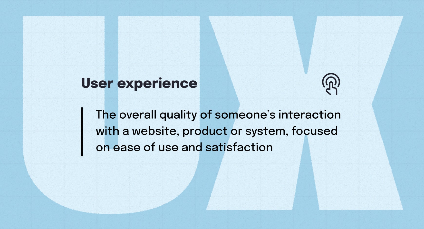
User experience (UX) refers to the overall quality of someone’s interaction with a website, app or product. It includes ease of use, clarity, navigation and how intuitive each step feels as someone moves through a task. UX also covers the impressions and emotional response people have while using the product.
Strong UX design choices rely on insights from UX research methods and consider user goals, motivations and pain points to create a smooth, enjoyable experience.
🎬 Learn what Slickplan can do!
We filmed a short video to show you exactly how to use Slickplan
What does UI mean?
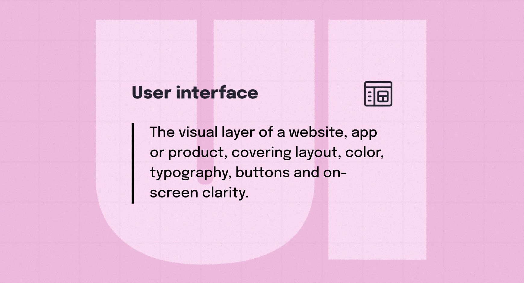
User interface (UI) refers to the visual elements of a website, app or product. It covers layout, color, typography, iconography, buttons and the spacing and patterns that shape what people see on screen. UI focuses on clarity, readability and creating a consistent visual system that supports user goals.
Good user interface design makes information easy to read and ensures every interactive element feels intentional and intuitive.
What does IA mean?
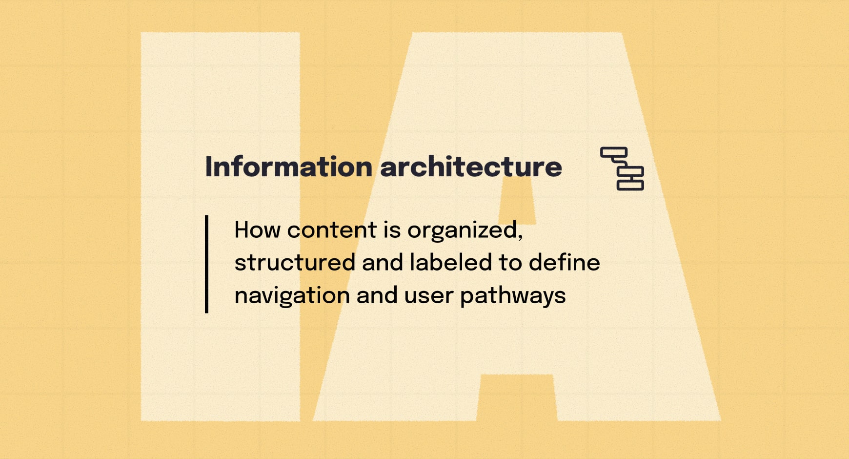
Information architecture (IA) refers to how content is organized, structured and labeled within a website or digital product. IA design shapes the navigation, hierarchy, categories and pathways that help people find what they need.
A well-built IA strategy reduces confusion and makes content easier to locate, giving people a clear sense of place and direction as they move through a website or mobile app.
What does IxD mean?
Interaction design (IxD) refers to how interface elements behave and respond when someone interacts with them. It includes feedback cues such as animations, transitions, vibrations, state changes and the microinteractions that guide people through a product.
Effective IxD improves clarity and helps people understand the results of their actions in real time.
UX, UI, IA & IxD: how they work together
UX, UI, IA and IxD each handle a different part of the digital experience, but they work best when they support one another. IA creates the structure, UX defines how people move through it, UI shapes the visual layer and IxD brings the interaction to life.
When these disciplines work together, they naturally support a more cohesive, intuitive and easy-to-follow user experience from start to finish — a foundation that also informs broader UX strategy.
UX vs UI: differences explained
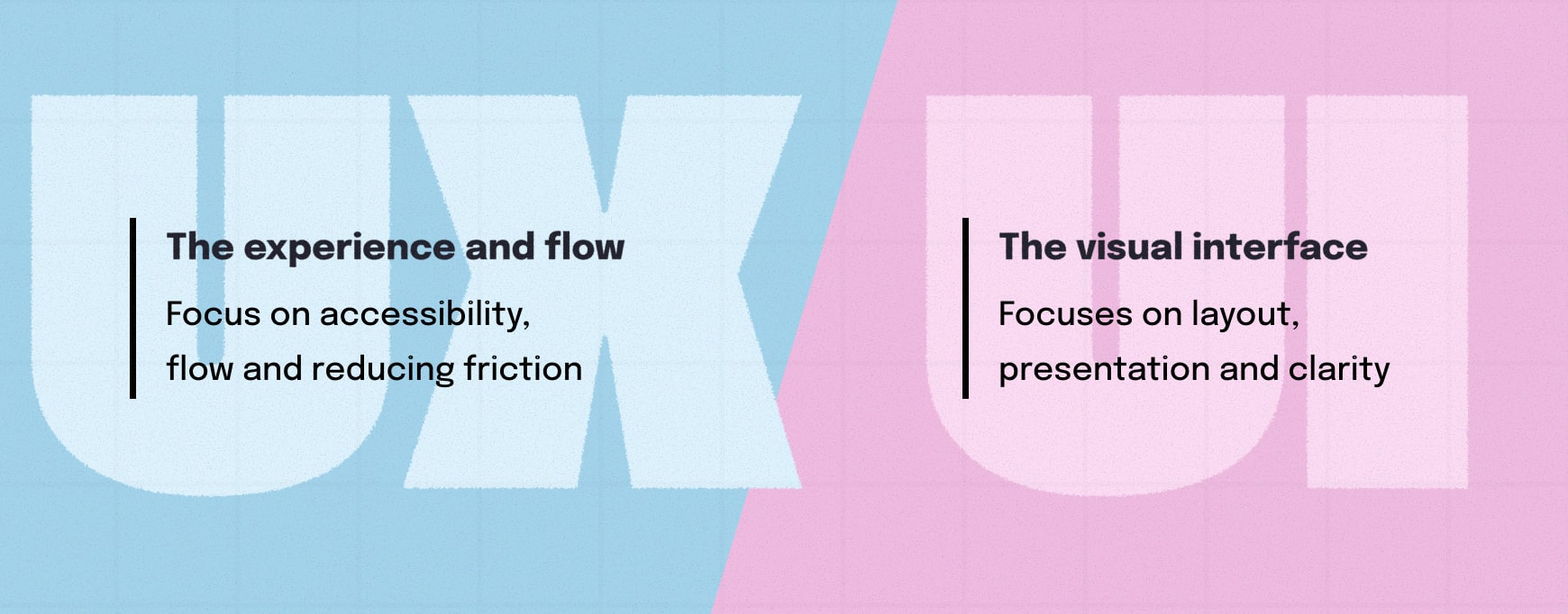
UX is the overall experience; UI is the visual interface. More broadly, user experience is concerned with flow, accessibility and reducing friction, focusing on flow, accessibility and reducing friction. UI, on the other hand, shapes the layout and presentation to deliver visual clarity. Practices such as Agile UX can influence how teams refine both, but they don’t change the core UI or UX definition.
The key UI vs UX difference is that UI reinforces the experience by making information readable, elements recognizable and actions easy to identify.
Example of the UX–UI difference:
In a digital form, the UI is the layout, labels and spacing that make each field easy to see. The UX is how the form guides someone through completion — reducing steps, auto-advancing, or showing only the fields needed to finish quickly.
IA vs UX: how structure supports experience
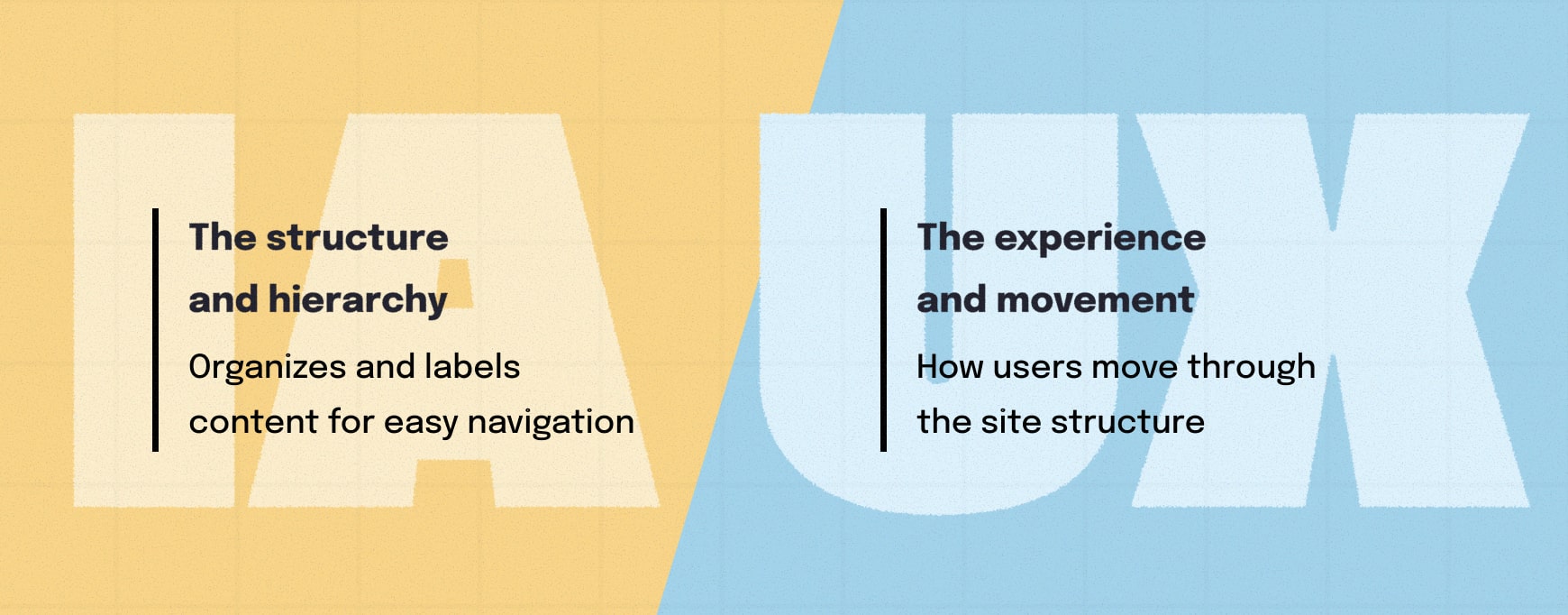
IA organizes and labels content into a logical structure; UX shapes how people move through that structure. Information architecture creates the hierarchy, categories and navigation that hold a site’s content together. Turning that structure into a clear pathway allows people to complete tasks more easily.
In the UX design process, this would be the difference between user flows and sitemaps. Without clear IA, a smooth and intuitive user experience is hard to achieve.
Example of IA–UX working together
A website with logical page organization and a clear menu is IA. Intuitive navigation that guides someone from that menu to the right content in as few steps as possible reflects UX design.
UI vs IxD: visual and interactive roles
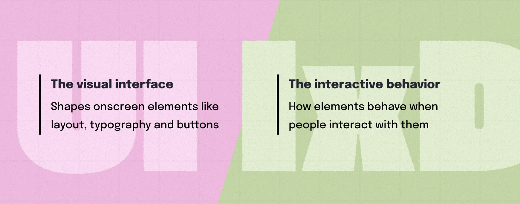
UI is what people see on screen — the layout, typography, colors and page elements. IxD defines how interface elements behave during interaction, a distinction that becomes clear when comparing wireframes and prototypes.
The user interface shapes the static visuals, while interaction design shapes the motion, feedback and response. Together, they produce interfaces that are clear, interactive and easy to follow.
Example of a UI–IxD partnership
The design decisions behind a button’s shape and color are UI. The way it highlights on hover, presses down when clicked and shows a loading spinner reflects IxD.
IxD vs UX: where interaction meets experience
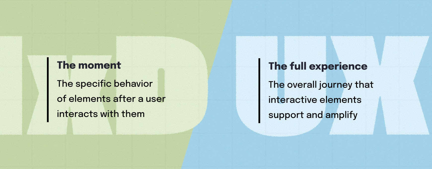
IxD focuses on the behavior of interface elements and how they respond through feedback, animations and transitions. UX is broader, covering the full journey someone takes, including clarity, navigation and task flow guided by those interactive cues.
The core IxD vs UX difference is that IxD shapes individual interaction moments, while UX shapes the overall experience those moments support.
Example of an IxD–UX collaboration
A button showing a loading spinner reflects IxD. The path someone takes to reach that button and what happens after clicking it relate to UX.
Difference between UI and UX: beginner-friendly summary
UI covers everything someone can visually identify: buttons, spacing, text, menus and overall appearance. UX focuses on the big picture and how those elements work together to create a smooth, understandable experience. UI improves clarity on the screen, while UX improves clarity in the process.
Together, UI and UX determine how a product or site looks and how it feels to use. Insights from user testing and usability metrics help highlight what’s working and what’s not.
Example of UI–UX working together
A clean form with clear labels is UI. A form that avoids unnecessary steps and helps someone complete the task quickly reflects UX.
Digital design starts with clarity
Understanding the differences between UX, UI, IA and IxD gives teams a shared language to work from. Whether you’re designing a feature, planning a site structure or reviewing a prototype, these definitions help everyone stay aligned and make decisions with clarity.
Use this glossary as a quick reference whenever these terms appear in conversations or documentation. Clear terminology leads to smoother collaboration, fewer misunderstandings and stronger digital experiences.
Share & refine designs with Slickplan
Add mockups from Figma or your computer to ensure UX/UI is moving in the right direction.
Frequently asked questions
What does UI stand for in design?
UI stands for user interface, the visual layer of a website, app or digital product. It includes layout, colors, typography, icons, spacing and the on-screen elements users interact with. UI design focuses on clarity, readability and consistency so people can easily understand where they are, what they can do and how to move through an interface without hesitation.
What does UX stand for?
UX stands for user experience. It's the overall quality of someone's interaction with a website, app or product, including how intuitive the steps feel, how easily tasks can be completed and how supportive the process is from beginning to end. UX focuses on how intuitive the experience feels — reducing friction, supporting user goals and guiding someone through a clear flow. Dedicated UX design tools help teams refine this work.
What does IA stand for in web design?
IA stands for information architecture, the structural framework behind a website or app. It defines how content is organized, labeled and arranged, shaping navigation, categories and pathways users rely on to find information. Good IA makes even the most complex sites easier to understand and ensures users have a clear sense of where they are and where to go next.
What is IxD (interaction design)?
IxD stands for interaction design; IxD design shapes how interface elements behave when users engage with them. It covers feedback cues, animations, transitions, state changes and microinteractions that help people understand what's happening as they click, tap or hover. Strong IxD makes an interface feel responsive, predictable and supportive, clarifying the results of each user action in real time.
What's the difference between UX, IA, UI and IxD?
UX defines the overall experience; UI defines the visual interface; IA establishes the structure and labeling of content; and IxD shapes how elements behave during interaction. Together, they form the core of digital design. Understanding the difference helps teams communicate clearly, collaborate more effectively and create products that are usable, intuitive and visually coherent across every step of the experience.
How does information architecture improve UX?
Information architecture strengthens UX by giving the experience a clear, logical structure. When content is grouped, labeled and arranged in predictable ways, users can move through a product without confusion. Strong IA reduces cognitive load, shortens pathways to information and makes each step of the journey feel more intuitive, directly improving overall user satisfaction and experience.
Which comes first: UX, IA, UI or IxD?
Typically, projects begin with IA because it defines the structure and relationships between content. UX comes next by mapping how people move through that structure. UI then brings visual clarity to each screen/element, and IxD adds the behaviors and feedback that guide interaction. While the process isn't always linear, this sequence supports a more cohesive, user-centered design approach and outcome.
Are all four required for website or app design?
Most modern digital products, websites and mobile apps rely on all four disciplines, even if they're handled by the same person on smaller teams. IA provides the foundation, UX shapes the experience, UI defines the visuals and IxD adds the interactive behavior that brings everything to life. Working together, they produce clearer, more intuitive and more consistent experiences for users.



 X
X

